Color is one of the most powerful tools in interior design. It shapes mood, influences perception, and defines the entire personality of a space. As we move through 2026, living room color trends are evolving in exciting directions — blending comfort with boldness, nature with sophistication. Whether you’re planning a full renovation or a simple refresh, understanding these trends can transform how your home feels and functions.
The living room is the heart of every home. It’s where families gather, conversations flow, and first impressions are made. Choosing the right color palette isn’t just an aesthetic decision — it’s a deeply personal one. The trends dominating 2026 reflect a collective desire for warmth, authenticity, and intentional living, moving away from cold minimalism toward spaces that feel truly alive.
This article explores the top eight color trends shaping living rooms in 2026. From earthy terracottas to moody midnight blues, each palette tells a story. These trends cater to diverse personalities and lifestyles, offering something meaningful for every home. Read on to discover which color direction speaks to you.
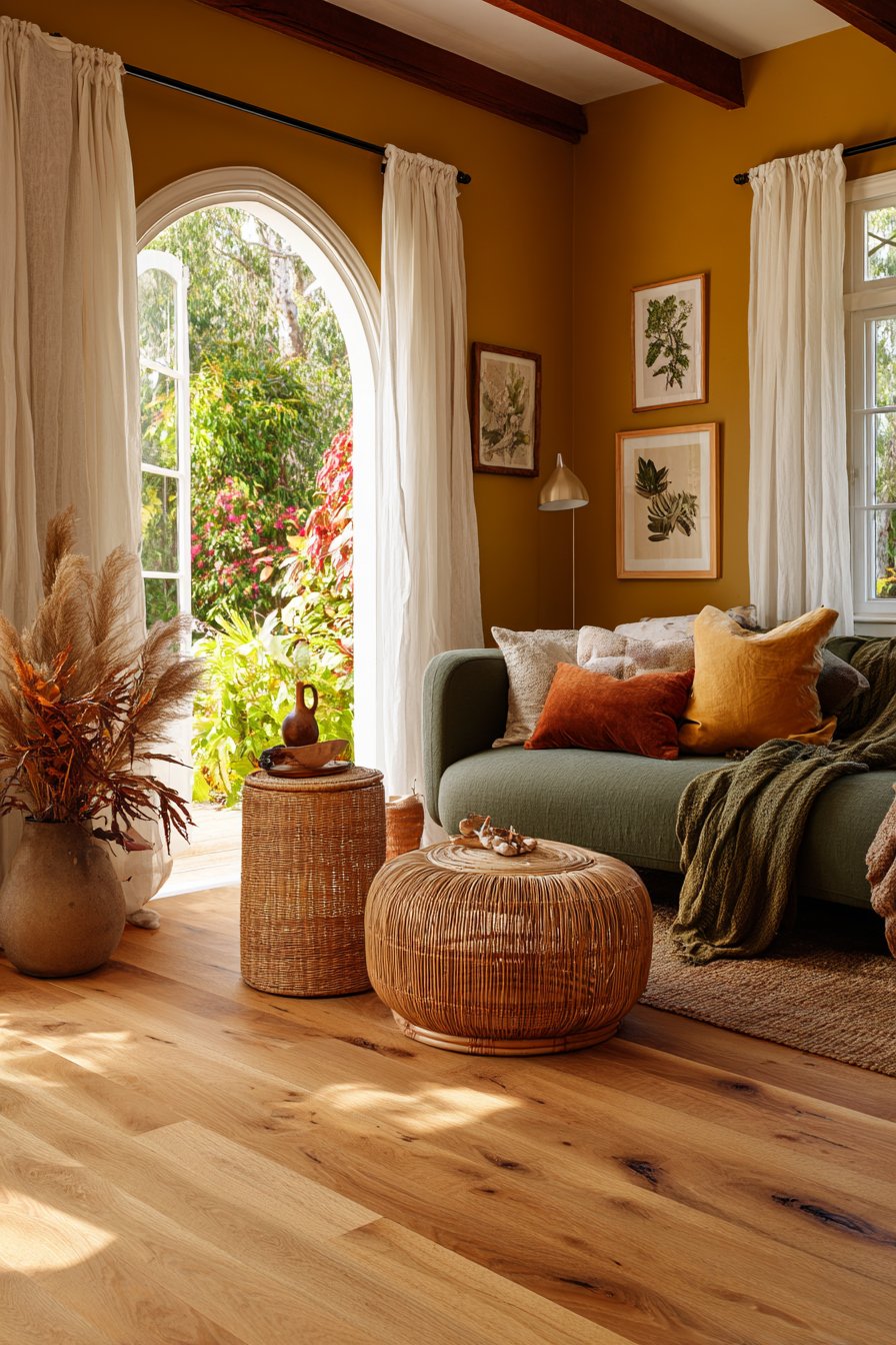
1. Warm Terracotta and Clay Tones
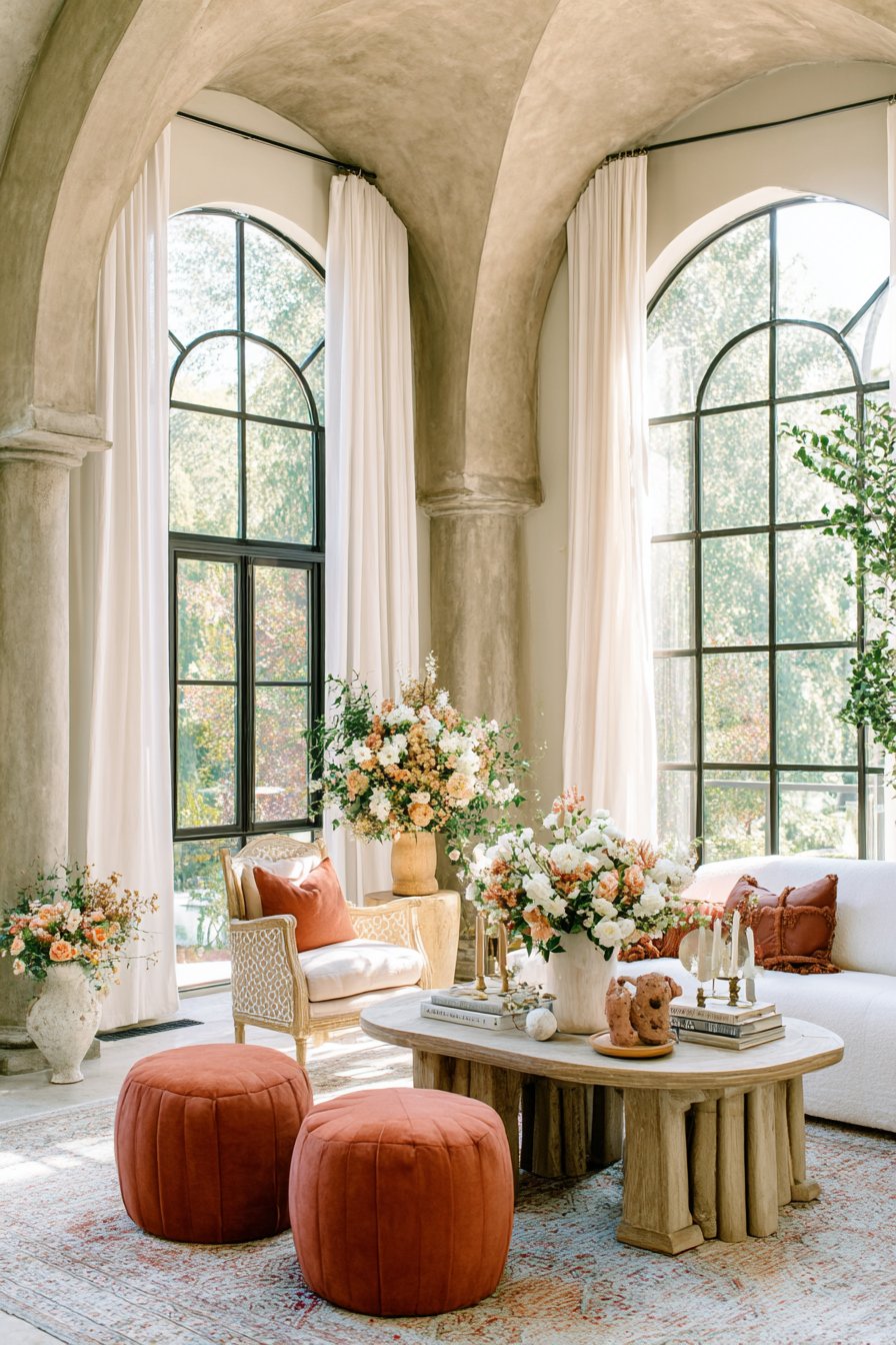
Terracotta has officially moved from a passing trend to a design staple. In 2026, warm clay hues are dominating living rooms with their grounding, earthy presence. These tones evoke sun-baked landscapes and ancient architecture, creating spaces that feel both timeless and deeply welcoming. The richness of terracotta pairs beautifully with natural materials like linen, rattan, and wood.
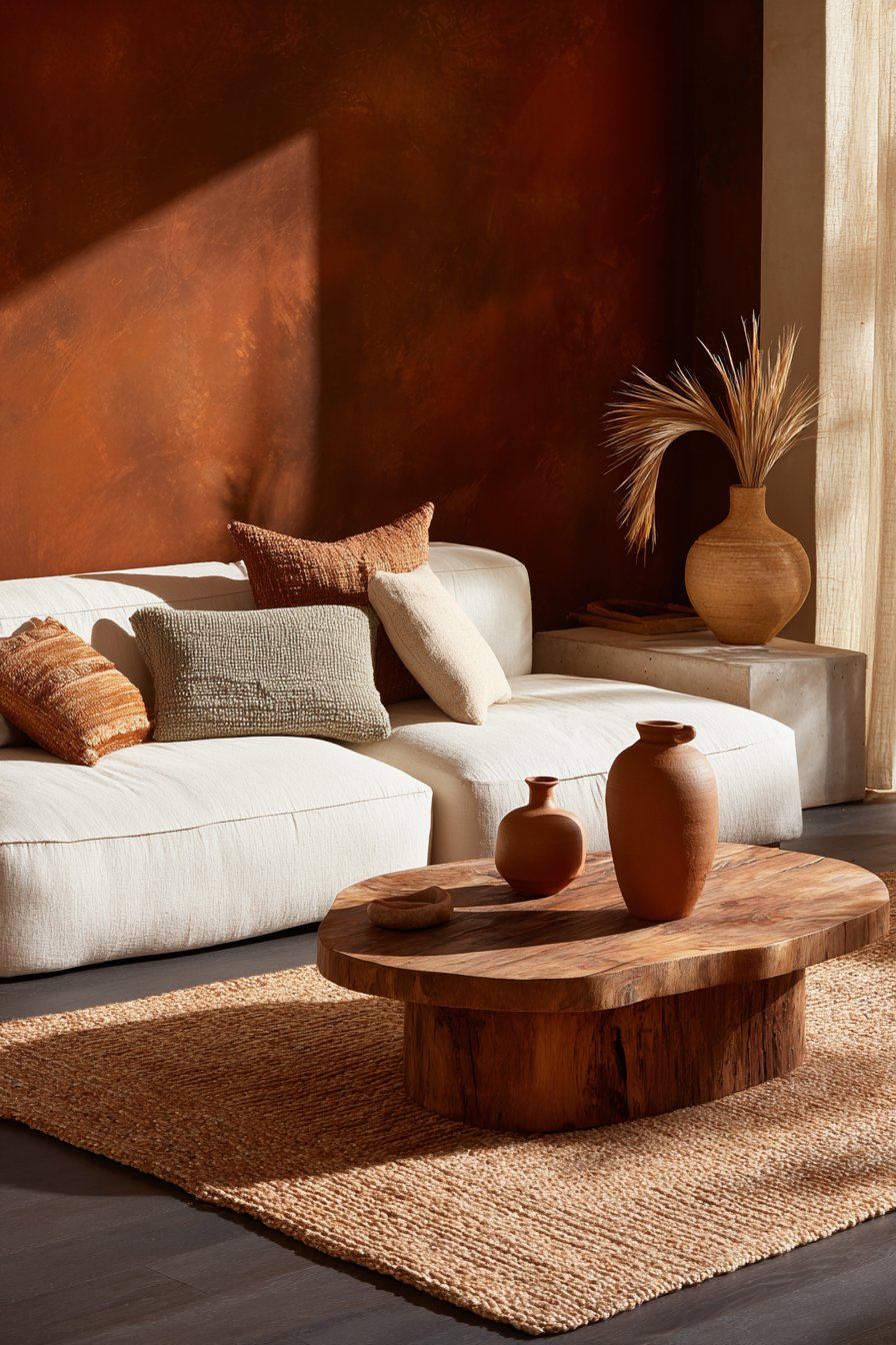
What makes terracotta so compelling is its incredible versatility. It works equally well as a full accent wall or as a subtle presence through textiles, cushions, and ceramics. Interior designers are pairing it with warm whites, dusty pinks, and deep ochres for layered, organic living rooms that feel curated but never overdone. This palette is especially powerful in spaces with good natural light.
The psychological impact of warm earth tones shouldn’t be underestimated. Studies in color psychology suggest that warm oranges and reds promote feelings of comfort, energy, and social connection — all ideal qualities for a living room. In 2026, this trend leans into a muted, chalky version of terracotta rather than anything too bright or saturated.
- Use terracotta on a single feature wall to anchor the room without overwhelming it
- Layer complementary tones like sand, rust, and burnt sienna for depth
- Introduce clay-toned ceramics or woven baskets as accent pieces
- Pair with warm-toned wood furniture for a cohesive, organic aesthetic
- Add cream or ivory soft furnishings to balance the warmth
- Use matte finishes to enhance the chalky, earthy quality of the color
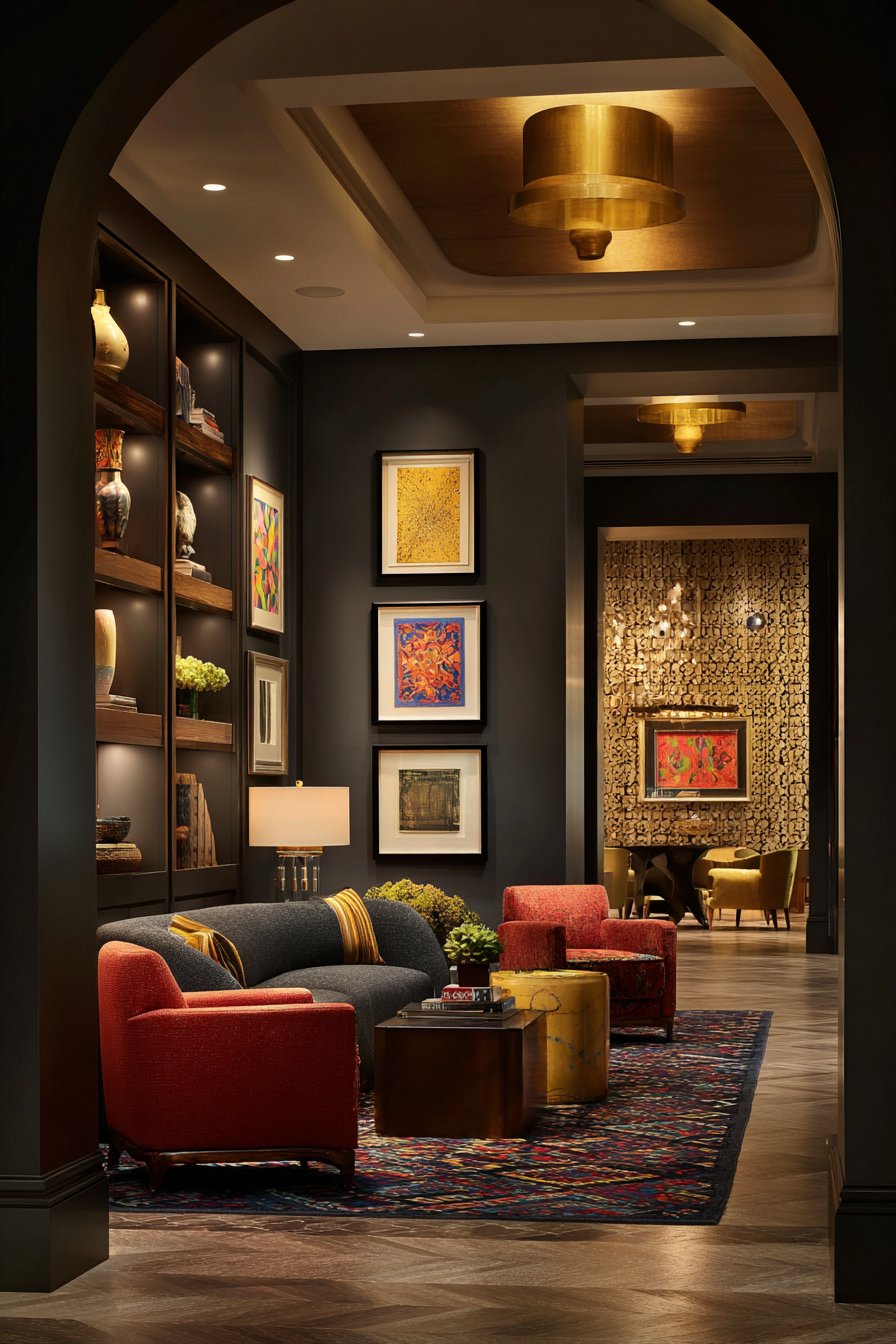
2. Moody Midnight Blue
Midnight blue is having a major moment in 2026, and it’s not hard to see why. This deep, sophisticated hue brings drama, depth, and an almost theatrical quality to living rooms. Far from feeling heavy or oppressive, when used correctly, midnight blue creates a cocooning atmosphere that is both luxurious and deeply restful. It’s a color that makes a room feel intentional and designed.
Designers are using midnight blue in daring ways — full-room immersive applications, lacquered cabinetry, and even painted ceilings. When paired with brass or gold hardware, warm lighting, and plush textiles like velvet and mohair, the result is a living room that feels like a private members’ club. The contrast between the deep blue and metallic accents is visually stunning and immediately elegant.
For those hesitant to commit fully, blue accent walls behind a sofa or fireplace are an approachable entry point. Midnight blue also works remarkably well in smaller living rooms, defying the conventional wisdom that dark colors shrink spaces. The key lies in layering warm light sources strategically to prevent the room from feeling cold or flat.
- Paint a single wall in midnight blue and offset it with warm-toned furniture
- Choose velvet sofas in navy or charcoal for a cohesive, luxurious look
- Add brass or antique gold light fixtures to warm up the dark palette
- Use off-white or cream rugs to create grounding contrast
- Layer multiple light sources — floor lamps, table lamps, and sconces — for warmth
- Introduce botanicals or greenery to add life and freshness to the dark palette
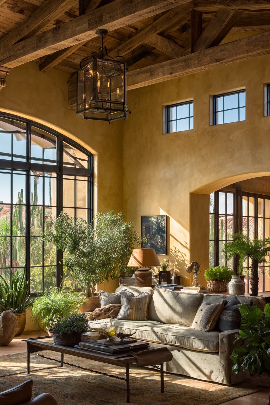
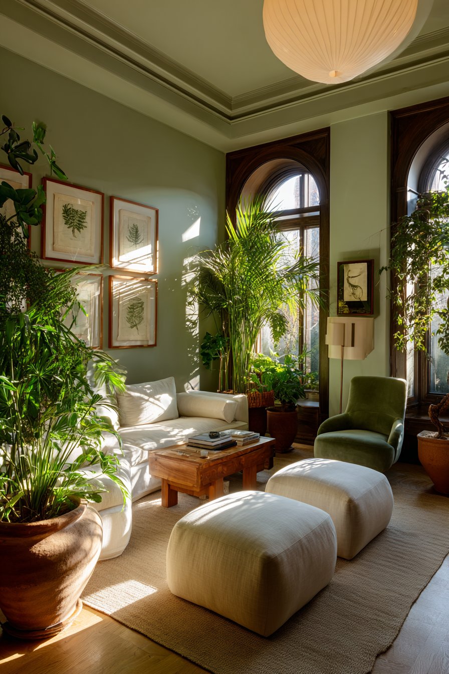
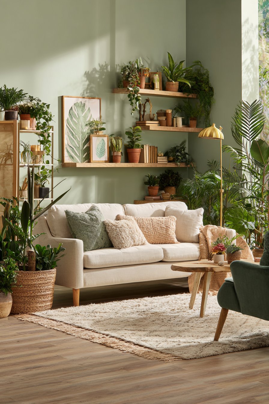
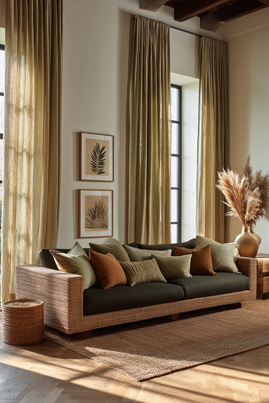
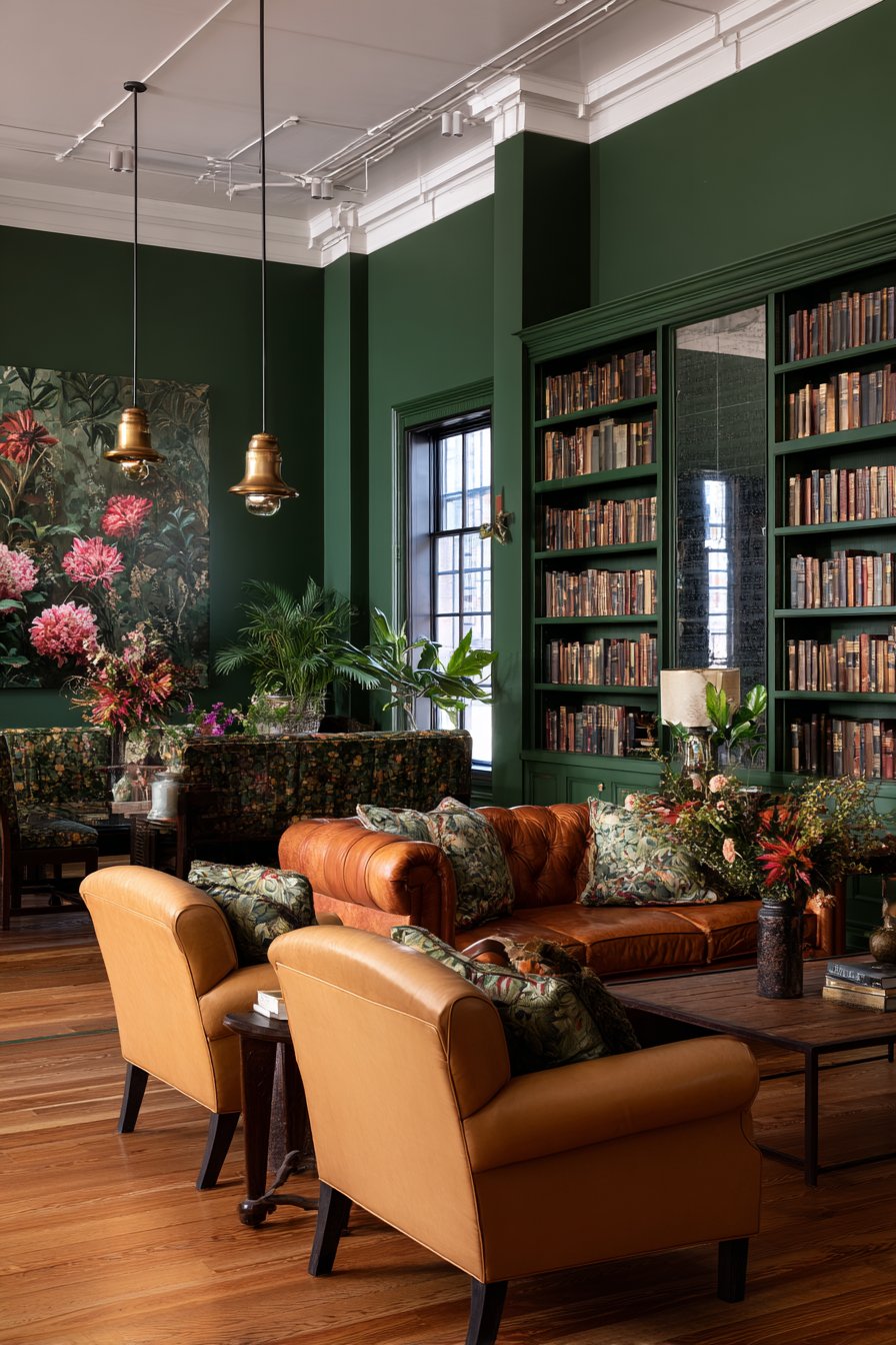
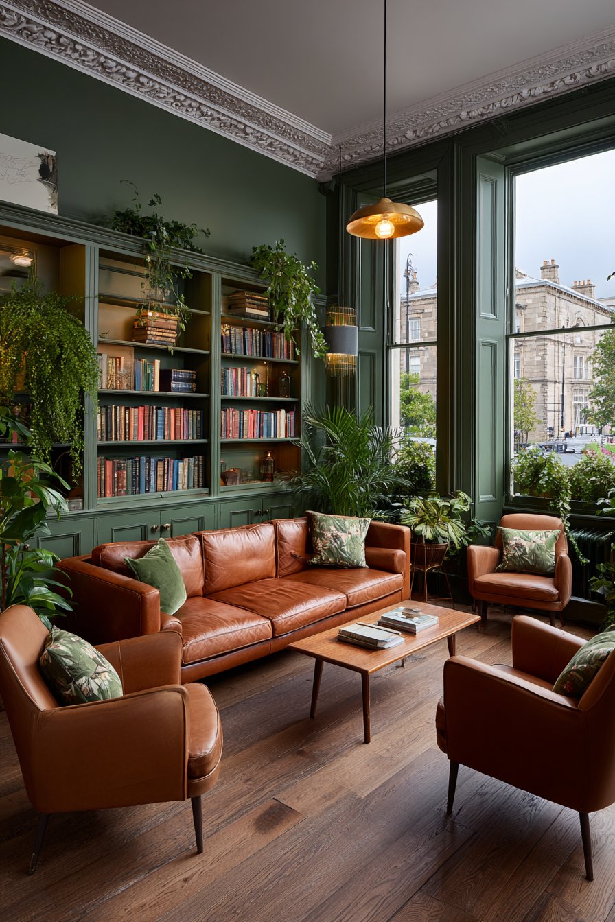
3. Sage Green and Botanical Hues
Sage green continues its reign as one of the most beloved interior colors, but in 2026 it has evolved. This year’s version is deeper, more complex, and botanically inspired. Think forest floors, olive groves, and mossy stones rather than the pale, washed-out sage of previous years. These richer botanical hues feel grounded, sophisticated, and deeply connected to the natural world.
The appeal of green in the living room is multifaceted. Green is the only color that sits in the exact center of the visible spectrum, making it inherently easy on the eye and psychologically restorative. Designers note that green-painted living rooms consistently receive high marks for comfort and relaxation. In 2026, green is being paired with warm neutrals, aged brass, and natural stone for a quietly elevated aesthetic.
What’s exciting about the botanical green palette is its range. From muted sage to deep hunter green to dusty olive, there’s a shade for every lighting condition and room size. Lighter botanical greens work beautifully in north-facing rooms that need warmth, while deeper greens add drama and intimacy to sun-drenched spaces. This flexibility makes the trend genuinely accessible.
- Choose a muted, chalky sage for a soft and restful living room atmosphere
- Pair deeper greens with warm walnut or oak furniture for richness
- Use botanical green on built-in shelving or alcoves for a designer touch
- Layer green tones through cushions, throws, and artwork for cohesion
- Introduce real plants to reinforce the botanical narrative naturally
- Combine with terracotta accents for a warm, earthy color dialogue
4. Soft Greige and Warm Neutrals
Warm greige — the perfect marriage of grey and beige — is the quiet hero of 2026 living room trends. After years of cool grey dominance, homeowners are gravitating toward neutrals with genuine warmth and depth. These tones are neither stark nor flat; they shift beautifully throughout the day as natural light changes, creating living rooms with dynamic, living color.
What separates 2026’s greige from the beige of decades past is its sophistication and intention. Today’s warm neutrals are carefully chosen, often with undertones of blush, caramel, or clay that give them remarkable complexity. They serve as perfect backdrops for statement furniture, art, and layered textiles without ever competing for attention. Interior designers describe them as “the perfect blank canvas with character.”
Greige is also one of the most universally flattering interior colors. It works with almost every other color in the spectrum, making it an ideal choice for those who love to update their accessories seasonally. In 2026, warm greige walls are being paired with creamy upholstery, soft linen drapery, and natural wood tones for living rooms that feel calm, considered, and genuinely inviting.
- Test multiple greige swatches in your specific light conditions before committing
- Look for undertones — choose warm caramel undertones over cool grey undertones
- Pair with off-white trim rather than bright white for a softer overall look
- Layer textures through linen, boucle, and wool to add dimension to neutral spaces
- Use artwork and cushions to inject personality and color into the neutral backdrop
- Consider a slightly deeper greige on the ceiling for a cocooning, enveloping effect
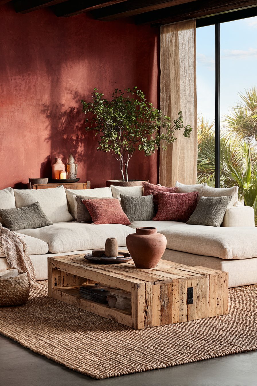
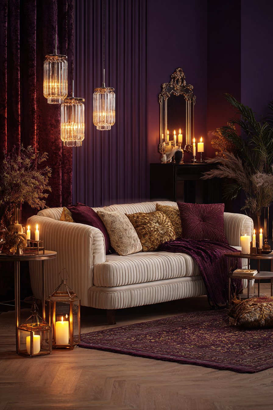
5. Rich Burgundy and Deep Wine
Burgundy is making a powerful comeback in 2026, reclaiming its status as one of the most sophisticated colors in the interior designer’s toolkit. This deep, wine-inspired hue brings a sense of old-world glamour and contemporary confidence to living rooms. It commands attention without being aggressive, offering warmth and drama in equal measure. Designers describe it as the grown-up alternative to red.
The key to using burgundy successfully lies in understanding its tonal range. From deep plum-influenced wines to warm brick-toned clarets, each variation creates a different mood. Burgundy works particularly well in living rooms with period features like cornicing, fireplaces, or high ceilings, where it enhances the architectural quality of the space. In more contemporary rooms, it acts as a bold, unexpected punctuation point.
In 2026, burgundy is most effective when paired with natural materials — warm wood, leather, aged brass, and woven textiles. The combination prevents the color from feeling heavy and adds organic texture that keeps the space feeling lived-in and authentic. Soft blush and cream tones alongside burgundy create a beautifully balanced, romantically sophisticated palette that’s gaining significant traction.
- Use burgundy on one statement wall and keep remaining walls in cream or blush
- Introduce burgundy through a velvet sofa or armchair as a bold anchor piece
- Pair with aged brass lamp bases and warm-toned wood side tables
- Add cream or ivory cushions to prevent the space from feeling too heavy
- Use deep wine tones in artwork or rugs to echo the wall color subtly
- Layer with soft candlelight in the evenings to enhance the warm, intimate quality
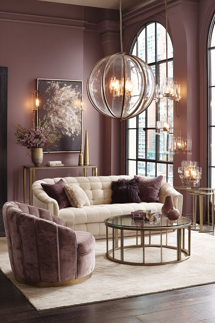
6. Dusty Lavender and Soft Mauves
Dusty lavender is one of 2026’s most surprising living room color stories. Long considered a bedroom color, muted purple tones are now making a sophisticated entrance into living spaces. These are not bright, childlike purples — they are grown-up, complex hues that hover between grey, pink, and blue, creating an atmosphere of quiet elegance and gentle creativity.
The psychology behind lavender and mauve is compelling. These tones promote relaxation and creativity simultaneously, making them ideal for living rooms used for both unwinding and working from home. Dusty mauves in particular carry a nostalgic, vintage quality that pairs beautifully with mid-century modern furniture, organic ceramics, and warm lighting. The effect is atmospheric, personal, and quietly trend-setting.
Interior designers are currently pairing dusty lavender with warm whites, natural linen, and eucalyptus greens for living rooms that feel effortlessly poetic. The trend works especially well in spaces with curved furniture, arched mirrors, and layered soft lighting. It’s a palette that rewards careful styling and rewards those willing to move beyond the expected.
- Choose a dusty, grey-toned lavender rather than a bright or cool purple
- Pair with warm white walls and natural linen curtains for balance
- Introduce warm-toned wood furniture to prevent the palette from feeling cold
- Layer soft mauve through cushions, throws, and small accent rugs
- Use arched or rounded mirror frames to complement the soft, romantic aesthetic
- Add eucalyptus or sage green accents for a fresh, organic counterbalance
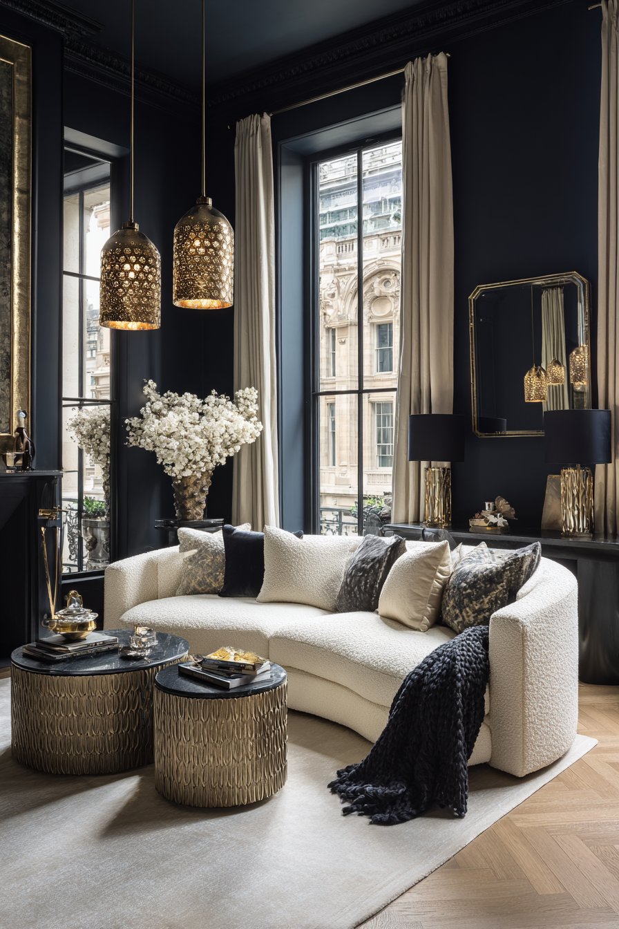
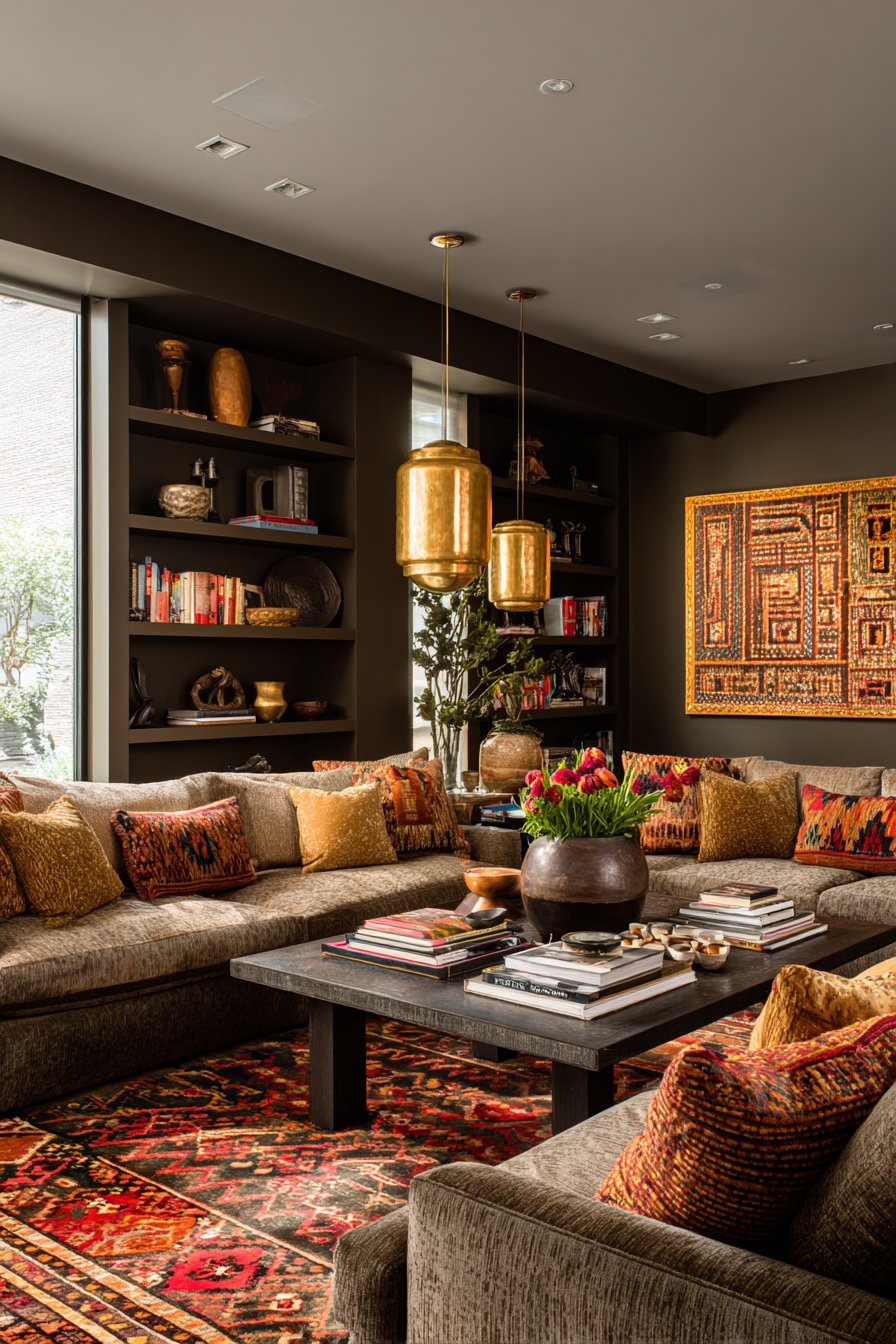
7. Charcoal and Off-Black
Charcoal and off-black are no longer reserved for the most daring of homeowners. In 2026, these deep, dramatic shades have become increasingly mainstream — and designers are celebrating that shift. Used thoughtfully, near-black tones create living rooms of extraordinary visual sophistication, drawing the eye inward and making every object within the space feel more precious and considered.
The secret to making charcoal work in a living room is lighting strategy. Without careful layering of warm light sources, dark rooms can feel flat and uninviting. But with the right combination of table lamps, floor lamps, wall sconces, and candlelight, charcoal walls become deeply atmospheric and endlessly beautiful. The color amplifies warm light in a way that lighter walls simply cannot match.
Off-black and charcoal are among the most versatile backdrop colors for art and decorative objects. Paintings, sculptures, plants, and textiles all pop against a dark background in a way that feels gallery-like and intentional. In 2026, the trend pairs charcoal walls with warm natural wood, cream boucle upholstery, and abundant greenery for a look that is bold but never cold.
- Commit to warm-toned artificial lighting — avoid cool white bulbs entirely
- Use charcoal on all four walls for a fully immersive, dramatic living room
- Introduce cream, ivory, or natural white upholstery as essential contrast
- Add abundant indoor plants to bring life and organic freshness to the dark palette
- Choose warm wood tones for flooring and furniture over cool grey or black
- Use metallic accents in aged brass or copper to reflect light beautifully
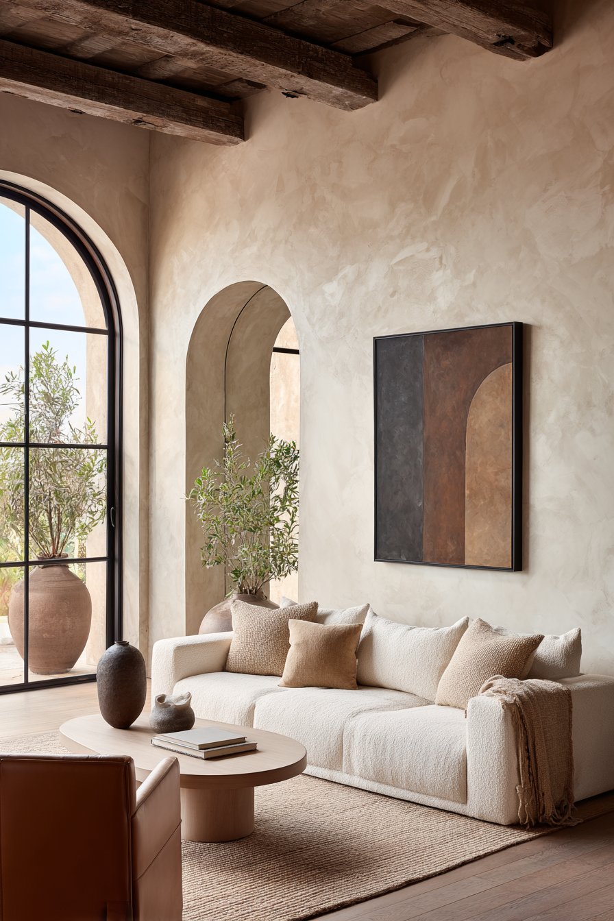
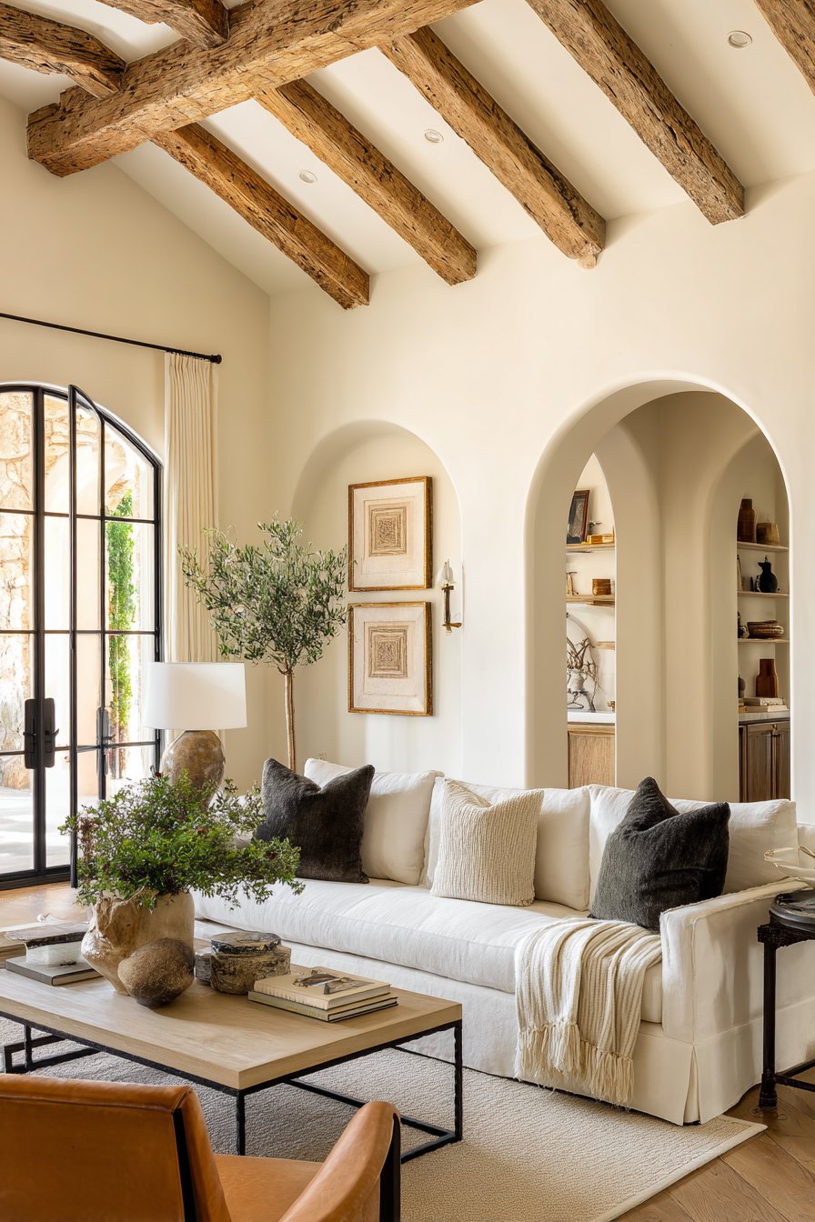
8. Warm White and Creamy Ivory
Warm white is experiencing a renaissance in 2026, but this is white with an entirely new attitude. Gone are the cold, clinical whites of the 2010s. Today’s white trend celebrates creamy, buttery, ivory-toned whites that feel genuinely warm and inviting. These are whites with personality — soft yellows, peachy blushes, and gentle caramel undertones that shift beautifully with the light throughout the day.
The beauty of warm white as a living room color lies in its ability to breathe. It opens up space, maximizes the effect of natural light, and creates a backdrop that is simultaneously calming and full of potential. In 2026, designers are pairing warm whites with layered textures — boucle sofas, woven rugs, linen curtains, and raw timber — to prevent the palette from feeling flat or sterile. The result is living rooms that feel genuinely luxurious.
Tonal layering is the key technique that elevates warm white beyond the ordinary. By using two or three slightly different white and ivory tones across walls, trim, and ceiling, designers create spaces with subtle depth and visual richness. This technique, combined with considered material choices and warm lighting, produces living rooms that feel both expansive and cocooning — a remarkable combination.
- Choose whites with warm yellow or peachy undertones rather than cool blue or grey
- Use the same warm white family across walls, ceiling, and trim for tonal layering
- Invest in high-quality textures — boucle, linen, and natural weaves — for visual interest
- Warm the space with amber-toned lighting and candles in the evenings
- Use natural materials like raw wood, rattan, and stone to add organic warmth
- Introduce one or two bold accent colors through artwork or cushions for personality
Conclusion
The living room color trends dominating 2026 reflect a broader cultural shift toward warmth, depth, and intentionality. Whether you’re drawn to the earthy richness of terracotta, the dramatic sophistication of midnight blue, or the quiet elegance of dusty lavender, this year’s palette offers something genuinely meaningful for every home and personality. These are colors chosen with purpose — each one designed to make the living room feel more alive, more personal, and more beautiful.
The most important thing to remember is that color is deeply personal. Trends provide inspiration and permission to experiment, but the colors you live with daily should ultimately reflect who you are. Use these trends as a starting point, trust your instincts, and don’t be afraid to layer, experiment, and evolve. Your living room is your canvas — and 2026 has given you a truly extraordinary palette to work with.