Your bedroom is more than just a place to sleep. It’s your personal sanctuary where you begin and end each day. The colors you choose for this intimate space can profoundly impact your mood, sleep quality, and overall well-being. Whether you lean toward calming neutrals or vibrant bold hues, understanding the psychology and practical implications of your color choices is essential for creating a bedroom that truly feels like home.
Selecting the perfect color scheme isn’t simply about following trends. It’s about understanding how different shades interact with natural light, affect perceived room size, and complement your existing furniture. Both neutral and bold approaches offer distinct advantages, and the right choice depends on your personality, lifestyle, and design goals. This comprehensive guide will explore the nuances of each approach, helping you make an informed decision that transforms your bedroom into the retreat you deserve.
From understanding color psychology to mastering accent techniques, we’ll cover everything you need to know. Whether you’re planning a complete renovation or a simple refresh, these insights will empower you to create a bedroom that reflects your unique style while supporting restful sleep and relaxation.
1. The Psychology Behind Neutral Bedroom Colors
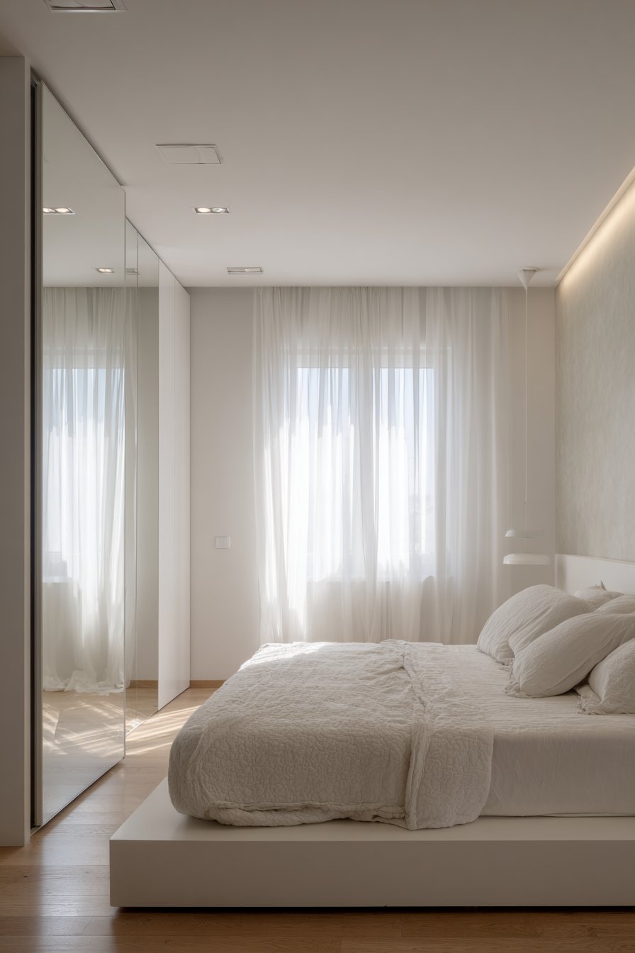
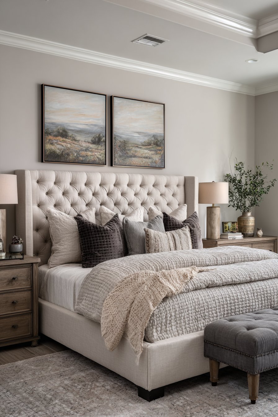
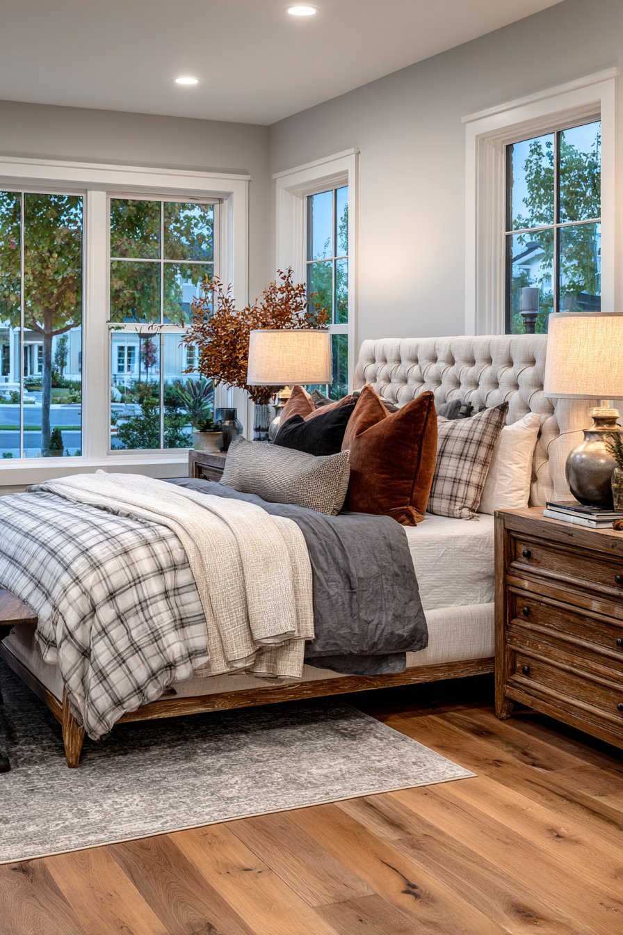
Neutral color schemes have dominated interior design for decades, and for good reason. These timeless palettes create a sense of calm and serenity that’s particularly valuable in bedroom spaces. Colors like beige, gray, white, and taupe act as visual anchors, reducing mental stimulation and promoting relaxation. Research shows that neutral environments can actually lower stress levels and improve sleep quality.
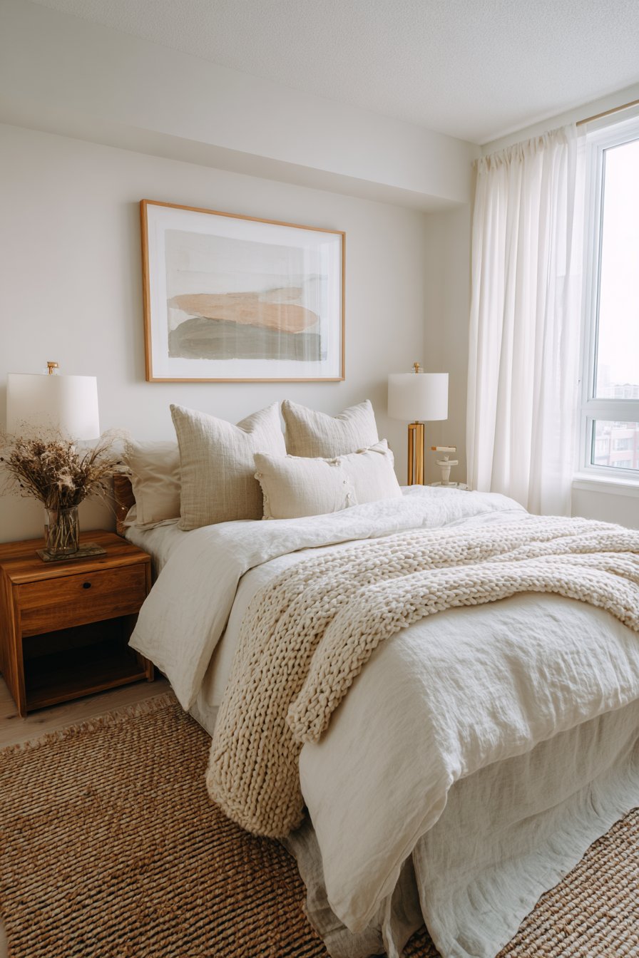
The versatility of neutral colors extends beyond their calming effects. They provide an excellent foundation for layering textures, patterns, and accessories without creating visual chaos. A neutral bedroom allows you to experiment with statement furniture pieces or artwork without worrying about color clashes. This flexibility means you can refresh your space seasonally by simply swapping textiles and decorative elements.
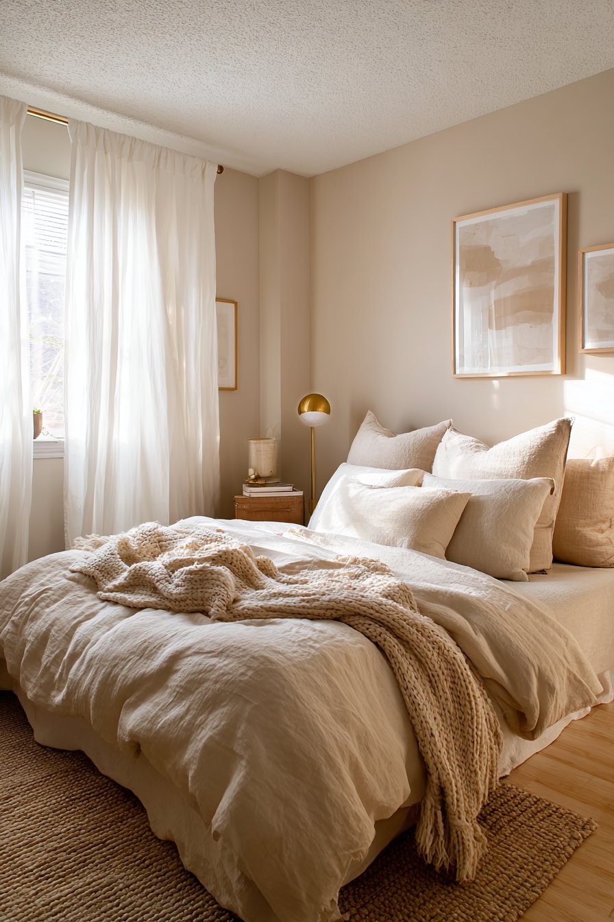
Neutral doesn’t mean boring or lifeless. The key is creating depth through varied tones and textures. Combine warm creams with cool grays, or layer different shades of white for sophisticated dimension. Adding natural materials like linen, wool, and wood introduces organic warmth that prevents the space from feeling sterile.
- Choose at least three different neutral shades to create visual interest
- Layer textures through bedding, curtains, and rugs for depth
- Incorporate natural wood tones to add warmth to cool neutrals
- Use matte and glossy finishes strategically to catch light differently
- Consider undertones carefully to ensure cohesive color harmony
- Add metallic accents in brass or bronze for subtle sophistication
2. The Power and Energy of Bold Color Choices
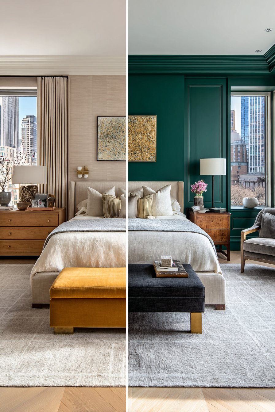
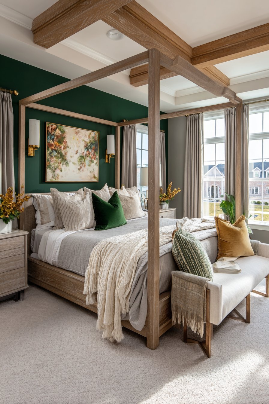
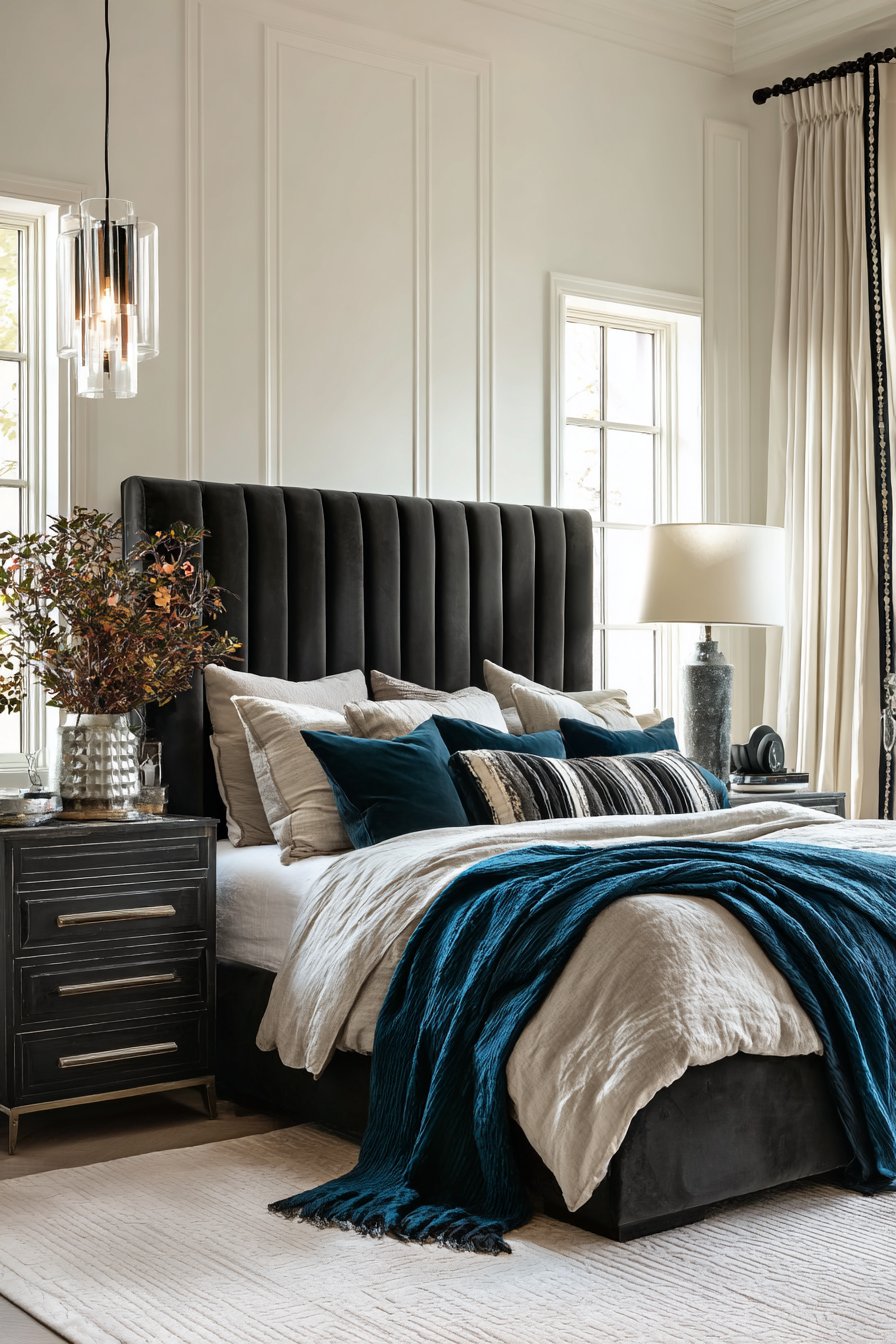
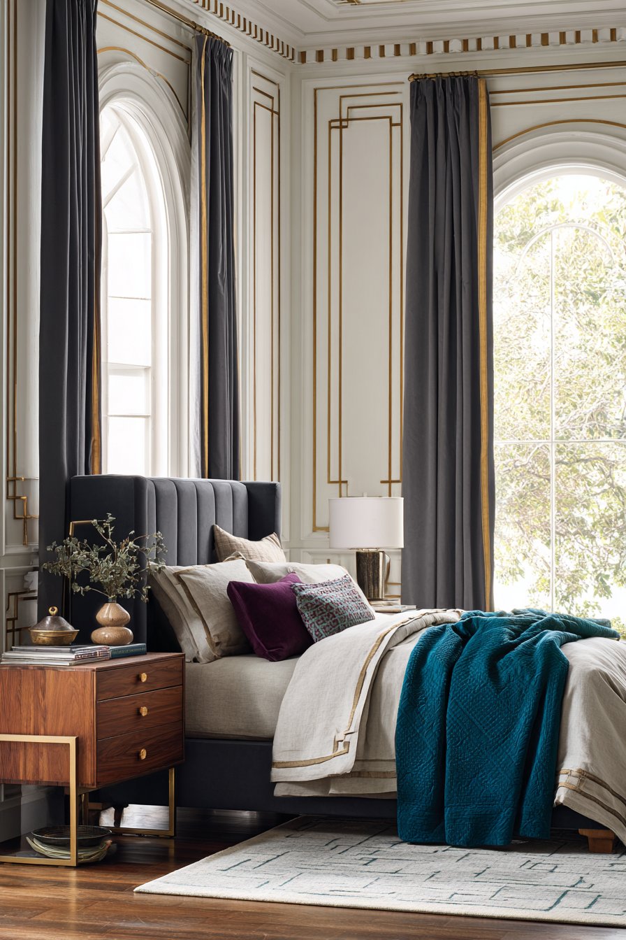
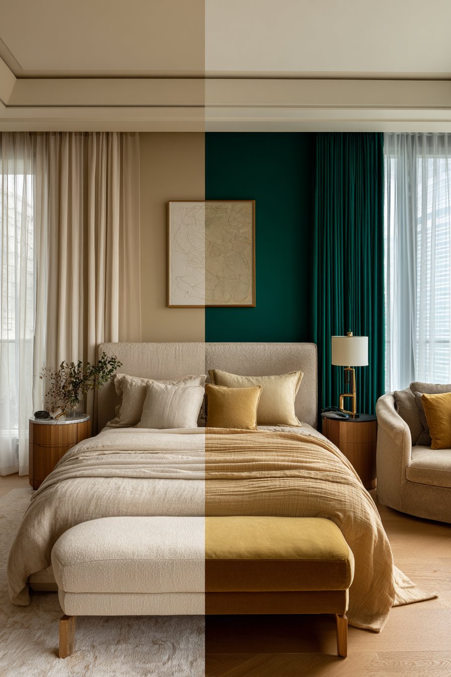
Bold bedroom colors make a powerful statement and reflect confident personal style. Deep blues, rich emeralds, dramatic charcoals, and vibrant terracottas can transform an ordinary bedroom into an extraordinary retreat. These saturated hues create immersive environments that showcase your personality and design courage. When executed properly, bold colors add drama and sophistication that neutral schemes simply cannot achieve.
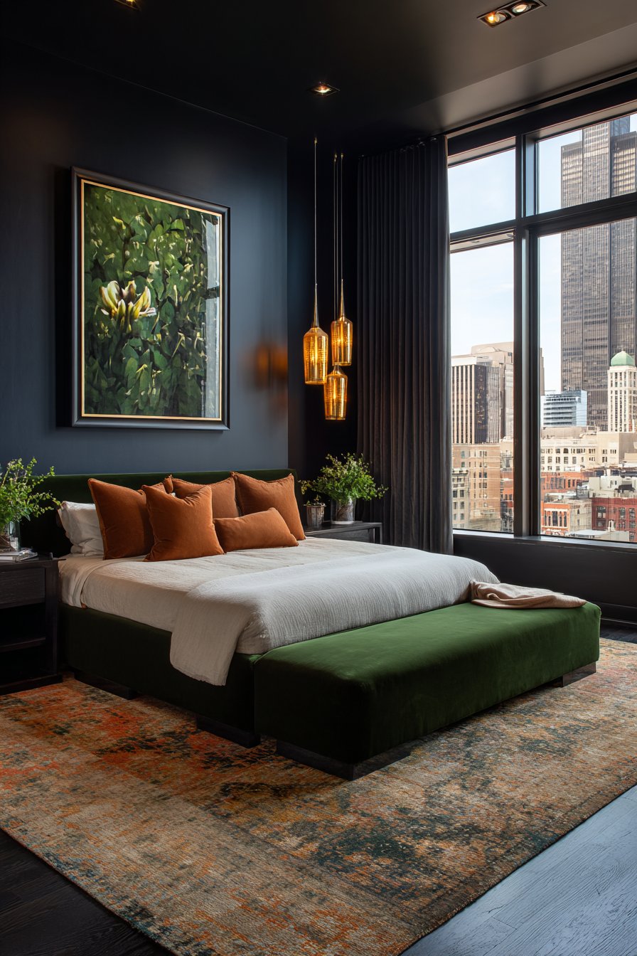
Contrary to popular belief, bold colors don’t necessarily disrupt sleep. Colors like navy blue and forest green actually promote relaxation due to their associations with nature and night. The key is selecting bold colors with calming undertones rather than highly stimulating shades. Rich jewel tones create cocoon-like atmospheres that feel both luxurious and restful.
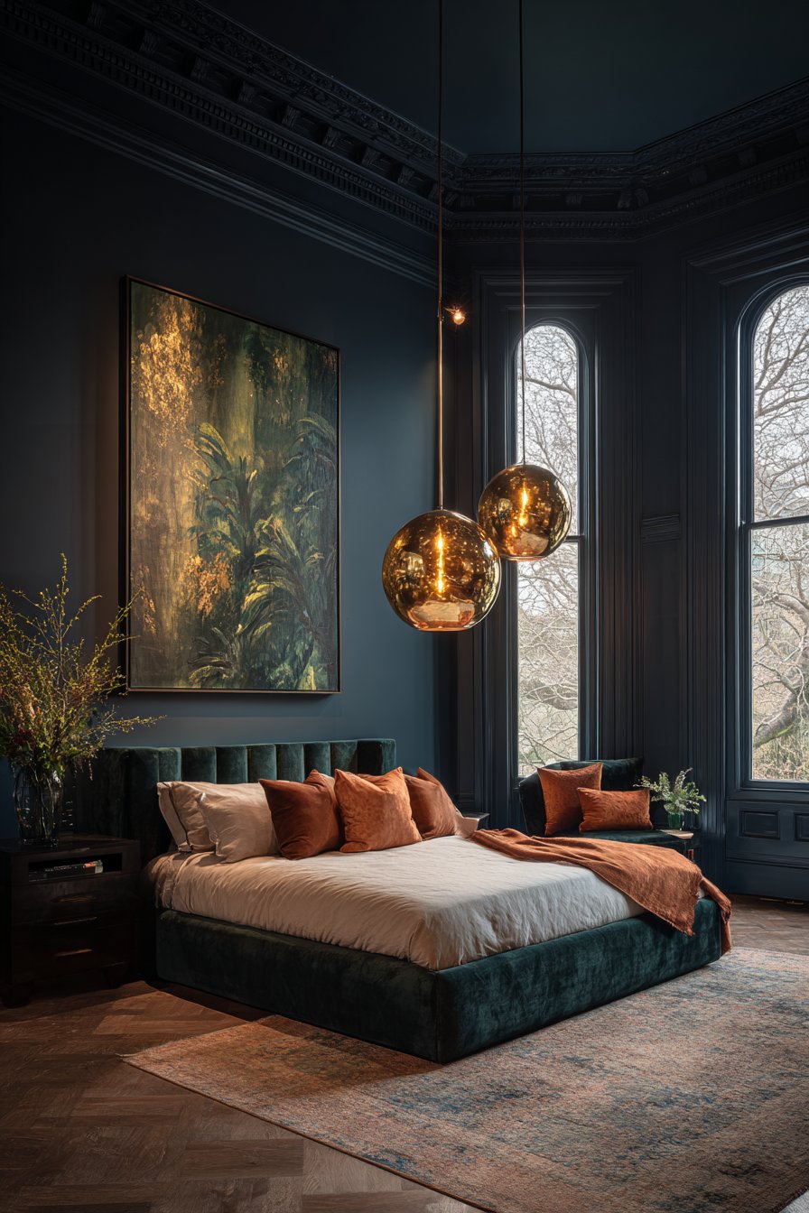
Bold color schemes demand commitment and careful planning. They work best in bedrooms with ample natural light, as darkness can make saturated colors feel oppressive. Consider your room’s orientation and how light changes throughout the day. Bold walls can also make small rooms feel smaller, so balance is crucial in compact spaces.
- Test paint samples in your actual bedroom lighting conditions
- Use bold colors on a single accent wall if full-room commitment feels overwhelming
- Pair bold walls with neutral bedding to prevent visual overload
- Ensure adequate lighting with layered sources throughout the room
- Consider removable wallpaper for bold patterns without permanent commitment
- Balance saturated walls with light-colored furniture and accessories
3. Creating Balance with the 60-30-10 Rule
Professional designers rely on the 60-30-10 rule to create harmonious color schemes. This principle suggests using your dominant color for 60% of the room, a secondary color for 30%, and an accent color for the remaining 10%. This formula works whether you’re designing with neutrals, bold colors, or a combination of both approaches.
In neutral bedrooms, your walls typically comprise the 60%, with furniture and larger textiles making up the 30%. The final 10% includes accent pillows, artwork, and decorative objects that add personality. For bold schemes, you might paint walls your statement color (60%), use neutral bedding and curtains (30%), and incorporate complementary accent colors (10%) through accessories.
This rule prevents any single color from overwhelming the space while ensuring sufficient variety to maintain visual interest. It creates a natural visual hierarchy that guides the eye comfortably around the room. Even in minimalist or monochromatic schemes, you can apply this principle using different shades and saturations of the same color family.
- Map out your color distribution before purchasing paint or furnishings
- Use painter’s tape to visualize how much wall space each color will occupy
- Remember that darker colors appear more dominant than lighter ones
- Include flooring and ceiling colors in your calculations for accuracy
- Adjust percentages slightly based on personal preference while maintaining balance
- Photograph your space to see if color distribution feels harmonious
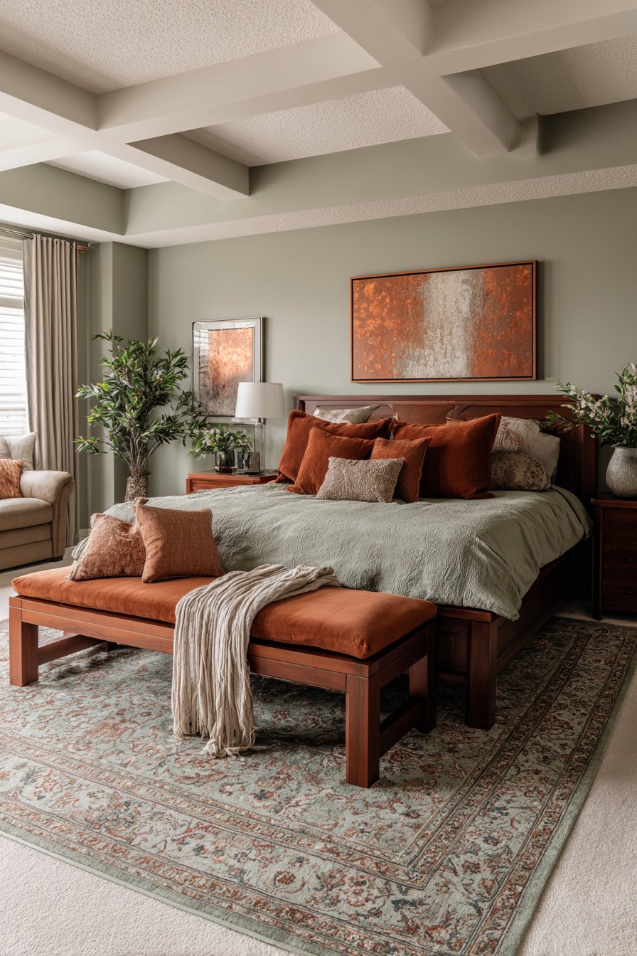
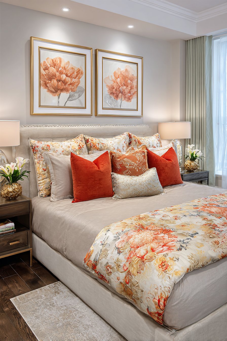
4. Mixing Neutral and Bold for Best of Both Worlds
You don’t have to choose exclusively between neutral and bold approaches. The most sophisticated bedrooms often blend both strategies for dynamic yet balanced results. This hybrid approach allows you to enjoy the calm foundation of neutrals while expressing personality through strategic bold accents. It’s an ideal solution for those who appreciate both aesthetics.
Start with neutral walls as your canvas, then introduce bold colors through furniture, bedding, or a statement headboard. Alternatively, paint one wall a dramatic color while keeping remaining walls neutral. This creates a focal point without overwhelming the space. You can adjust the neutral-to-bold ratio based on your comfort level and design confidence.
This mixed approach also offers practical advantages. If you tire of your bold choices, you can easily swap accent pieces without repainting entire rooms. It allows you to experiment with trending colors through accessories while maintaining a timeless neutral foundation. This strategy is particularly smart for rental properties where permanent changes aren’t allowed.
- Introduce bold colors through easily changeable elements like throw pillows
- Use a bold upholstered headboard against neutral walls for impact
- Layer neutral bedding with bold accent blankets for flexibility
- Install neutral curtains but add bold tiebacks or trim
- Choose neutral primary furniture but bold nightstands or chairs
- Rotate seasonal accessories to shift between more neutral or bold looks
5. Considering Room Size and Natural Light
Your bedroom’s physical characteristics should significantly influence your color decisions. Room dimensions and light exposure dramatically affect how colors appear and feel. Small bedrooms benefit from lighter, neutral colors that reflect light and create an illusion of spaciousness. Dark, bold colors can make compact rooms feel cave-like, though this effect works well if you’re intentionally creating a cozy atmosphere.
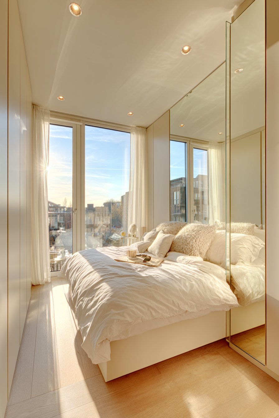
Natural light quality varies based on your room’s orientation. North-facing bedrooms receive cooler, indirect light that can make colors appear more muted. These spaces often benefit from warm neutrals or rich bold colors that compensate for limited brightness. South-facing rooms enjoy abundant warm light, giving you freedom to use cooler neutrals or almost any bold color successfully.
Artificial lighting also plays a crucial role in color perception. Incandescent bulbs cast warm yellow tones, while LED lights can be cool or warm depending on their temperature rating. Always test paint samples under both natural and artificial light at different times of day before committing to your final choice.
- Photograph paint samples at morning, afternoon, and evening to see variations
- Use lighter shades on walls if your room receives minimal natural light
- Paint sample boards that you can move around the room rather than directly on walls
- Consider how window treatments will affect light and color appearance
- Install dimmer switches to adjust artificial light intensity and color impact
- Remember that glossy finishes reflect more light than matte or eggshell
6. Long-Term Satisfaction and Flexibility Considerations
Color trends come and go, but repainting a bedroom requires significant time and investment. Consider which approach offers better longevity for your lifestyle and budget. Neutral schemes typically have greater staying power and remain stylish through changing trends. They also appeal to broader audiences, which matters if you plan to sell your home within a few years.
Bold colors make stronger style statements but may require more frequent updates. What feels exciting today might become tiresome after several years of daily exposure. That said, if bold colors genuinely reflect your personality, they’ll likely bring lasting satisfaction. The key is choosing colors you truly love rather than trendy shades that simply feel current.
Think about your commitment level before deciding. If you enjoy regularly refreshing your space, bold colors provide dramatic transformation opportunities. If you prefer stability and subtle evolution, neutrals offer a peaceful backdrop that ages gracefully. Consider your lifestyle, budget, and how often you realistically want to redecorate.
- Invest in high-quality neutral paint that won’t need frequent touch-ups
- Choose classic bold colors like navy or emerald rather than trendy shades
- Consider your five-year plan for the space before committing to bold walls
- Budget for future repainting if choosing bold colors you might tire of
- Select neutral furniture pieces that work with multiple color schemes
- Keep paint information and touch-up paint for easy maintenance over time
Choosing between neutral and bold bedroom color schemes isn’t about right or wrong decisions. It’s about understanding your personal needs, room characteristics, and design goals. Both approaches offer unique benefits that can transform your bedroom into a space that truly supports your well-being.
Remember that your bedroom should reflect your personality while promoting rest and relaxation. Whether you choose calming neutrals, dramatic bolds, or a sophisticated blend, the most successful color scheme is one that makes you feel completely at home. Trust your instincts, test thoroughly before committing, and don’t be afraid to experiment until you discover the perfect palette for your personal sanctuary.