Olive green has emerged as one of the most sophisticated and versatile colors in contemporary interior design. This earthy, muted shade brings natural warmth and elegance to any space while maintaining a sense of calm sophistication. Unlike brighter greens that can feel overwhelming, olive green offers a grounded aesthetic that works beautifully across various design styles.
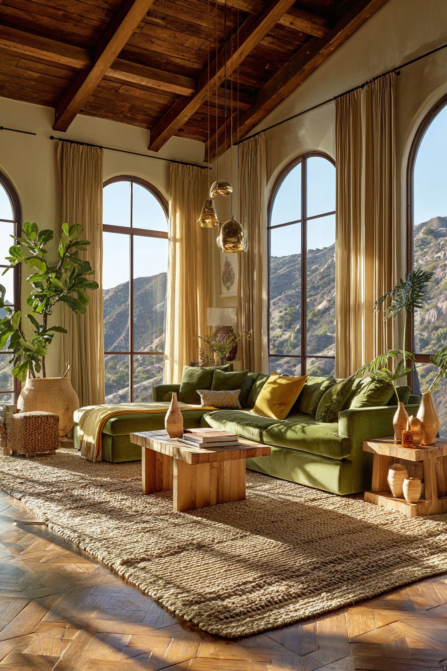
Thoughtful interior design goes beyond simply selecting attractive colors—it requires understanding how different hues interact with lighting, existing furnishings, and architectural elements. The right color choices create functional and inspiring spaces that reflect your personality while enhancing daily living. Olive green presents unique opportunities and challenges that deserve careful consideration before committing to this trend.

This article explores essential factors to evaluate when incorporating olive green into your home decor. From understanding undertones to considering room lighting, we’ll cover everything you need to make informed decisions. Whether you’re planning a complete room makeover or adding subtle accents, these insights will help you achieve a cohesive, beautiful result.
1. Understanding Olive Green’s Undertones
Olive green isn’t a single shade—it exists on a spectrum with varying undertones that dramatically affect its appearance. Some olive greens lean toward yellow-brown bases, creating warmer, earthier vibes perfect for cozy spaces. Others contain gray undertones that produce cooler, more contemporary aesthetics suitable for modern interiors.
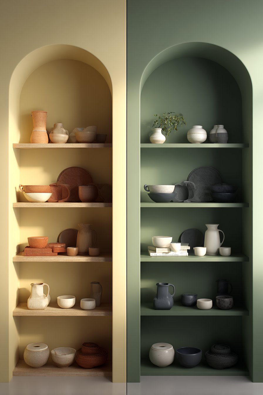
The undertones in your olive green choice will determine compatibility with existing colors in your space. Warm olive greens pair beautifully with terracotta, rust, and cream tones, while cooler variations complement navy, charcoal, and crisp white. Testing paint samples in your actual room reveals how natural and artificial light affects these subtle color variations throughout the day.
Understanding these nuances prevents costly mistakes and ensures your olive green selections harmonize with your overall design vision. The wrong undertone can clash with flooring, create unwanted color casts, or make spaces feel smaller than they are.
- Purchase multiple olive green samples and observe them at different times of day
- Compare samples against existing furniture, flooring, and fixed elements
- Consider how undertones shift under warm incandescent versus cool LED lighting
- Test samples on different walls to see how natural light direction affects appearance
- Take photos of samples in various lighting to review undertone consistency
- Consult color wheels to identify complementary and analogous color relationships
2. Evaluating Your Room’s Natural Lighting
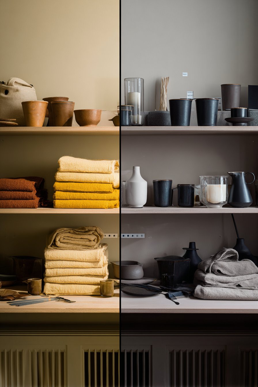
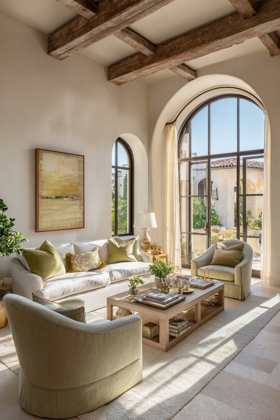
Natural lighting dramatically transforms how olive green appears in your space, making this consideration absolutely critical. Rooms with abundant southern light intensify olive green’s yellow undertones, creating warmer, more vibrant appearances. North-facing rooms receive cooler light that can make olive green appear more subdued and grayish.

The amount of natural light also affects whether olive green feels inviting or oppressive. In dimly lit spaces, darker olive shades can make rooms feel smaller and cave-like. Conversely, lighter olive tones in bright rooms create fresh, airy atmospheres that feel connected to nature.
Window size, orientation, and surrounding landscape all influence how olive green performs in your space. Trees outside windows cast green-tinted light that can either enhance or muddy olive green walls. Understanding these dynamics helps you select the perfect shade intensity for your specific lighting conditions.
- Map your room’s natural light patterns throughout the day before selecting shades
- Choose lighter olive tones for rooms with limited natural light
- Consider deeper, richer olives for spaces with abundant sunshine
- Account for seasonal lighting changes, especially in rooms with deciduous trees outside
- Use sheer window treatments to maximize natural light with darker olive choices
- Test samples on the wall that receives the most natural light exposure
3. Assessing Existing Furniture and Fixtures
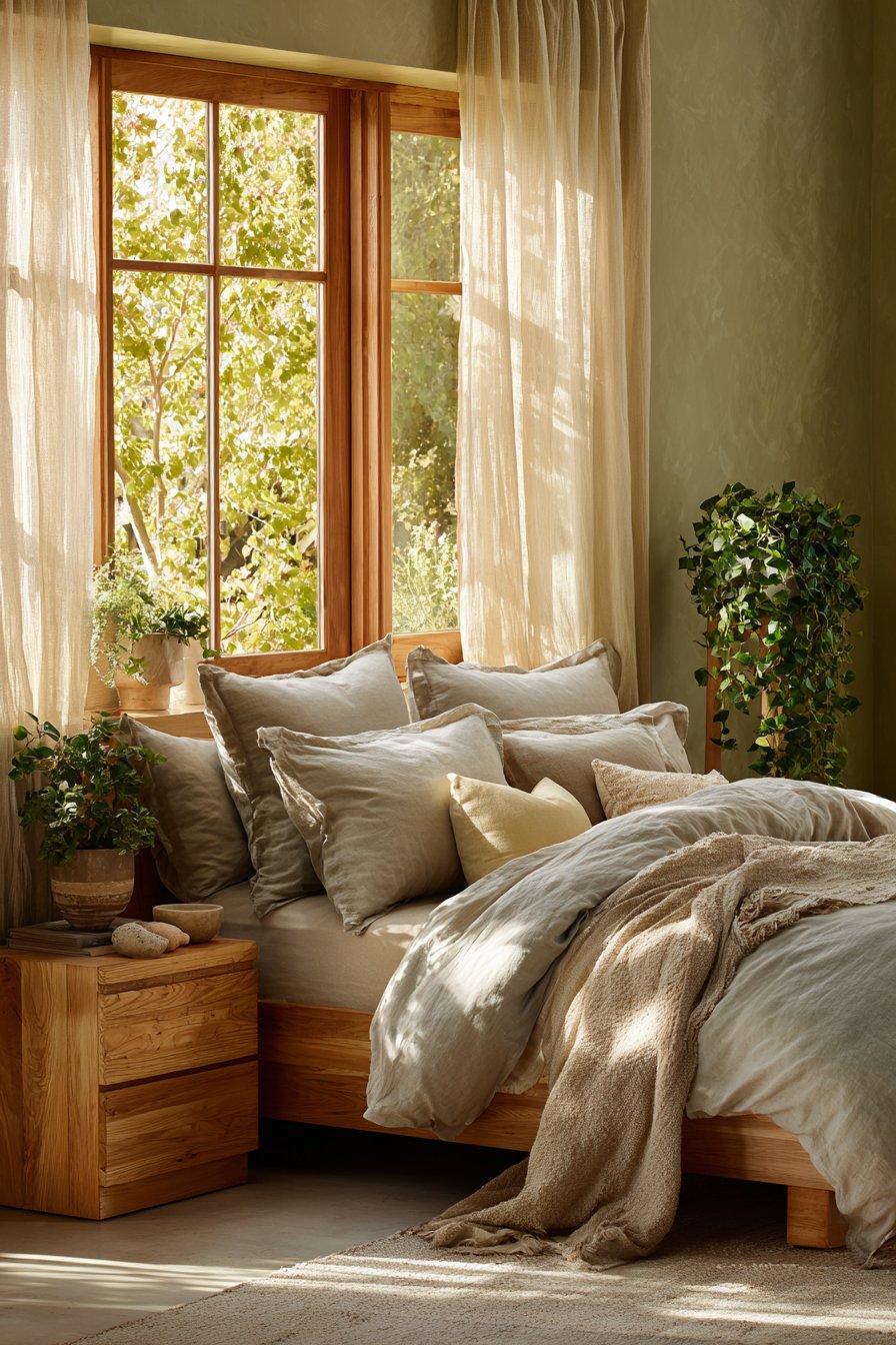
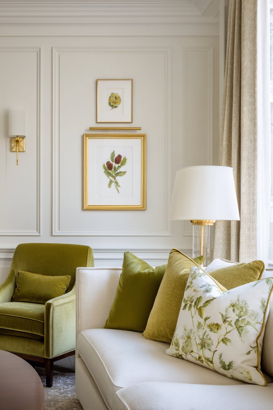
Your current furniture pieces, flooring, and permanent fixtures significantly impact how well olive green integrates into your space. Wood furniture with warm honey or orange tones pairs naturally with yellow-based olive greens, creating cohesive, organic palettes. Cool-toned gray or black furniture demands gray-based olive shades for harmonious combinations.

Metal finishes in your space also influence olive green compatibility. Brass, gold, and copper fixtures create luxurious pairings with warm olive tones, evoking vintage sophistication. Chrome, nickel, and matte black metals complement cooler olive variations, producing modern, streamlined aesthetics.
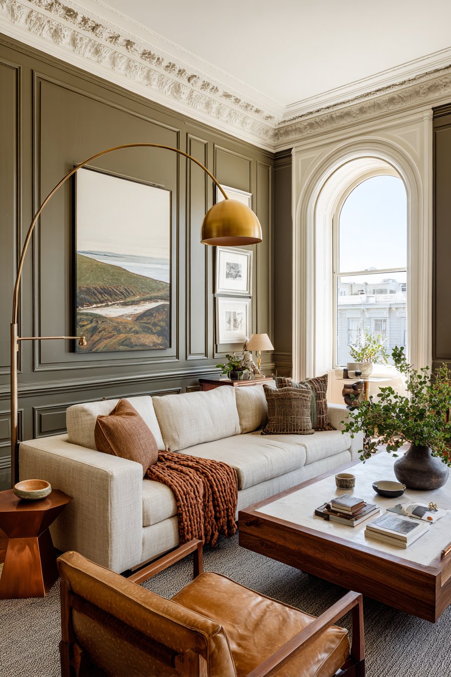
Flooring deserves particular attention since it’s typically expensive to replace. Light oak or bamboo floors work beautifully with various olive shades, while dark walnut flooring requires careful balance to avoid overwhelming darkness. Consider how your olive choices will transition between rooms for visual flow throughout your home.
- Photograph your existing furniture and use digital tools to preview olive combinations
- Collect fabric swatches from upholstery to compare against olive paint samples
- Inventory metal finishes throughout the room for consistent coordination
- Consider whether you’re willing to change accessories to accommodate olive green
- Evaluate whether existing statement pieces will complement or compete with olive tones
- Plan which furniture pieces might need updating for cohesive design harmony
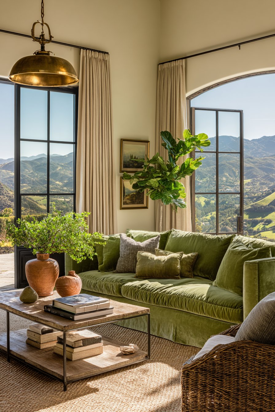
4. Determining the Right Saturation Level
Saturation refers to color intensity—how vivid or muted your olive green appears. Highly saturated olive greens make bold statements and work well as accent walls or in spaces where you want drama. Low saturation creates subtle, sophisticated backgrounds that let other design elements shine.
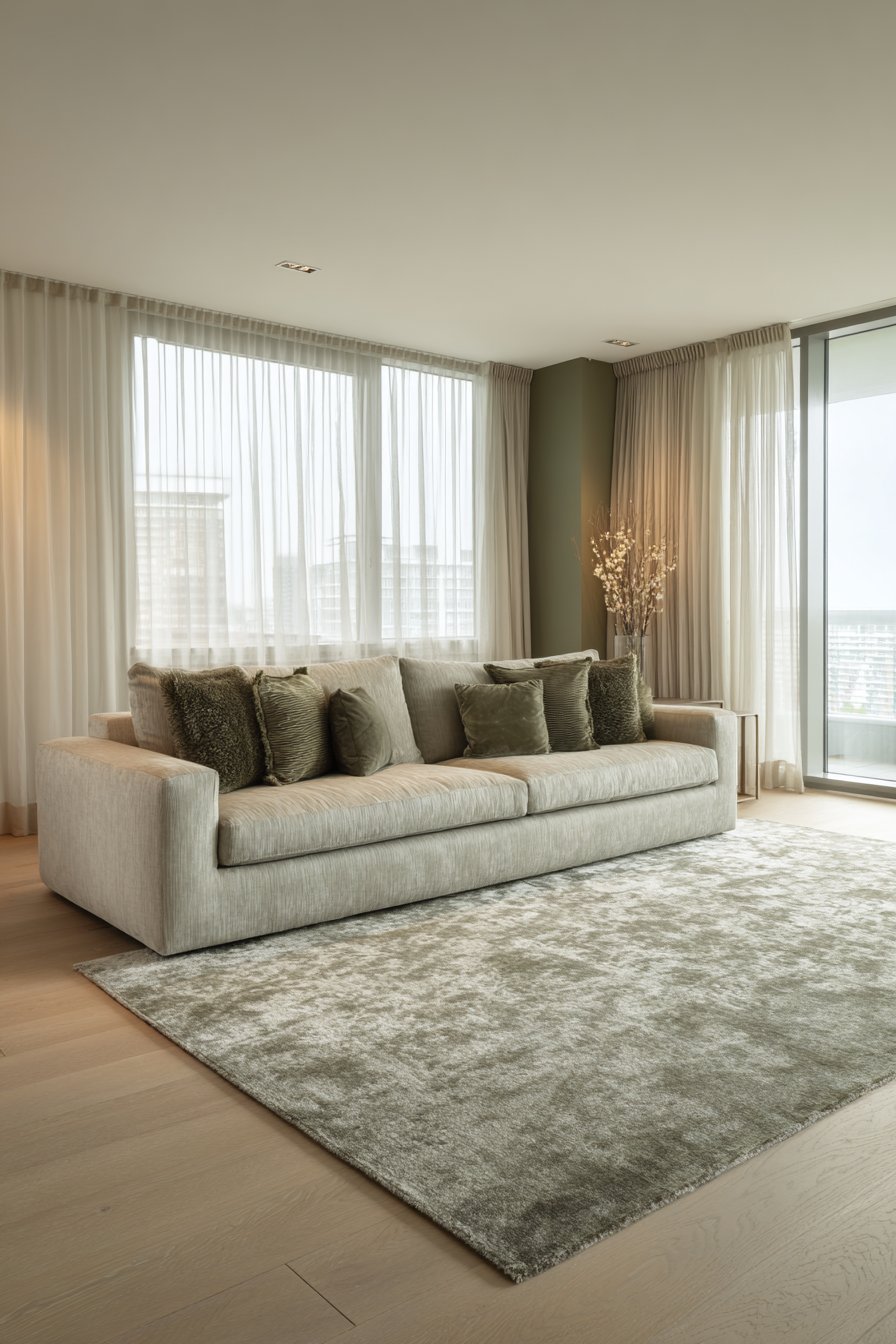
Your room’s purpose should guide saturation decisions. Living rooms and bedrooms often benefit from medium to low saturation olive greens that feel calming and restful. Home offices and creative spaces can handle higher saturation levels that energize and inspire productivity without overwhelming the senses.
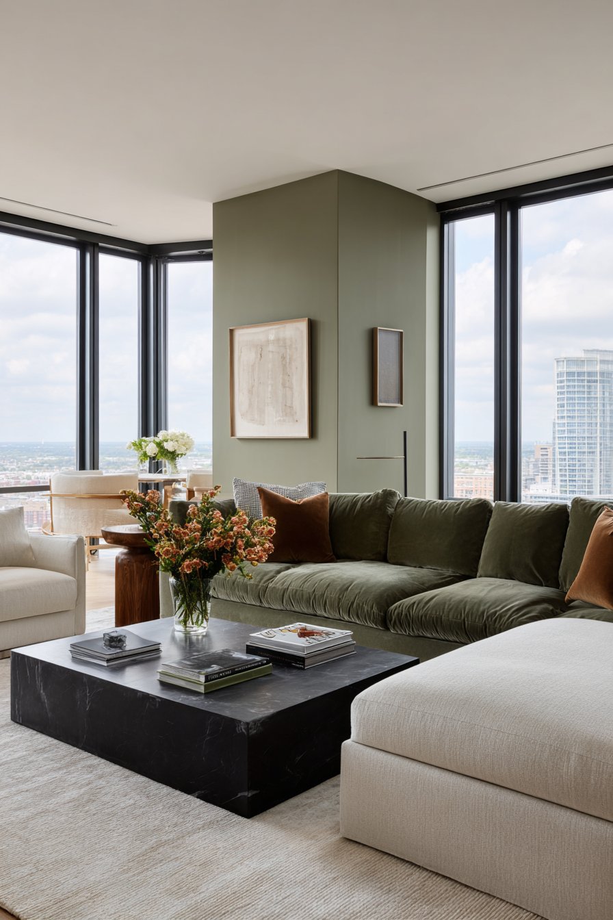
The size of your space also dictates appropriate saturation. Smaller rooms typically look better with muted olive tones that don’t visually close in walls. Larger spaces can accommodate richer, more saturated olive greens that add depth and coziness to expansive areas.
- Use the 60-30-10 rule: 60% dominant color, 30% secondary, 10% accent
- Start with lower saturation for your first olive green experiment
- Save highly saturated olive for smaller doses like pillows or artwork
- Consider matte finishes for more saturated shades to reduce visual intensity
- Balance saturated olive walls with plenty of neutral furnishings and textiles
- Remember that saturation appears more intense on large wall surfaces than samples
5. Coordinating With Your Design Style
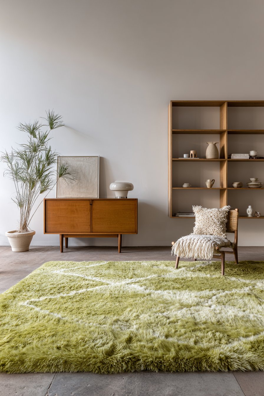
Olive green adapts remarkably well to various design styles when chosen and styled appropriately. Mid-century modern aesthetics embrace olive green alongside teak furniture, geometric patterns, and brass accents. Scandinavian design incorporates lighter, sage-like olives with natural woods and minimalist principles.
Traditional and transitional styles use olive green more conservatively, often in fabrics, draperies, or as sophisticated wall colors paired with classic moldings. Bohemian and eclectic spaces allow for adventurous olive combinations with multiple patterns, textures, and global influences.
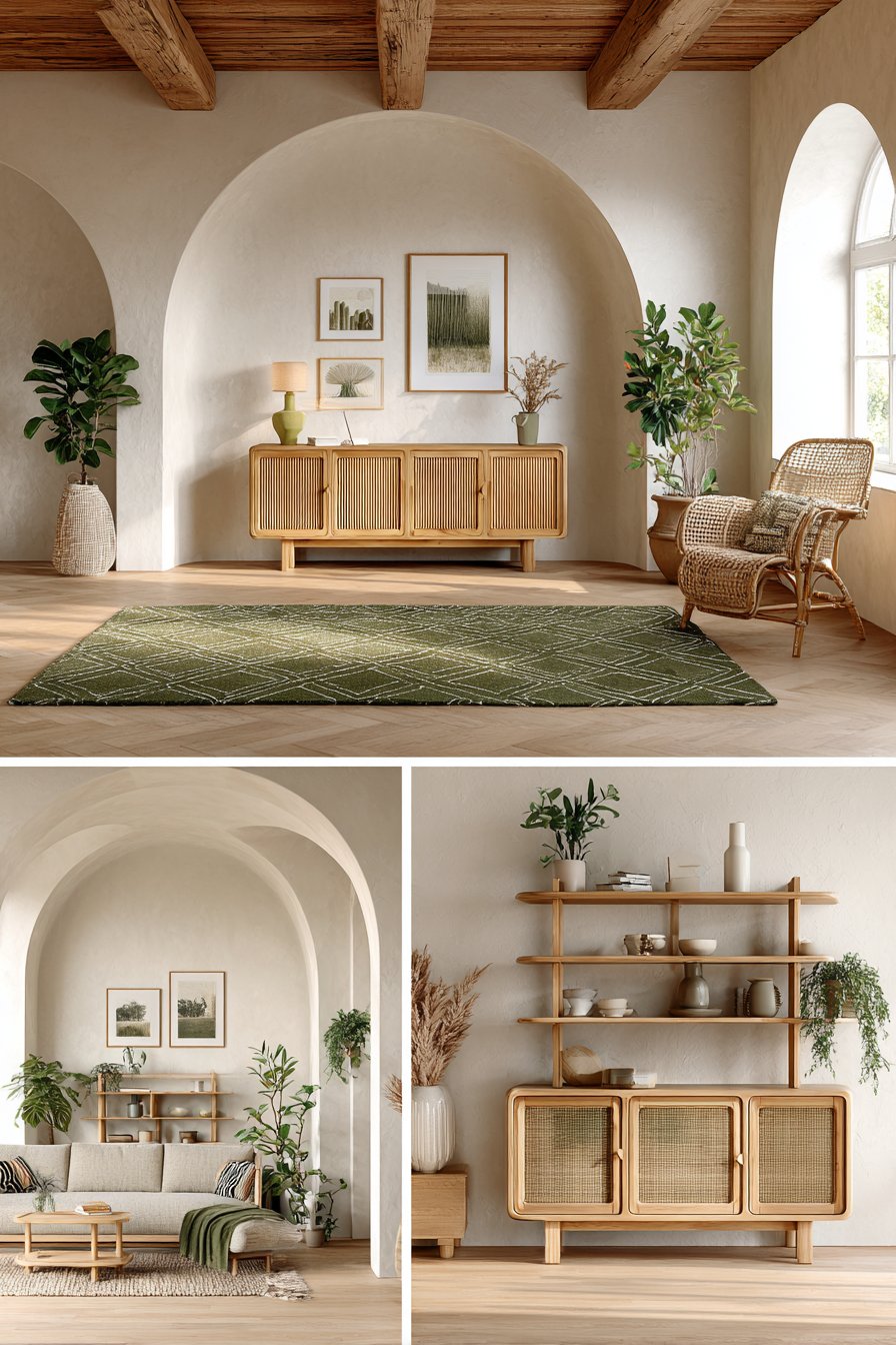
Your chosen design style determines not just the shade but also where and how you incorporate olive green. Modern farmhouse might use olive in textured textiles and painted cabinets, while industrial spaces might feature olive velvet upholstery against exposed brick and metal elements.
- Research your preferred design style’s typical color palettes before committing
- Create mood boards combining olive green with style-appropriate elements
- Consider whether olive will be a primary color or supporting accent
- Evaluate successful olive green examples within your chosen design aesthetic
- Decide if you’re creating a timeless look or embracing current trends
- Plan how olive green proportions align with your style’s typical color distribution
6. Planning for Long-Term Satisfaction
Color trends come and go, but paint and major purchases represent significant investments. Olive green currently enjoys popularity, but you need to assess whether you’ll still appreciate it years from now. Personal color preferences tend to be quite stable, so trust your instincts about long-term appeal.
Consider your commitment level when choosing between removable and permanent applications. Starting with olive green accessories like pillows, throws, and artwork allows experimentation with minimal risk. Once you’re confident, progress to larger commitments like painted walls or upholstered furniture.
Think about resale value if you plan to sell your home within a few years. While olive green is currently desirable, highly personalized color choices can limit buyer appeal. Keeping olive green to easily changeable elements maintains flexibility while still enjoying this sophisticated hue.
- Start small with reversible olive green additions before major commitments
- Choose classic olive shades over trendy variations for better longevity
- Invest in quality olive pieces you’d keep even if you tired of the color
- Consider whether olive green reflects your authentic style or just current trends
- Plan an exit strategy for how you’d update the space if preferences change
- Balance trendy olive applications with timeless neutral foundations for flexibility
Conclusion
Choosing olive green home decor requires thoughtful consideration of multiple factors that influence how this sophisticated color performs in your unique space. From understanding undertones and assessing lighting conditions to coordinating with existing furnishings and your personal design style, each element plays a crucial role in achieving beautiful, cohesive results. The strategic approach outlined in these sections helps you avoid common pitfalls while maximizing olive green’s considerable aesthetic potential.
Remember that successful interior design balances current trends with timeless principles and personal preferences. Start with smaller olive green additions, observe how they interact with your space, and gradually expand your commitment as confidence grows. With careful planning and consideration of these essential factors, olive green can transform your home into a sophisticated, naturally elegant sanctuary that you’ll love for years to come.