Gray dominated interior design for over a decade. It was the go-to neutral for walls, furniture, and floors across millions of homes. But design trends are shifting fast, and homeowners are ready for something warmer, bolder, and more expressive. The post-gray era has officially arrived, and it’s bringing a refreshing wave of color, texture, and personality into living spaces.
Today’s interior design landscape is moving toward palettes that feel more human and grounded. People want their homes to evoke emotion, comfort, and individuality. The cold, sterile undertones of gray simply don’t deliver that warmth anymore. Designers and homeowners alike are exploring richer tones, earthy textures, and layered neutrals that feel alive and intentional.
This article explores the most exciting trends stepping into gray’s place. Whether you’re planning a full renovation or a simple refresh, these emerging directions will inspire your next design move. From warm beiges to deep greens and terracotta, the future of home color is anything but flat.
1. Warm Beige and Greige Take the Lead
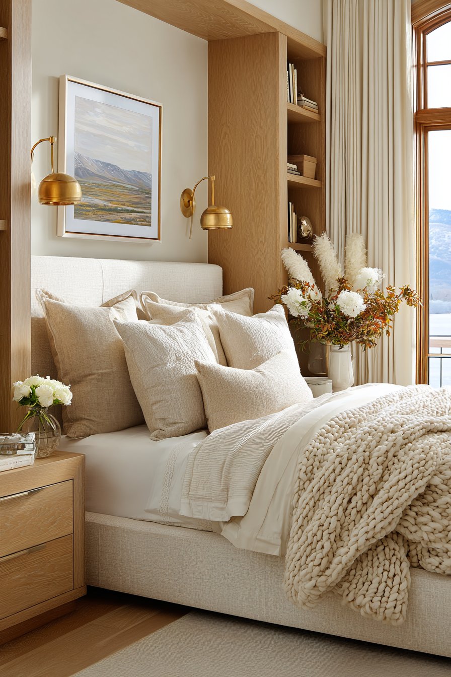
Warm beige is officially the new neutral. Unlike gray, beige carries yellow and pink undertones that instantly make a space feel inviting. It pairs beautifully with natural wood tones, linen textures, and soft lighting. Interior designers are calling it one of the most versatile and timeless color choices of the decade.
Greige — a blend of gray and beige — offers a softer transition for those still attached to cooler tones. It brings the best of both worlds: the sophistication of gray with the warmth of beige. It works exceptionally well in open-plan living areas, kitchens, and bedrooms. Paint brands like Benjamin Moore and Sherwin-Williams have seen massive spikes in greige sales over the past two years.
What makes beige and greige so compelling is their adaptability across styles. They complement Scandinavian minimalism, coastal living, and even maximalist interiors with ease. These tones don’t compete with art, furniture, or architectural details — they simply enhance everything around them.
- Choose warm beige with LRV (Light Reflectance Value) above 60 for small rooms
- Layer different beige tones in textiles, walls, and furniture for depth
- Pair with natural oak or walnut wood tones for a cohesive look
- Use greige on trim and molding to add architectural interest
- Test paint swatches in both natural and artificial light before committing
- Avoid cool-toned whites alongside warm beige — it creates visual tension
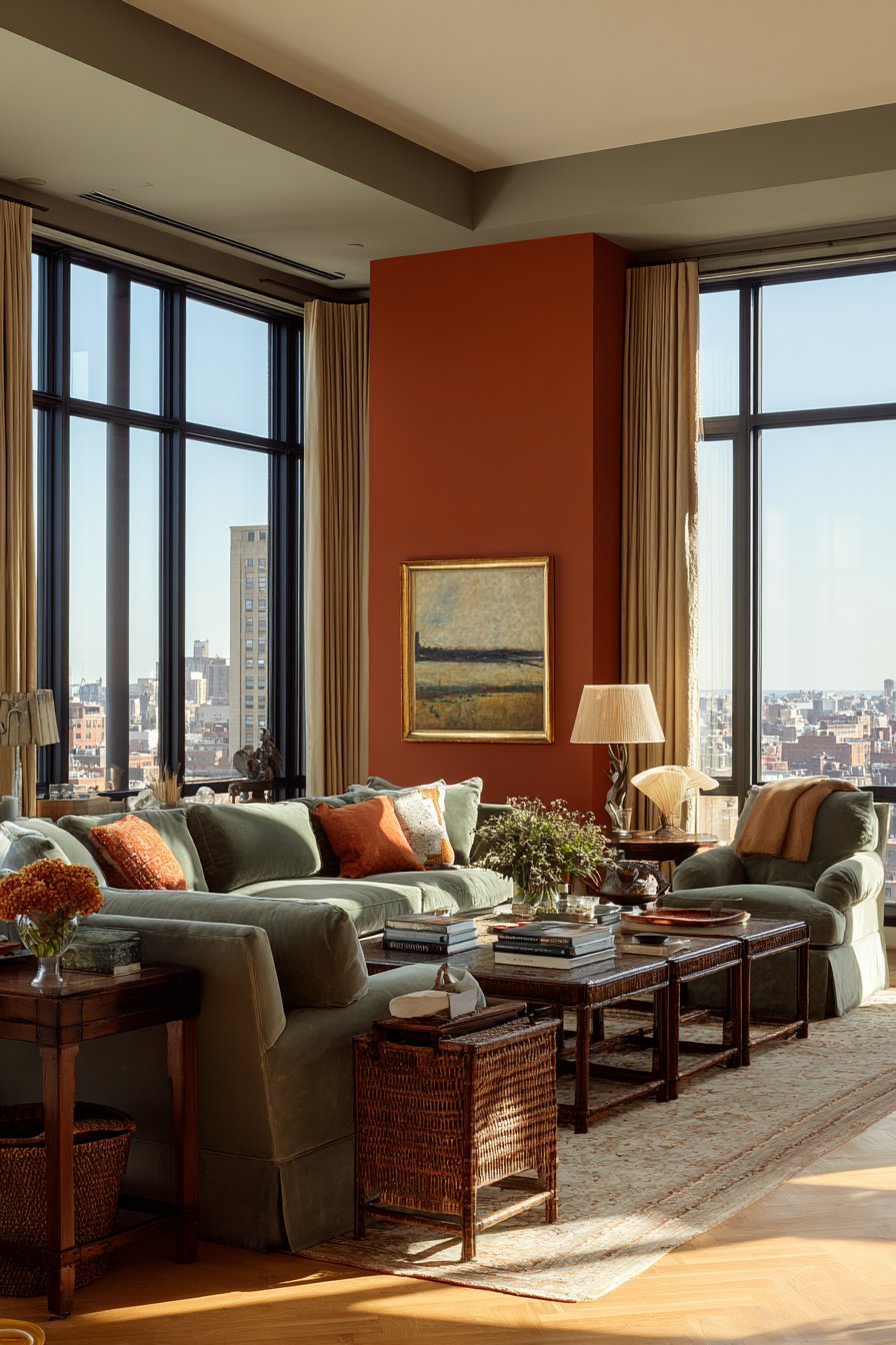
2. Earthy Terracotta Makes a Bold Statement
Terracotta has surged back into the spotlight, and for good reason. This warm, clay-inspired hue connects interiors to the natural world in a way gray never could. It evokes Mediterranean landscapes, artisan pottery, and sun-baked earth. Used on walls, in tiles, or through accessories, terracotta adds instant soul to any space.
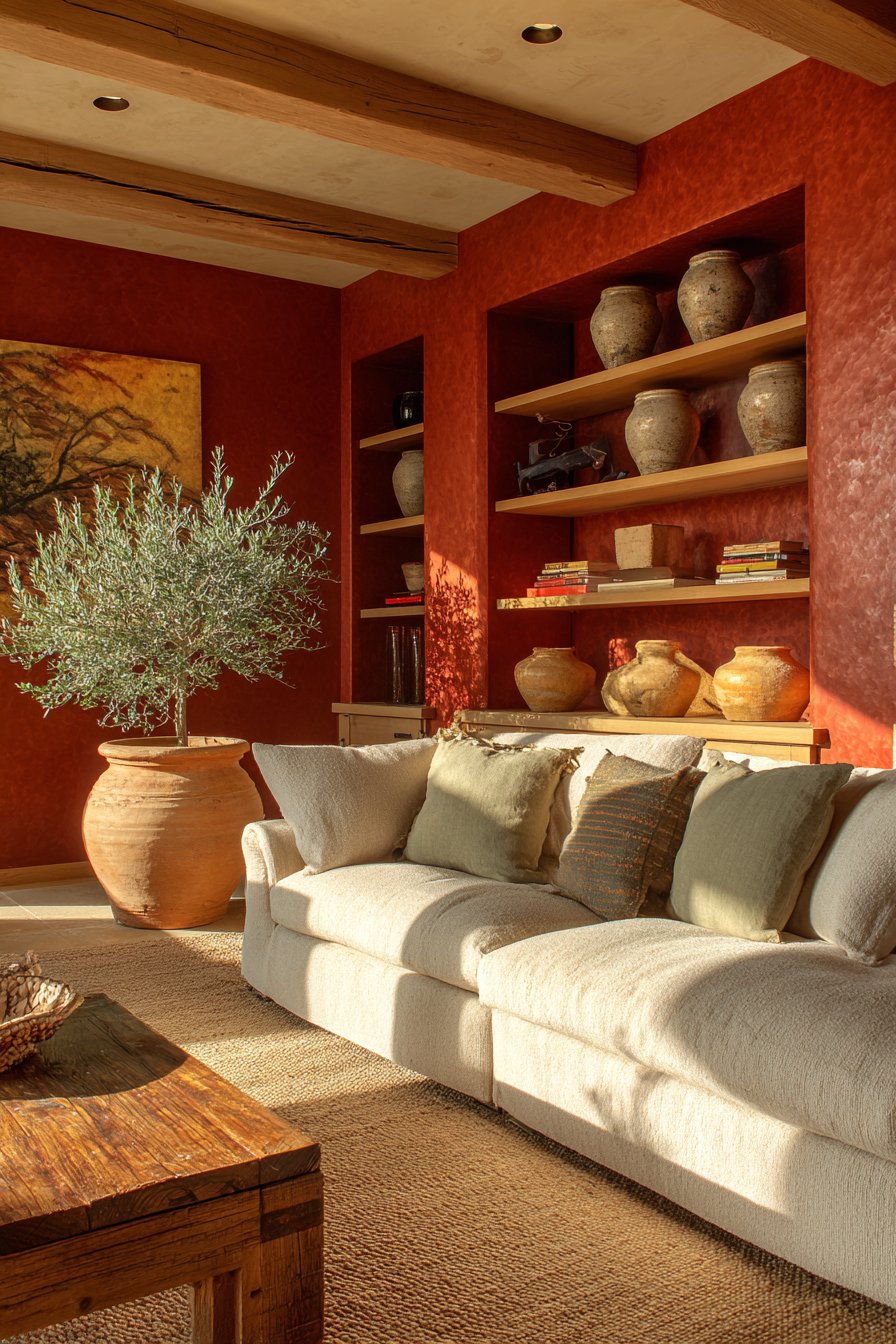
The beauty of terracotta is its range. From muted dusty tones to vivid burnt orange, there’s a shade for every comfort level. Design-forward homeowners are using terracotta as an accent wall color in living rooms and dining spaces. Others incorporate it through ceramic vases, woven cushions, and handmade tiles that bring artisanal character to kitchens and bathrooms.
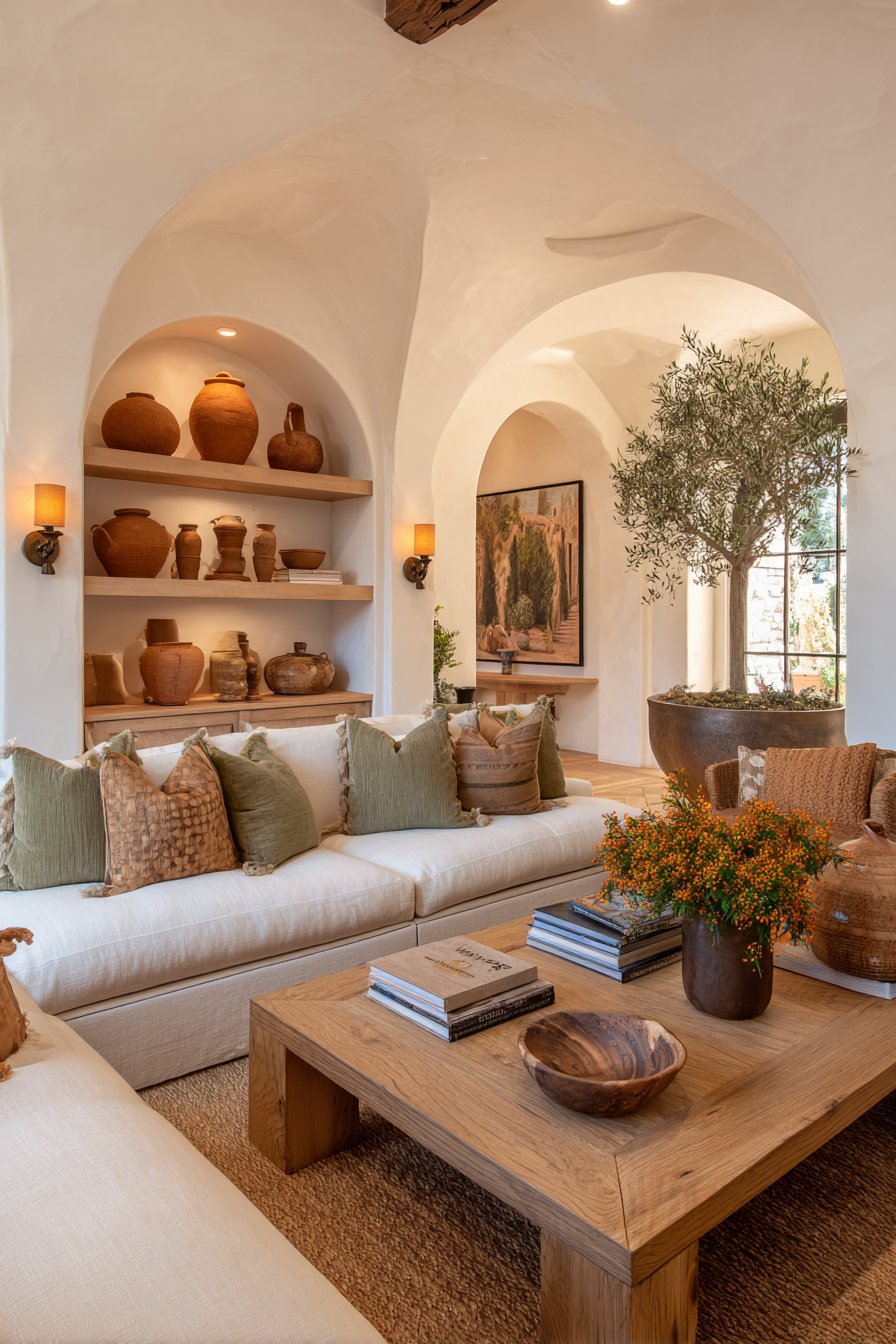
Terracotta also performs brilliantly in warm lighting conditions. Under incandescent or warm LED bulbs, it glows richly and creates an intimate, cozy atmosphere. It pairs naturally with sage green, cream, and deep brown — forming a palette that feels deeply rooted in nature and biophilic design principles.
- Use terracotta floor tiles in bathrooms for a spa-like, earthy feel
- Introduce the color gradually through throw pillows or ceramic planters
- Pair terracotta walls with white plaster or limewash finishes
- Combine with rattan and natural fiber rugs for a cohesive organic look
- Consider terracotta grout in white tile backsplashes for subtle warmth
- Layer terracotta with rust, ochre, and sand for a rich tonal palette
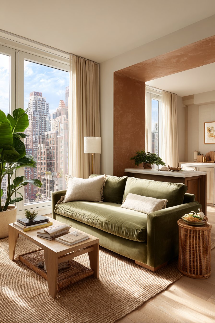
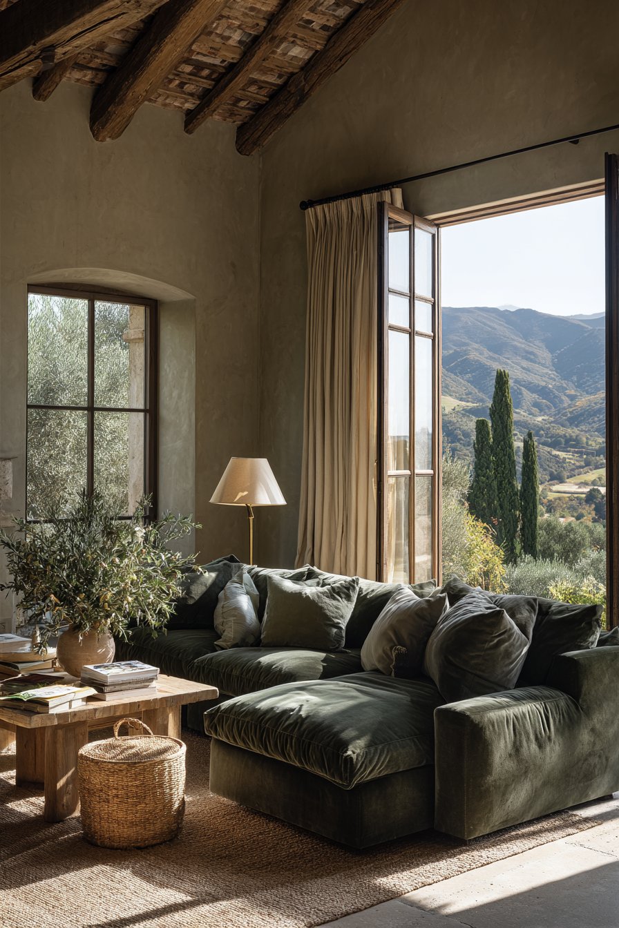
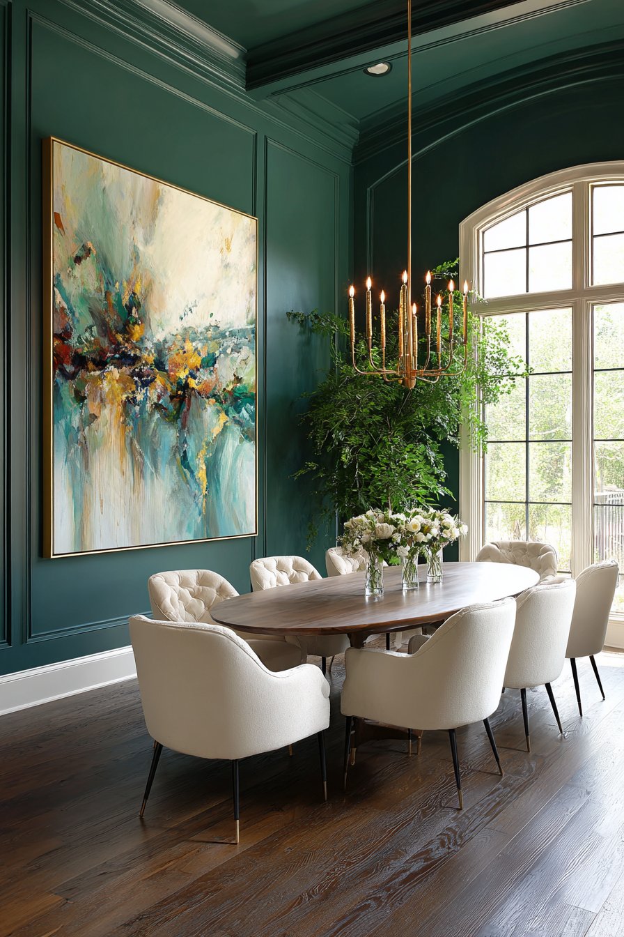
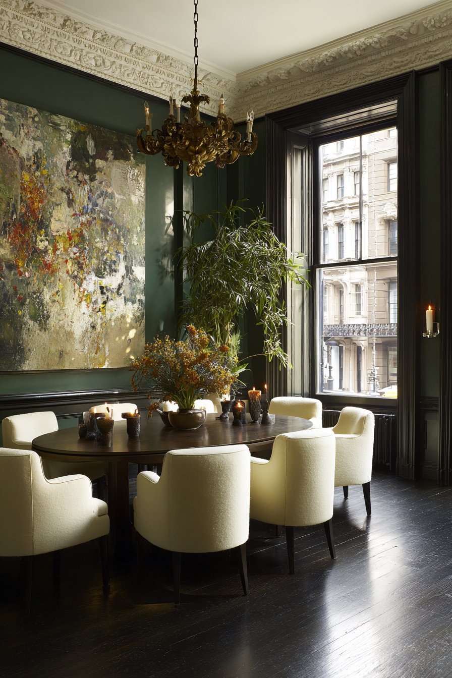
3. Deep Forest and Sage Green Dominate
Green has become the defining color of modern interiors. From deep hunter and forest green to soft sage, this versatile family of hues is appearing on walls, cabinetry, furniture, and soft furnishings everywhere. It connects interior spaces to nature, supporting the growing biophilic design movement that prioritizes wellness and organic connection.
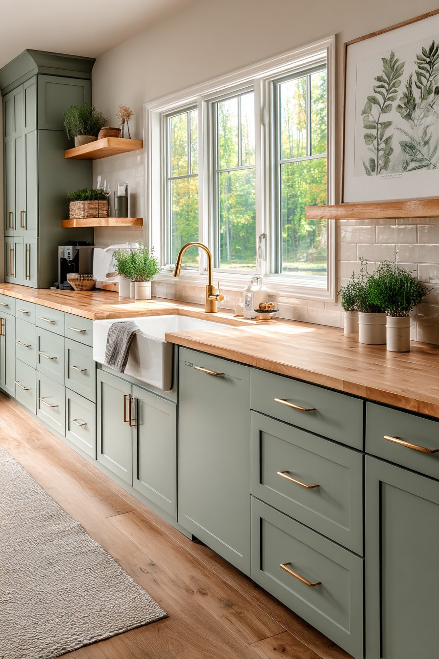
Sage green, in particular, has claimed enormous popularity. Its muted, dusty quality makes it surprisingly easy to live with. It doesn’t overwhelm a room — instead, it creates a calm, restorative atmosphere that works equally well in kitchens, bedrooms, and home offices. Many designers describe sage as the new gray because of its neutral yet color-forward versatility.
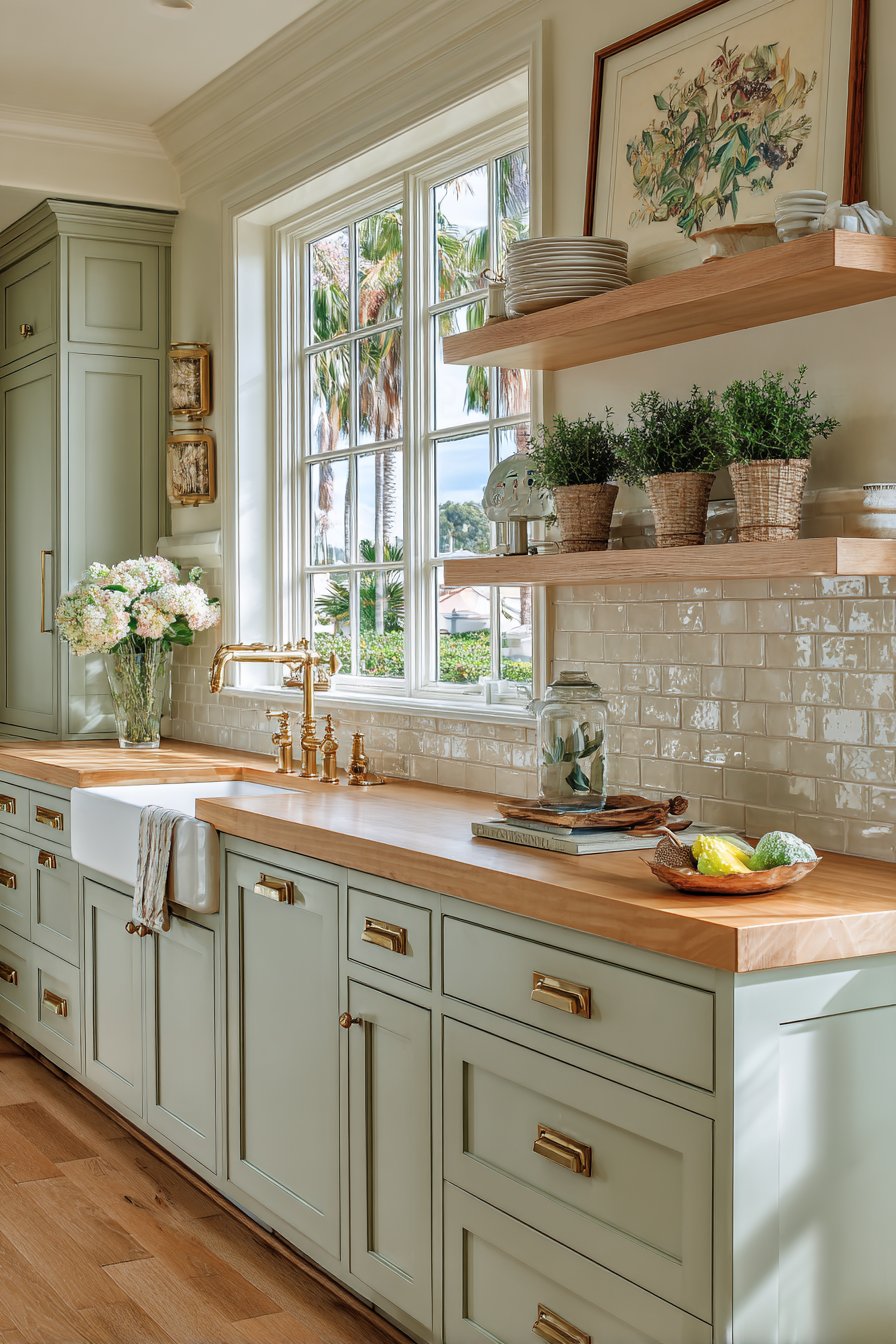
Deep greens like forest, bottle, and hunter work best in rooms with strong natural light or as deliberate moody, dramatic choices in dining rooms and studies. When paired with brass hardware, warm wood furniture, and cream textiles, deep green creates an atmosphere of refined sophistication that gray simply cannot achieve.
- Paint lower kitchen cabinets in sage green while keeping uppers white
- Use forest green velvet sofas as a statement furniture piece
- Pair deep green walls with antique brass or gold fixtures
- Incorporate live plants to reinforce the botanical, nature-forward palette
- Choose sage green bathroom tiles for a serene, spa-inspired retreat
- Layer green tones in pillows, throws, and art for a cohesive look
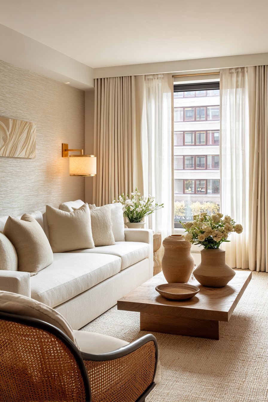
4. Warm White and Limewash Finishes Rise Up
Clean, cold white walls are fading out alongside gray. In their place, warm white and off-white tones are creating softer, more livable backdrops. Shades like ivory, cream, and Swiss coffee are replacing stark whites, adding a gentle warmth that makes rooms feel effortlessly elegant.
The limewash technique has exploded in popularity as homeowners seek textured, aged finishes with depth and character. Unlike flat paint, limewash creates a naturally variegated surface that absorbs and reflects light differently across a wall. The result is a finish that feels organic and handcrafted — qualities that mass-produced gray paint could never provide.
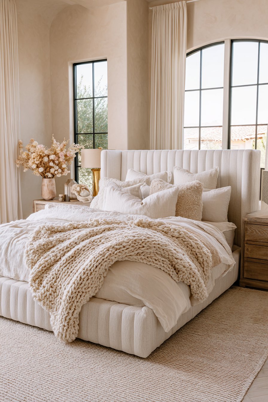
Limewash works exceptionally well in living rooms, bedrooms, and entryways. It pairs beautifully with exposed brick, reclaimed wood, and linen upholstery. The tactile quality of the finish adds a layer of sensory richness that elevates entire interior schemes from ordinary to extraordinary.
- Apply limewash over existing paint for a budget-friendly transformation
- Choose Venetian plaster for high-traffic areas that need more durability
- Pair warm white limewash walls with natural fiber rugs and woven lighting
- Use warm white on ceilings to make rooms feel taller and airier
- Avoid cool fluorescent lighting — it kills the warmth of these finishes
- Sample limewash finish on a small section before committing to a full wall
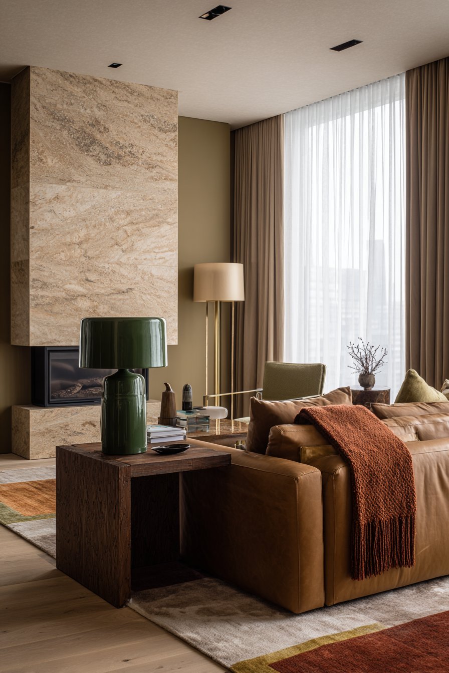
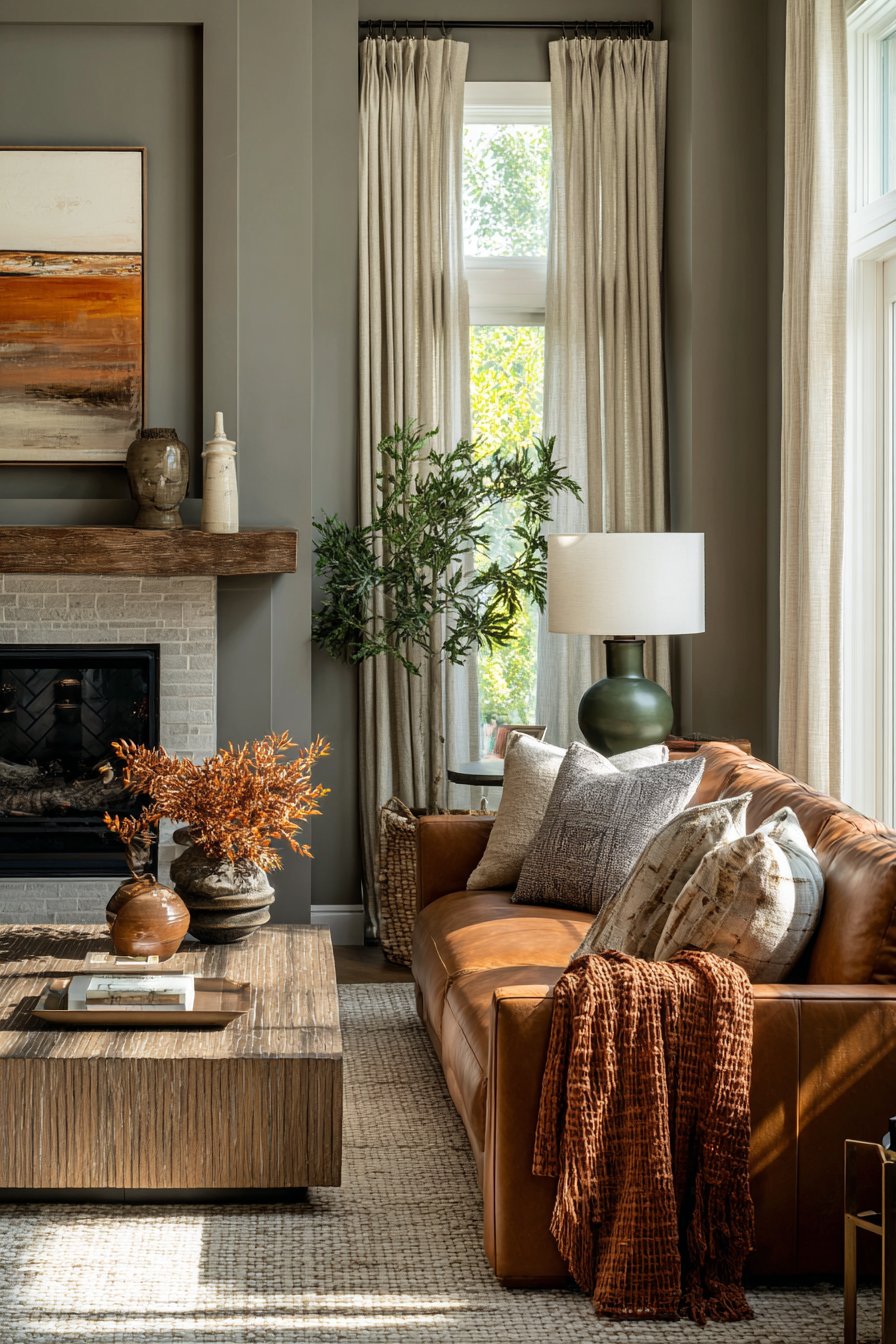
5. Warm Caramel and Cognac Browns Return
Brown is back — but not the heavy, dated chocolate brown of the early 2000s. Today’s warm caramel and cognac tones are refined, luxurious, and deeply on-trend. These hues appear in leather furniture, wooden cabinetry, wall paint, and decorative accessories. They bring a sense of richness and grounding that gray always lacked.
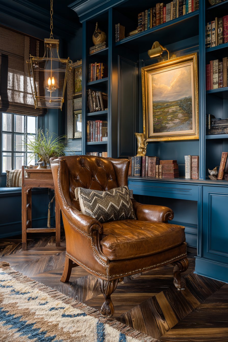
Caramel brown works beautifully as a wall paint color in rooms where a cocooning, intimate feel is desired. Libraries, home offices, and primary bedrooms are perfect candidates. The color wraps a room in warmth, making it ideal for spaces where relaxation and focus are priorities. When paired with cream, gold, and rust, it creates a palette reminiscent of autumn landscapes.
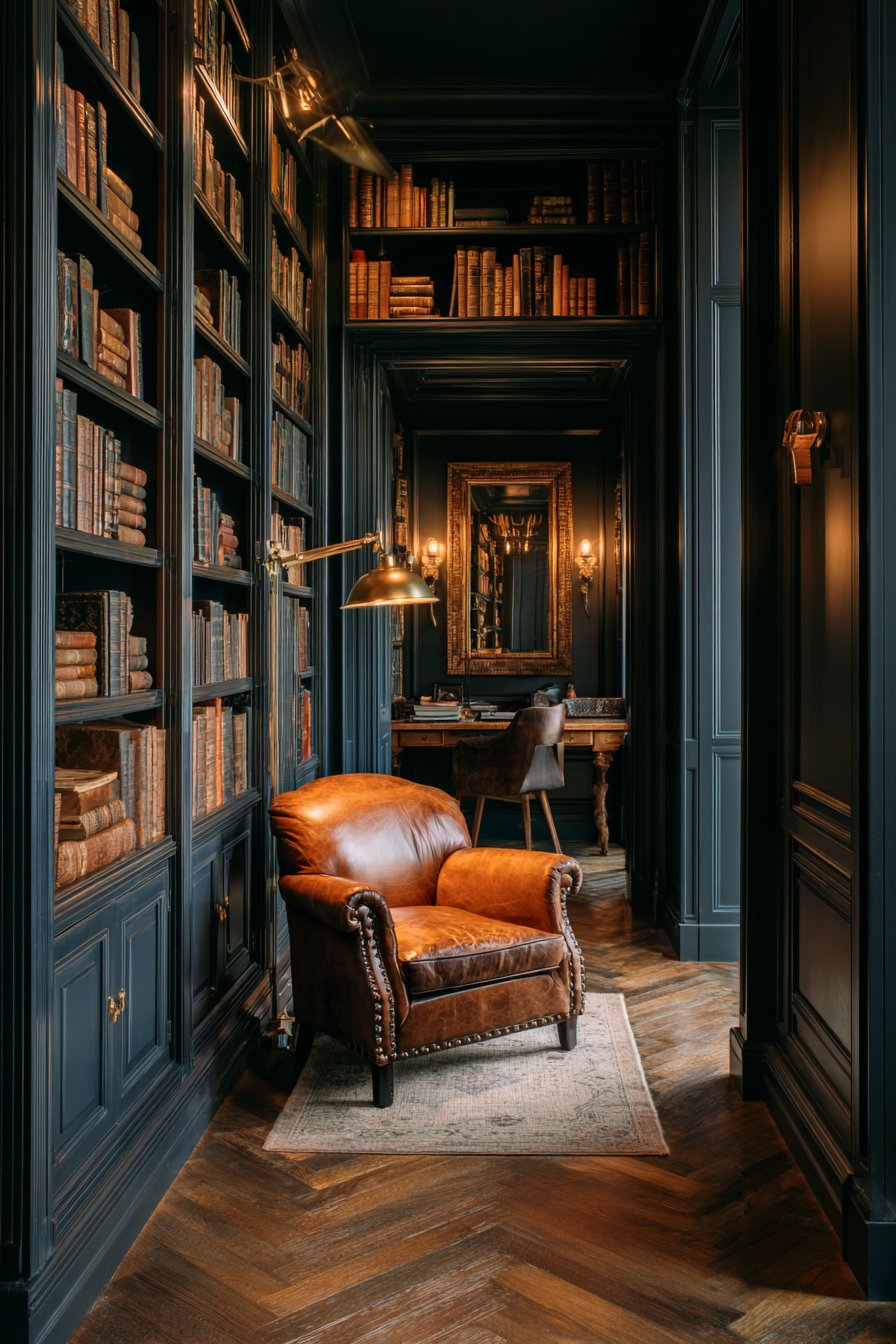
Cognac leather furniture has become a defining element of contemporary interior design. Sofas, armchairs, and ottomans in this rich tone add tactile luxury and age beautifully over time. Unlike gray upholstery, cognac leather develops a patina with character — becoming more beautiful the longer it’s used.
- Invest in a cognac leather sofa as a long-term, trend-resistant furniture choice
- Use caramel wall paint in home offices to boost focus and warmth
- Pair brown tones with cream, ivory, and soft gold for a sophisticated palette
- Incorporate wooden furniture in warm oak or walnut to reinforce the palette
- Add caramel tones through leather-bound books, wooden trays, and baskets
- Avoid mixing warm brown with cool gray — the contrast creates visual disharmony
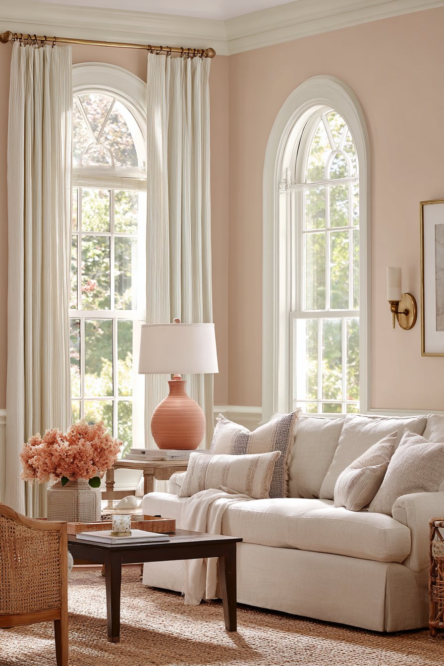
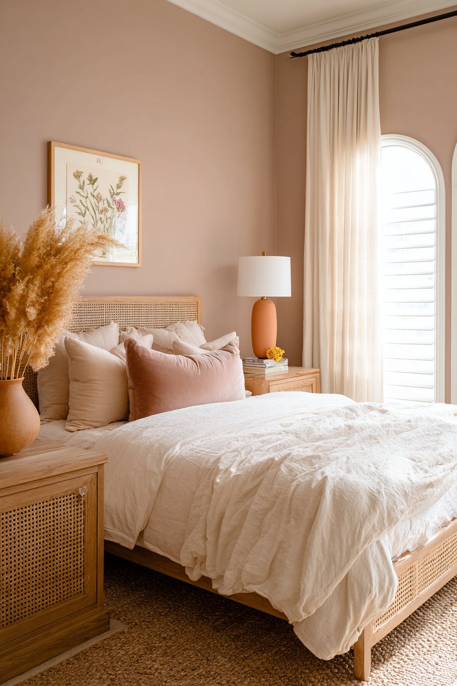
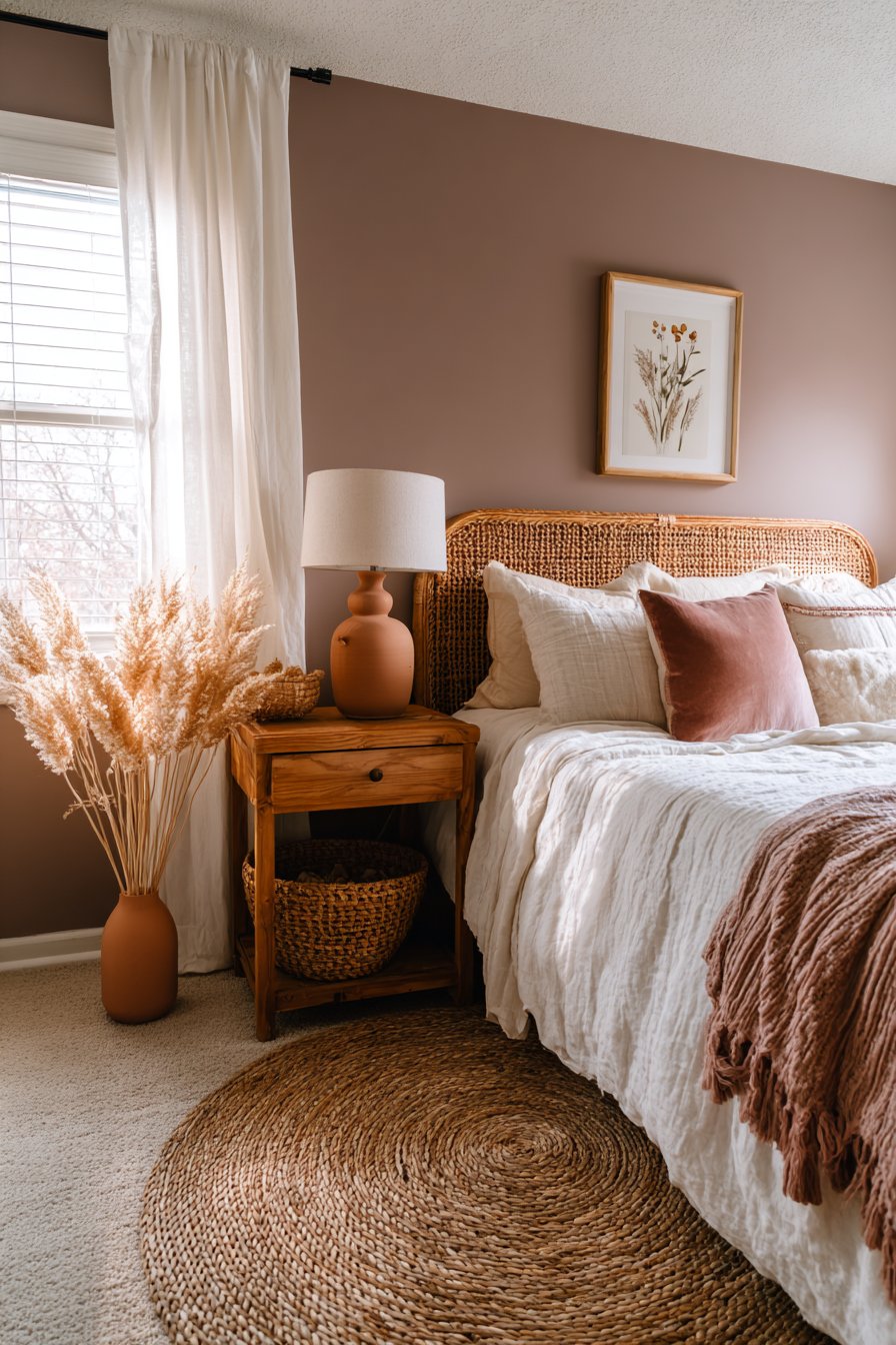
6. Dusty Mauve and Blush Pinks Soften Spaces
The pink family has matured significantly. Gone are the bubblegum and candy pinks of a few years ago. Today’s trending pinks are dusty, muted, and deeply sophisticated. Mauve, blush, and antique rose are appearing in bedrooms, living rooms, and even kitchens — bringing a sense of quiet femininity and warmth without feeling overdone.
Dusty mauve is particularly compelling because it sits between pink and purple. It has enough neutrality to work as a background color while still adding unmistakable personality. Paired with terracotta, sage green, or warm cream, it forms part of the earthy, artisanal palette that defines contemporary interiors.
Blush pink continues to evolve as a timeless accent color. Used in upholstered headboards, curtains, and ceramic accessories, it adds a gentle warmth to spaces without demanding attention. The key is to treat blush as a tonal neutral rather than a feature color — layering it subtly across multiple elements for a cohesive, refined effect.
- Use dusty mauve on bedroom walls with warm white trim for contrast
- Introduce blush through linen cushions, throws, and bedside lampshades
- Pair mauve with antique brass hardware for a luxurious, vintage-inspired look
- Avoid overly bright or cool-toned pinks — they miss the sophisticated mark
- Layer mauve with rust and clay tones for a rich, sunset-inspired palette
- Choose matte paint finishes for dusty pinks — gloss makes them look garish
7. Rich Navy and Deep Blue Create Drama
Deep, saturated blues are making a powerful statement in modern interiors. Navy, midnight blue, and indigo are being used on walls, cabinetry, and large furniture pieces to create rooms with drama and depth. These tones communicate confidence and sophistication, and they work in virtually every room of the house.
Navy kitchen cabinetry has become one of the most popular design choices of recent years. Paired with brass or gold hardware, white marble countertops, and warm wood floors, navy kitchens feel both classic and contemporary. They age beautifully and never look dated — a significant advantage over trend-driven gray cabinetry.
Deep blue works equally well in living rooms and bedrooms. A navy velvet sofa against warm white walls creates an instantly striking focal point. In bedrooms, deep blue walls create a cocoon-like atmosphere that promotes rest and relaxation. It pairs brilliantly with gold, cream, blush, and natural wood for a palette that feels layered and intentional.
- Use navy on kitchen island cabinets while keeping perimeter cabinets lighter
- Choose deep blue velvet for sofas, armchairs, or statement headboards
- Pair navy walls with warm brass lighting for maximum visual impact
- Incorporate deep blue through patterned rugs, art, and ceramic accessories
- Use midnight blue in bathrooms with gold fixtures for a hotel-inspired feel
- Balance dark blue with plenty of natural light and warm wood accents
8. Warm Mustard and Ochre Add Character
Yellow-based tones are making a sophisticated comeback. Mustard and ochre — deeply saturated, complex yellows — are bringing character, energy, and historical richness to interiors. These colors appear in art, upholstery, ceramics, and occasionally walls. They have a warmth and depth that no shade of gray can replicate.
Mustard yellow works exceptionally well as an accent color in otherwise neutral rooms. A single mustard armchair or set of cushions can transform a beige or cream living room into something with genuine personality. The key is restraint — used sparingly, mustard adds warmth without overwhelming the senses.
Ochre has strong connections to natural pigments and earth tones. Artists have used it for thousands of years, and interior designers are now embracing its historical richness. Ochre-toned walls in dining rooms create an atmosphere of warmth and conviviality — perfect for spaces where gathering and connection are priorities.
- Use mustard as a statement accent through a single sofa or armchair
- Incorporate ochre in abstract art or hand-thrown ceramic accessories
- Pair mustard with deep teal or forest green for a vibrant, complementary palette
- Use ochre wall paint in dining rooms with warm candlelight for atmosphere
- Avoid pairing mustard with cool gray — the undertones clash visually
- Layer mustard, terracotta, and rust for a warm maximalist look
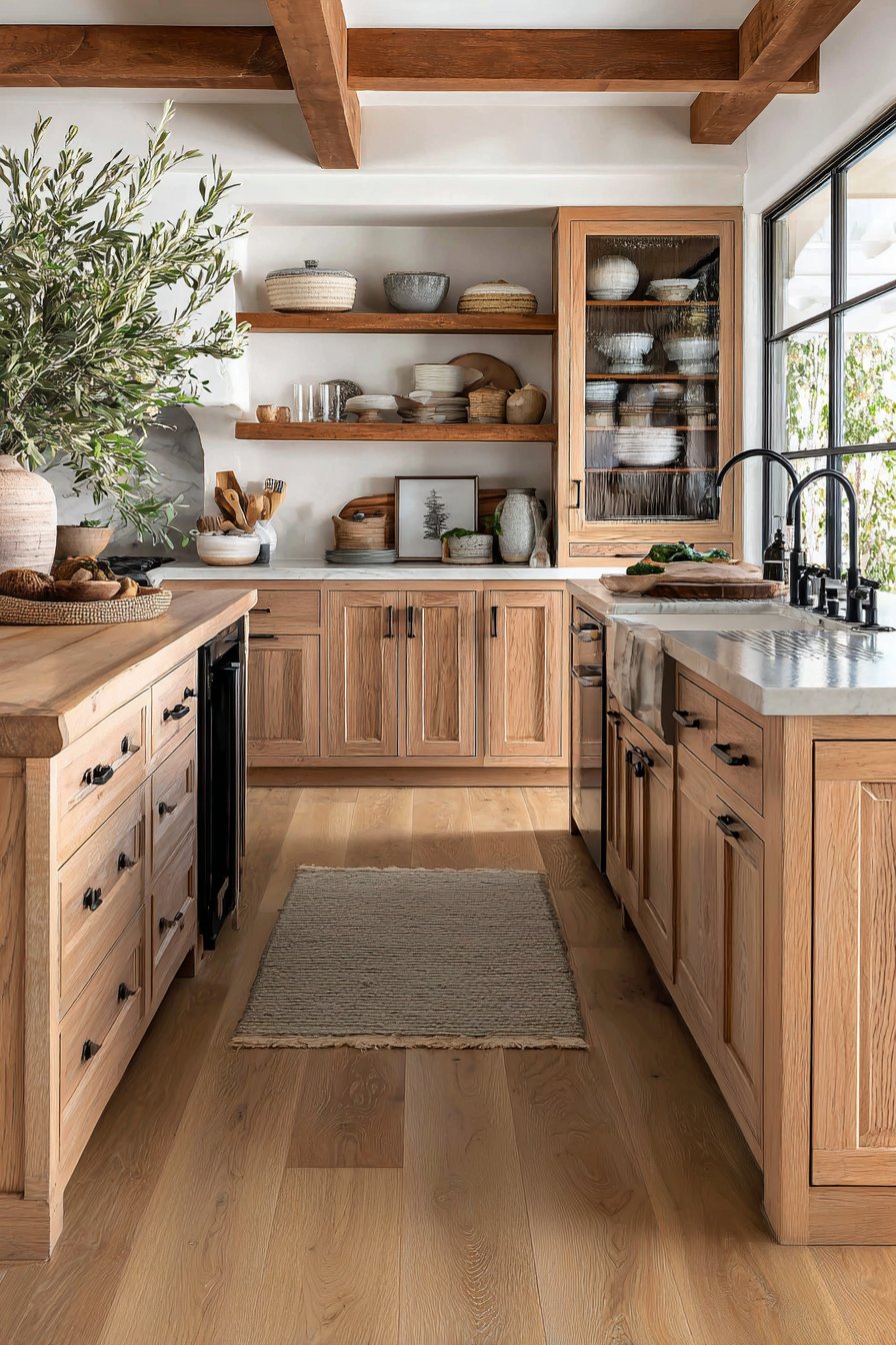
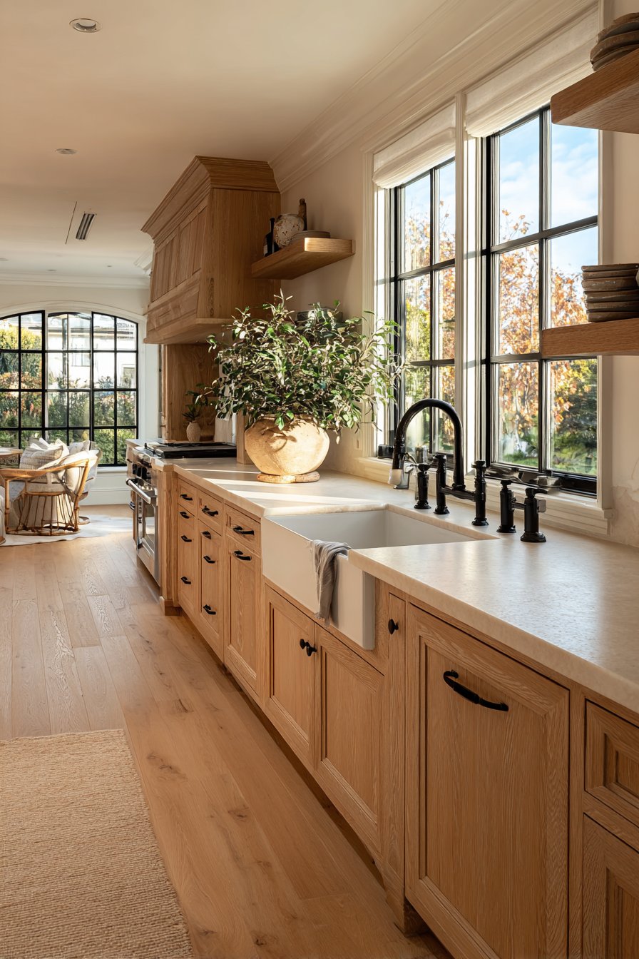
9. Warm Neutrals in Natural Materials
It’s not just about paint color anymore. Natural materials are replacing synthetic, gray-toned surfaces across every category of home decor. Linen, jute, rattan, raw wood, stone, and terracotta clay are redefining what “neutral” means in modern interiors. These materials bring texture, warmth, and authenticity that painted gray drywall simply cannot offer.
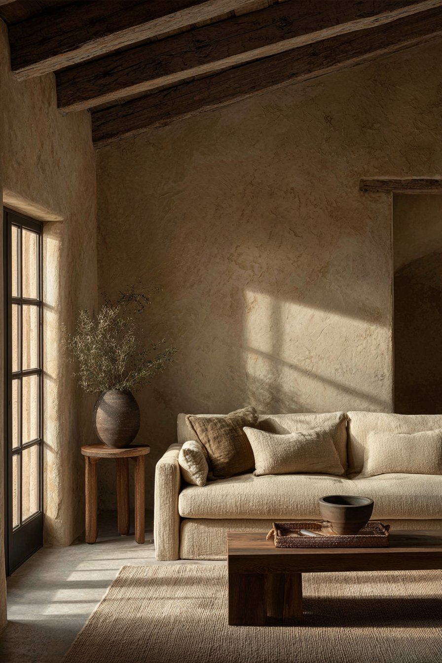
Linen upholstery has become the fabric of choice for sofas, chairs, and window treatments. Its natural, slightly undone quality creates a relaxed sophistication. Unlike gray polyester, linen ages gracefully and becomes softer and more characterful over time. It’s also a more sustainable choice — a growing priority for today’s design-conscious homeowners.
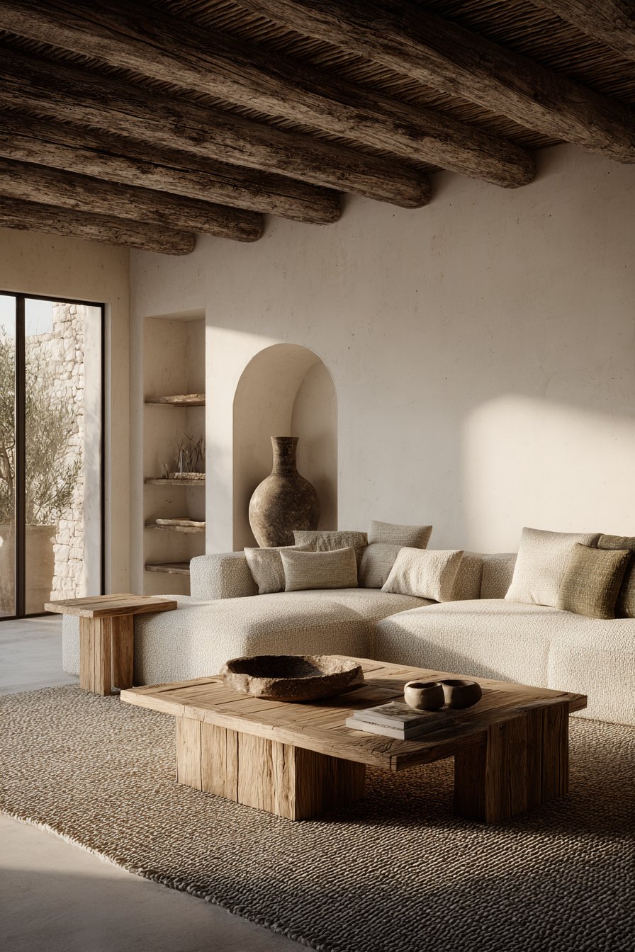
Raw wood in light oak, pine, and ash tones is replacing the dark espresso and gray-stained furniture that dominated the 2010s. These lighter woods make rooms feel airier and more connected to nature. Combined with stone countertops, woven rugs, and ceramic accessories, natural material palettes create interiors of genuine warmth and depth.
- Choose linen or cotton velvet over synthetic upholstery for furniture
- Incorporate raw wood through floating shelves, coffee tables, and bed frames
- Use natural stone tiles in bathrooms and kitchens over porcelain gray alternatives
- Add jute or sisal rugs as a warm, textural foundation for living areas
- Select handmade ceramic tableware and accessories for artisanal character
- Layer multiple natural textures for a rich, organic interior aesthetic
10. Moody Burgundy and Rust Bring Depth
Deep, wine-inspired tones are claiming their place in the modern home. Burgundy, rust, and deep red-brown hues are being embraced by designers who want spaces with genuine emotional weight. These colors have historical associations with richness, luxury, and intimacy — qualities that resonate deeply with today’s desire for meaningful, personal interiors.
Burgundy works beautifully as a wall color in dining rooms and bedrooms. Against warm white trim, it creates a dramatic, intimate atmosphere perfect for evening entertaining or restful sleep. When paired with antique brass fixtures, dark wood furniture, and cream textiles, burgundy feels timeless rather than trendy.
Rust is the more accessible sibling of burgundy — slightly more orange, slightly more casual. It works brilliantly as an accent throughout neutral interiors. Rust cushions, pottery, and textiles bring energy and warmth to beige or cream rooms. The color has an earthy, artisanal quality that connects seamlessly to terracotta, ochre, and warm wood tones.
- Use burgundy as a feature wall color in dining rooms or bedroom alcoves
- Introduce rust through cushions, throws, and woven baskets as accents
- Pair burgundy with antique brass, dark walnut, and warm cream
- Use rust-toned ceramics and handmade pottery as coffee table styling
- Avoid pairing burgundy with cold grays — it creates an uncomfortable visual tension
- Layer rust, terracotta, and ochre for a rich, sun-soaked palette
Conclusion
Gray’s reign in home decor is over, and the alternatives arriving in its place are far more exciting. From warm beige and terracotta to deep forest green and rich burgundy, today’s trending colors share one thing in common — they make spaces feel alive, personal, and deeply human.
The move away from gray isn’t just about color preference. It reflects a broader cultural shift toward authenticity, warmth, and emotional resonance in the home. People want interiors that tell a story, reflect their personality, and genuinely comfort them. The colors and materials replacing gray do exactly that. Embrace the change, trust your instincts, and let your home become the warm, expressive sanctuary it deserves to be.