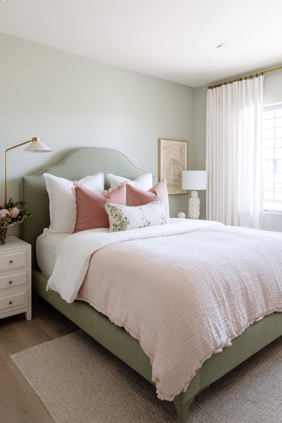
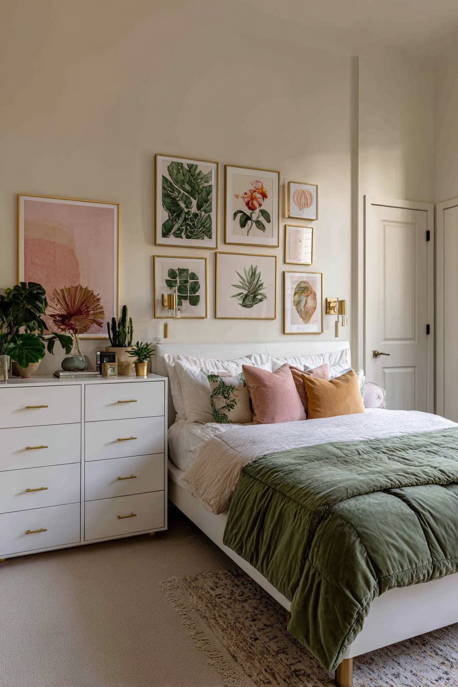
Creating a green and pink bedroom opens up a world of design possibilities. This color combination brings together nature’s tranquility with soft romantic warmth. The palette works beautifully across various design styles from modern to vintage.
Green and pink bedrooms have surged in popularity among interior designers and homeowners. These complementary colors create spaces that feel both energizing and calming. The versatility allows for endless customization based on personal taste and existing decor.
This article explores twenty unique green and pink bedroom concepts. Each design showcases different approaches to material selection, lighting, and spatial arrangement. From bold emerald statements to gentle sage whispers, these ideas demonstrate the remarkable range within this color scheme.
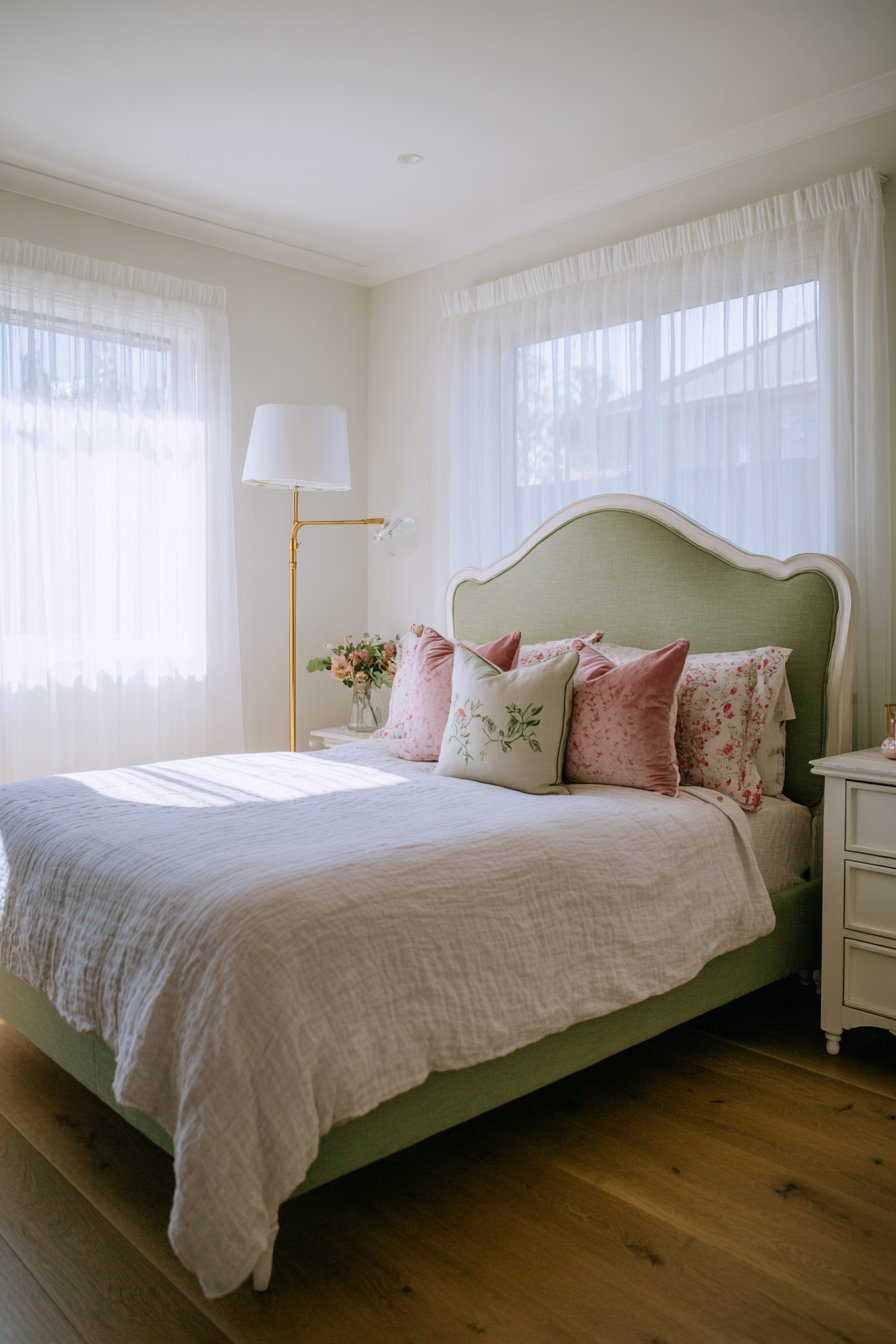
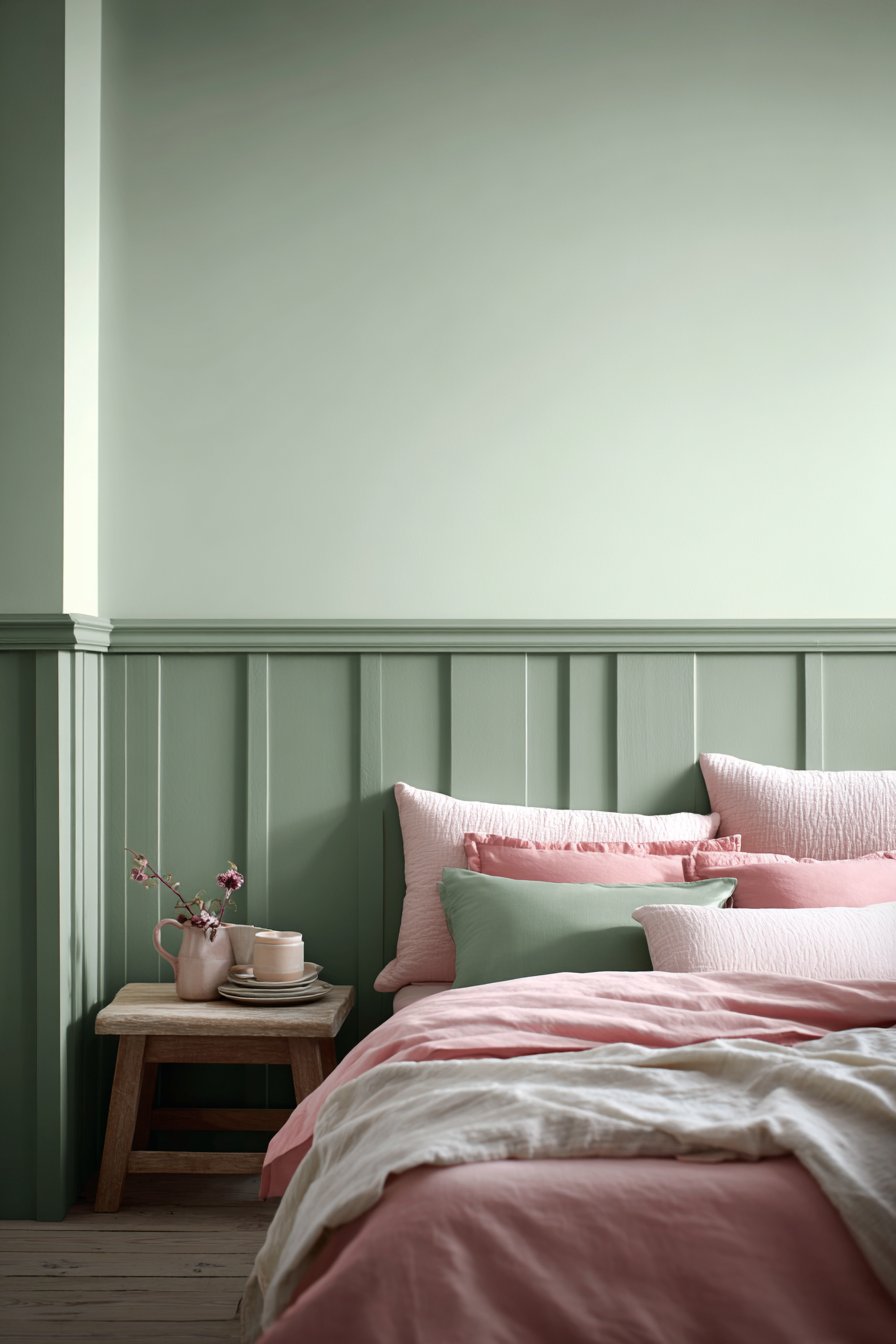
1. Sage Green Upholstered Elegance with Blush Accents
Picture a bedroom where a sage green upholstered bed frame commands attention with its curved headboard. Blush pink linen bedding drapes across the mattress with beautiful textured weave. Dusty rose velvet throw pillows nestle alongside eucalyptus green cushions featuring subtle botanical embroidery. The combination creates instant visual interest.
Soft mint green walls provide a serene backdrop that enhances the calming atmosphere. A modern brass floor lamp stands beside the bed on light oak hardwood flooring. The metallic accent adds sophistication without overwhelming the gentle color palette. Natural morning light filters through sheer white curtains creating soft shadows throughout the space.
The material choices in this design deserve special recognition. The upholstered headboard offers comfort while adding texture. Linen bedding provides breathability and a relaxed aesthetic. Velvet pillows introduce luxury through their tactile richness.
The lighting strategy balances natural and artificial sources beautifully. Morning sunlight creates an awakening atmosphere. The brass floor lamp provides task lighting for evening reading. Together they highlight the fresh feminine aesthetic throughout the room.
Key Design Tips:
- Select an upholstered headboard in sage green for a soft focal point
- Layer blush pink linens with eucalyptus green accent pillows for depth
- Choose brass metallic accents to bridge warm and cool tones
- Install sheer curtains to maximize natural light while maintaining privacy
- Opt for light oak flooring to ground the airy color palette
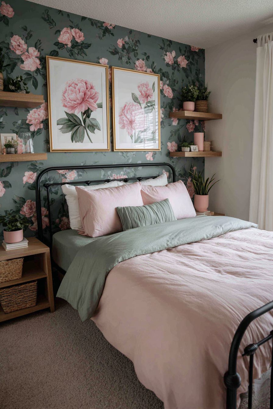
2. Emerald Wallpaper with Watercolor Florals
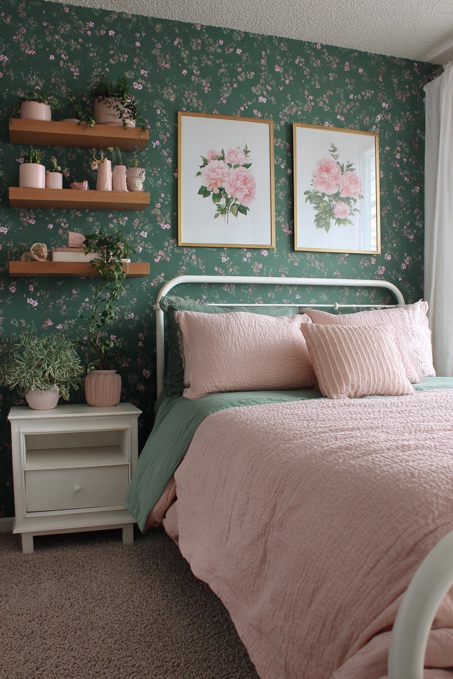
An emerald green accent wall featuring delicate pink floral wallpaper transforms this bedroom instantly. The watercolor style adds artistic sophistication to the space. Against this backdrop, a white iron bed frame creates beautiful contrast. The simplicity of the frame allows the wallpaper to shine.
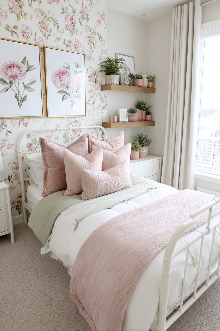
Blush pink duvet and sage green sheet sets coordinate perfectly with the wall treatment. Floating shelves in natural wood display small potted succulents and pink ceramic vases. These accessories reinforce the botanical theme throughout the room. Gold-framed botanical prints featuring pink peonies and green foliage hang asymmetrically above the shelves.
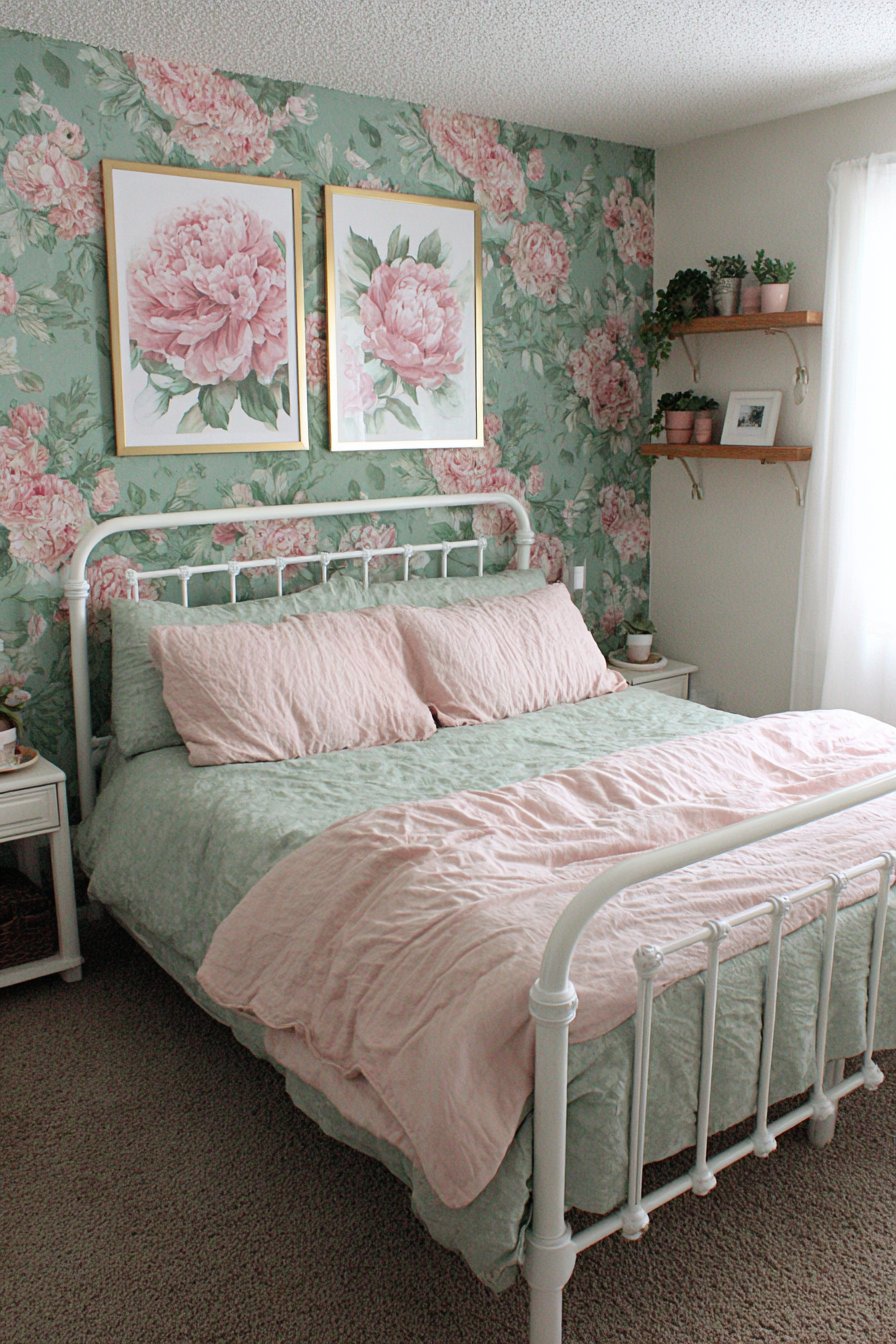
The wallpaper selection proves critical to this design’s success. Watercolor patterns add softness that solid colors cannot achieve. The floral motif connects the green and pink elements naturally. The emerald depth provides richness while maintaining elegance.
Asymmetrical art placement creates dynamic visual interest on the walls. The varied heights and spacing prevent monotony. Each piece contributes to the cohesive botanical narrative. The gold frames add warmth and traditional refinement.
Key Design Tips:
- Choose watercolor wallpaper for softer visual impact than solid paint
- Use white furniture to prevent color overwhelm in bold spaces
- Install floating shelves for displaying coordinating accessories
- Frame botanical prints in gold to add warmth and sophistication
- Arrange artwork asymmetrically for contemporary appeal
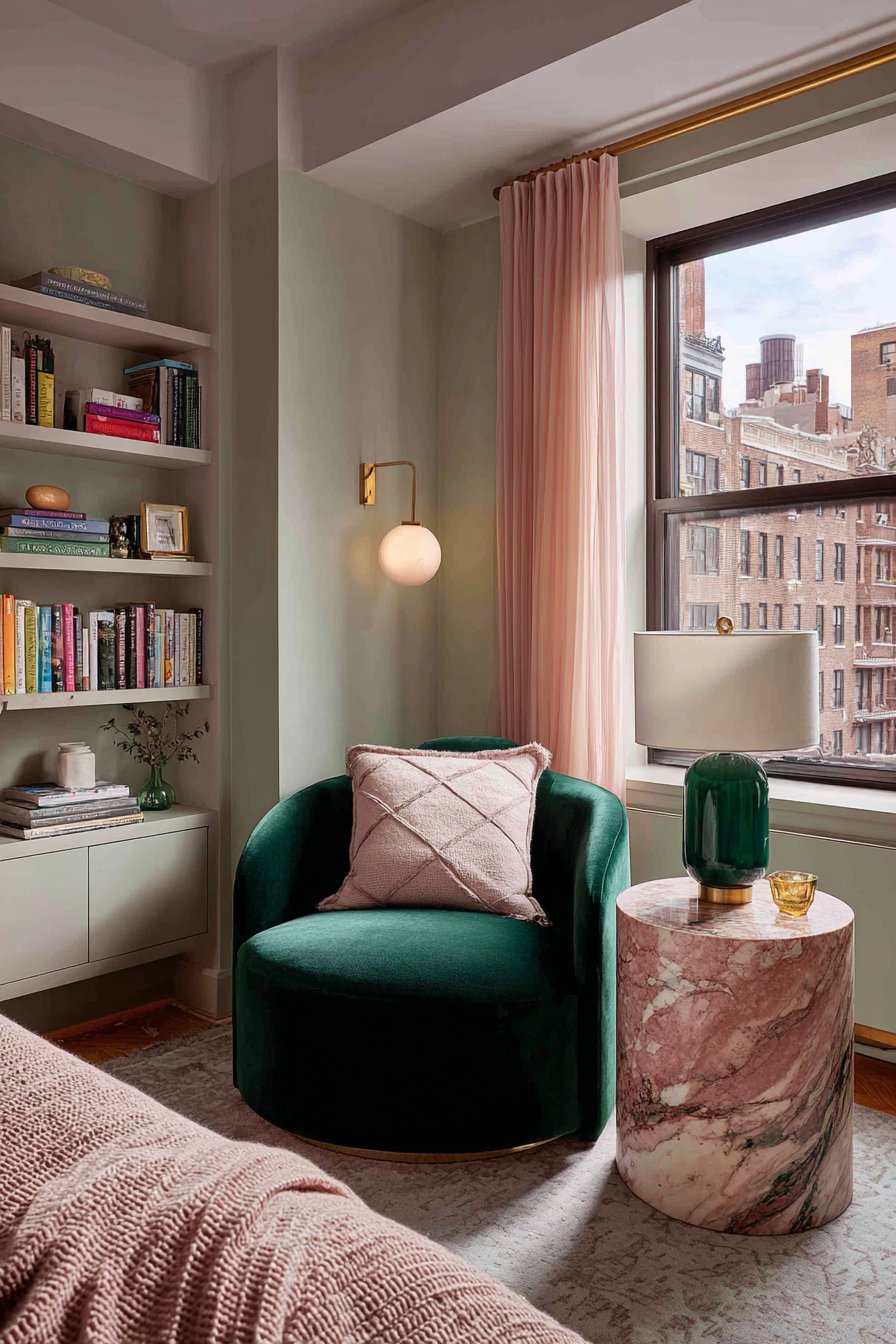
3. Forest Green Reading Nook with Pink Marble Details
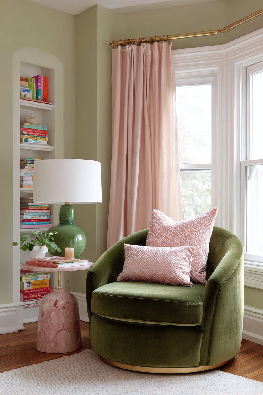
A forest green velvet armchair positioned near a tall window creates an intimate reading corner. The rich jewel tone adds depth and luxury to the space. A pink geometric throw pillow provides the perfect color accent. The contrast between the solid chair and patterned pillow adds visual intrigue.
The round side table features brass construction with a pink marble top. This combination of materials elevates the design significantly. A table lamp with green ceramic base and white linen shade sits atop the surface. Walls painted in soft pistachio green provide a calming backdrop that doesn’t compete with the darker chair.
A small white bookshelf holds colorful book spines nearby. Sheer blush pink curtains filter natural light creating a warm glow. The filtered illumination interacts beautifully with the velvet chair texture. The marble surface reflects light adding dimension to the corner.
This reading nook demonstrates how strategic furniture placement maximizes natural light. The window proximity ensures comfortable daytime reading. The lamp provides necessary evening illumination. Together they create a functional space for all hours.
Key Design Tips:
- Position velvet furniture near windows to showcase texture in natural light
- Combine brass and marble for sophisticated material mixing
- Use geometric patterns on solid furniture for visual interest
- Select sheer curtains in accent colors for cohesive light filtering
- Paint walls in lighter shades when using dark furniture pieces
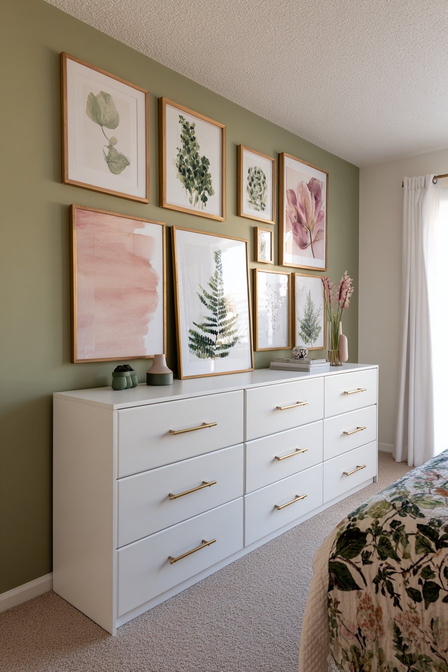
4. Gallery Wall Showcase with Mixed Frame Finishes
A thoughtfully curated gallery wall features mixed frame finishes including gold, white, and natural wood. The variety prevents monotony while maintaining cohesion. Green botanical prints, pink abstract watercolors, and vintage floral illustrations combine both colors harmoniously. The balanced asymmetrical arrangement creates professional polish.
Pale sage walls provide the perfect backdrop for this art collection. The neutral wall color allows the artwork to command attention. Below the gallery, a low white dresser with brass drawer pulls anchors the display. Small decorative items in coordinating green and pink tones sit atop the surface.
The frame mixing technique deserves careful attention. Gold frames add warmth and traditional elegance. White frames provide clean modern contrast. Natural wood introduces organic warmth. Together they create depth while maintaining unity through the artwork subjects.
The dresser styling complements the wall display without competing for attention. Brass hardware echoes the gold frames above. The white finish keeps the lower portion light and airy. Decorative accessories reinforce the color story throughout the room.
Key Design Tips:
- Mix three frame finishes for visual interest without chaos
- Arrange gallery walls asymmetrically for contemporary appeal
- Choose artwork that shares color themes rather than exact shades
- Paint walls in lighter tones to showcase colorful art collections
- Style furniture below galleries to complement without competing
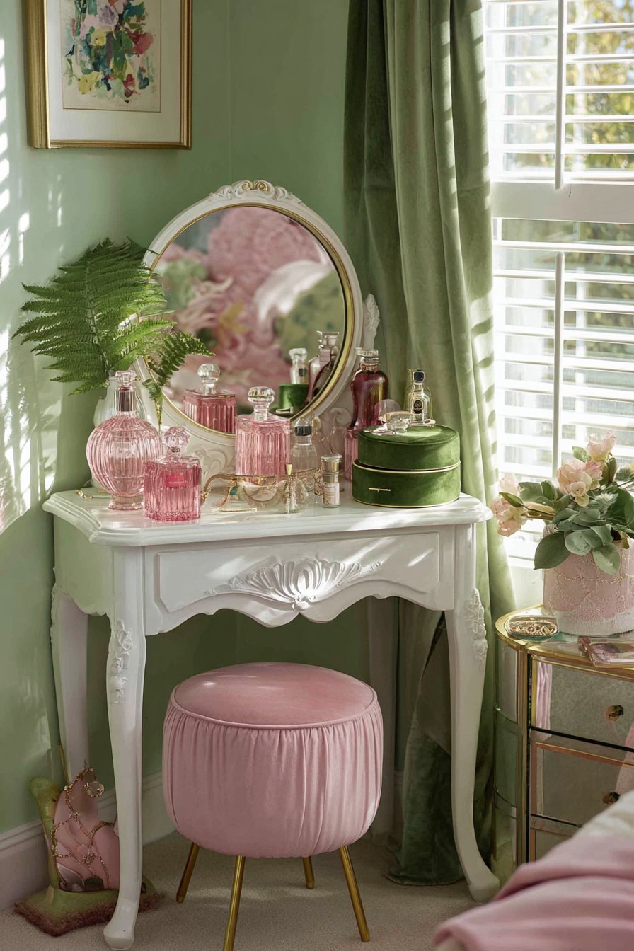
5. Vintage Vanity with Feminine Accessories
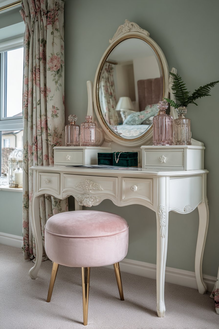
A white vintage-style dressing table with carved details creates a dedicated beauty area. The large round mirror features a gold frame that adds glamour. Pink glass perfume bottles, green velvet jewelry boxes, and a small potted fern adorn the surface. The accessories tell a story of refined femininity.
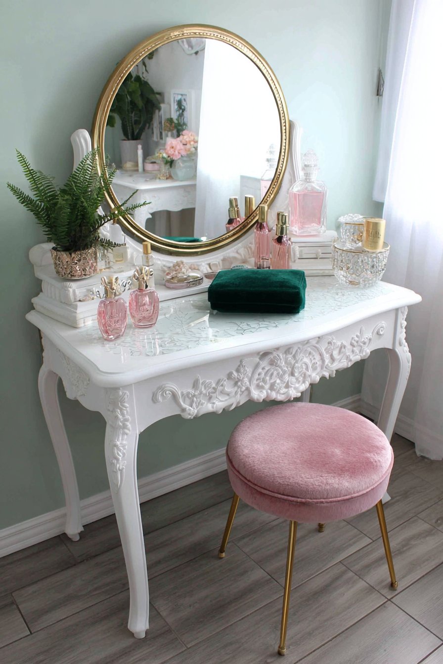
Soft mint green walls create a fresh backdrop for this vanity arrangement. A pink velvet cushioned stool with gold legs sits beneath the table. The coordinated metallic accents throughout tie the elements together beautifully. Natural window light from the side creates gentle illumination perfect for makeup application.
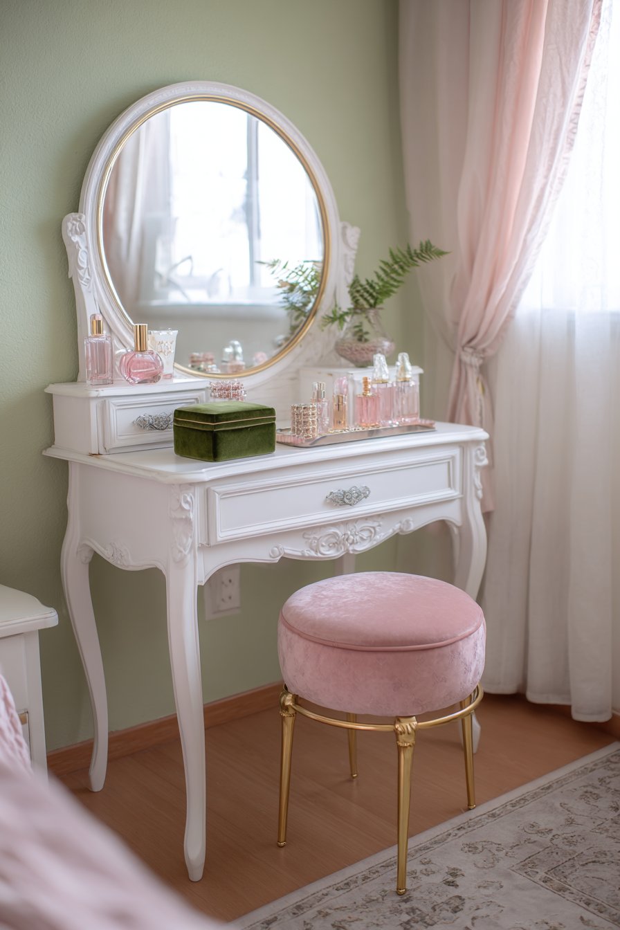
The reflective surfaces in this space multiply the light beautifully. The mirror bounces light throughout the room. Glass bottles catch and refract the natural illumination. These details create sparkle and dimension.
Velvet appears twice in this vignette on the jewelry box and stool. The fabric adds luxury and softness. The green velvet provides color connection to the walls. The pink velvet reinforces the secondary color theme.
Key Design Tips:
- Position vanities near windows for optimal natural makeup lighting
- Choose vintage furniture with carved details for character
- Display accessories in small groups for curated styling
- Coordinate metallic finishes throughout for cohesive design
- Add living plants to beauty areas for freshness
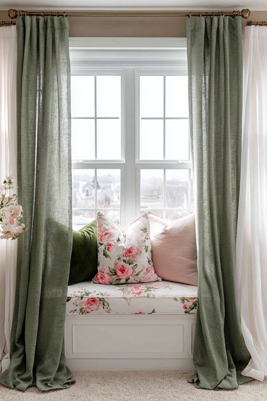
6. Layered Window Treatments with Dimensional Depth
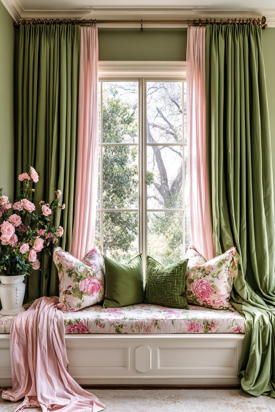
Floor-to-ceiling sage green curtains in heavy linen create impressive vertical lines. The substantial fabric features subtle texture that adds depth. Sheer blush pink voile panels underneath create dimensional layering. This combination offers both privacy and light control.
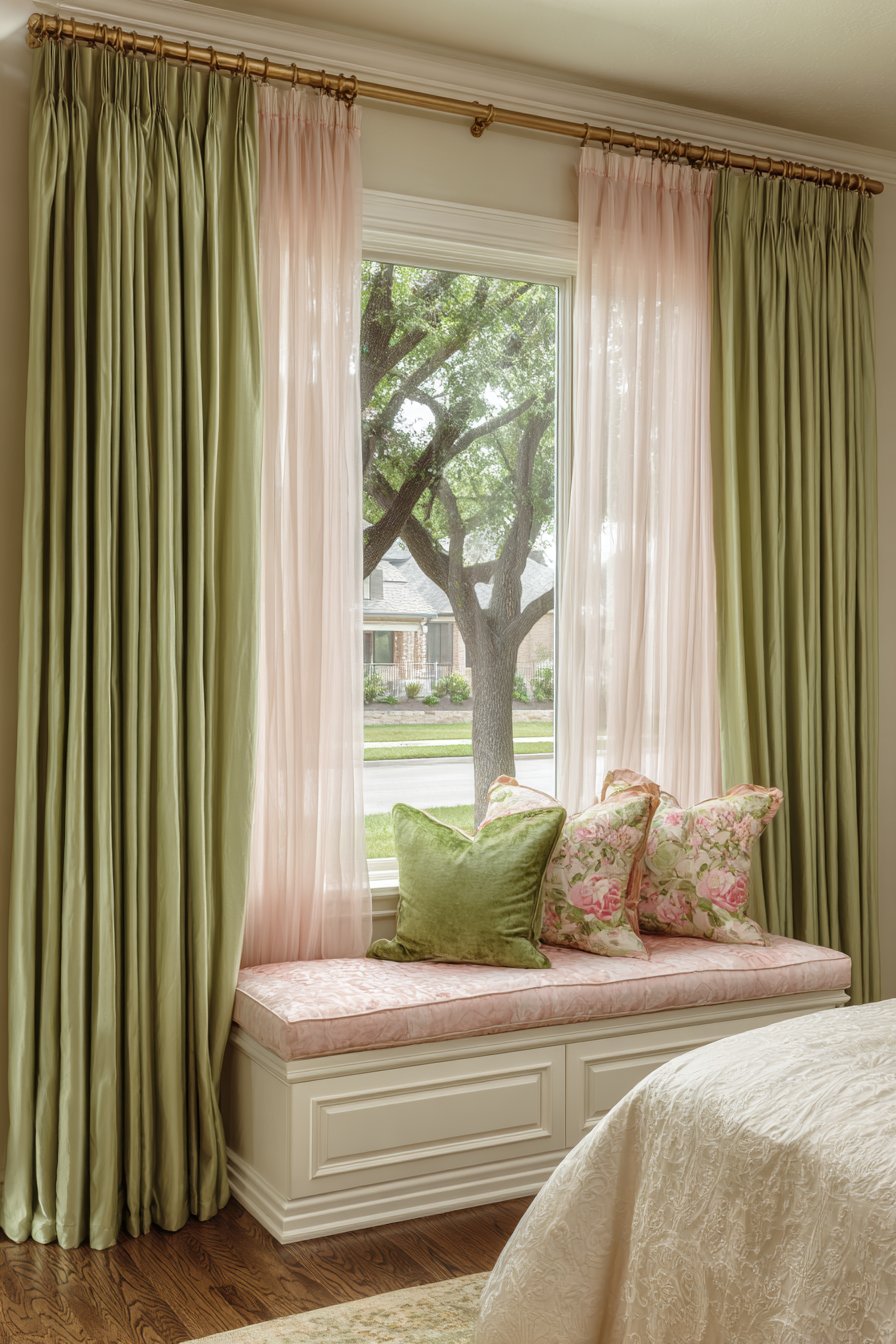
White painted curtain rods with brass finials span a large window opening. The hardware adds traditional elegance while remaining understated. The window treatments frame a cushioned window seat beautifully. Pink floral cushions and green throw pillows adorn the seat.
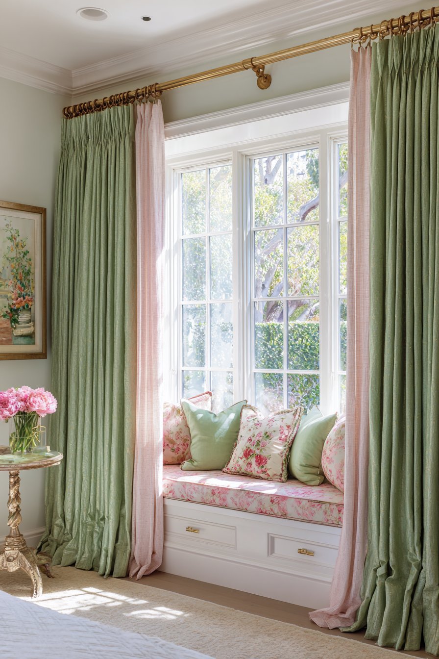
Natural light filters through the layered fabrics creating a soft rosy-green glow. The color mixing happens naturally through the sheer overlay. This lighting effect changes throughout the day creating dynamic atmosphere. The heavy outer curtains can close for complete darkness when needed.
The window seat extends the functional space within the bedroom. The cushioning provides comfortable seating for reading or relaxing. The coordinating pillows continue the color story. The framed view becomes a focal point.
Key Design Tips:
- Layer heavy and sheer curtains for maximum flexibility
- Install floor-to-ceiling treatments to emphasize room height
- Choose textured fabrics over flat for visual interest
- Add window seats beneath large windows for functionality
- Select hardware finishes that coordinate with room accents
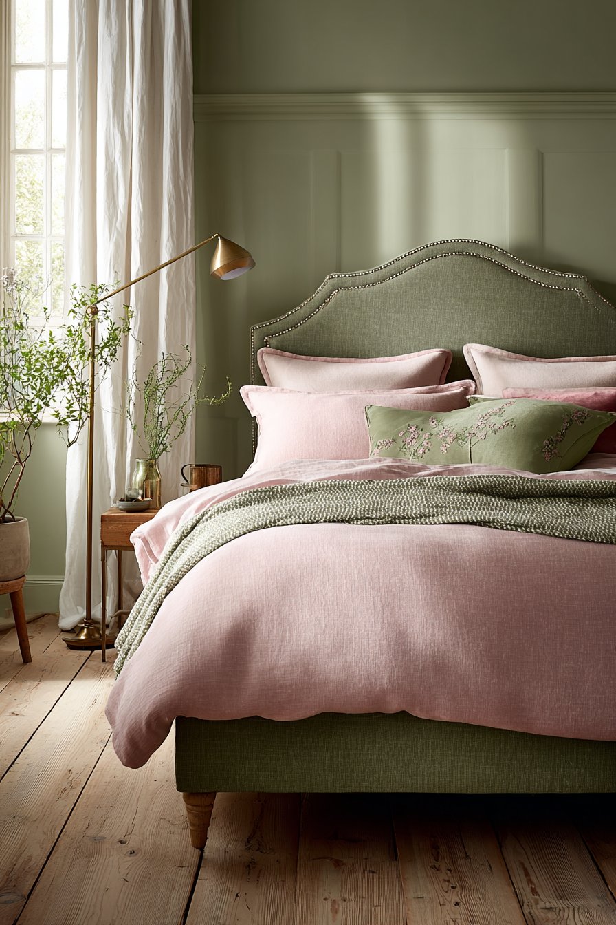
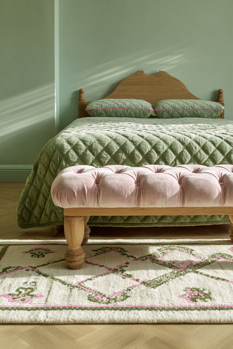
7. Tufted Bench with Quilted Coverlet Coordination
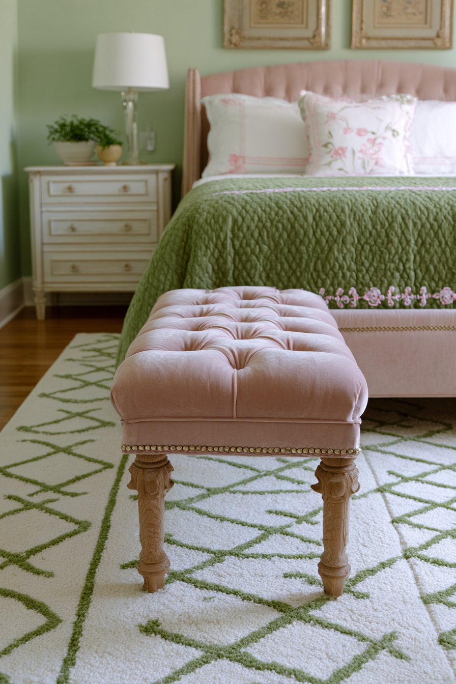
A tufted bench upholstered in dusty pink velvet sits at the foot of the bed. The rolled arms and natural oak legs add traditional charm. Above, the bed displays a forest green quilted coverlet with pink embroidered border detail. The coordination between bench and bedding creates intentional design.
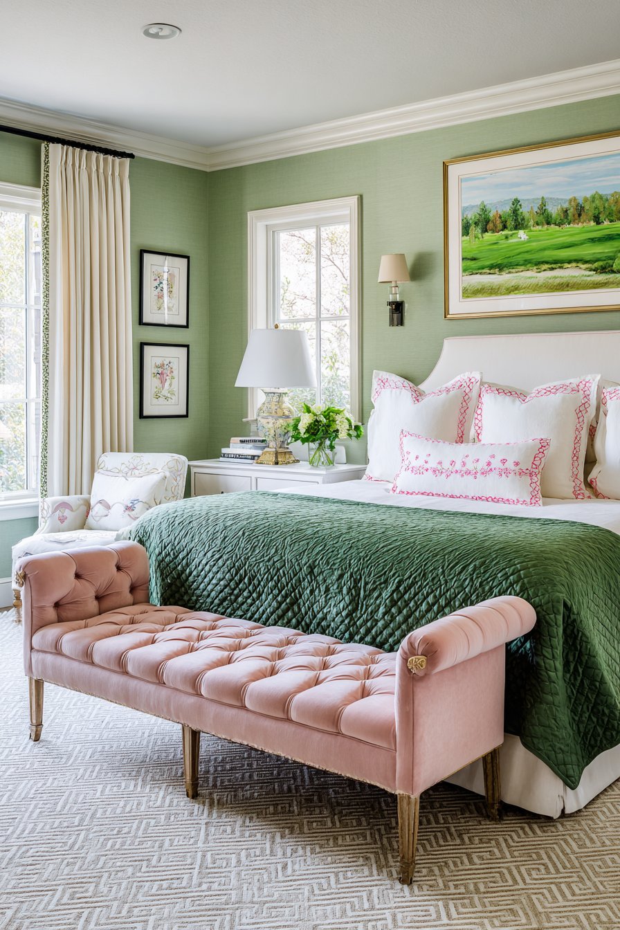
Pale celadon green walls provide a subtle backdrop that doesn’t compete. A geometric area rug in cream with green and pink accents grounds the furniture arrangement. The neutral base allows the colorful pieces to shine. Soft morning light creates gentle shadows that enhance the velvet texture.
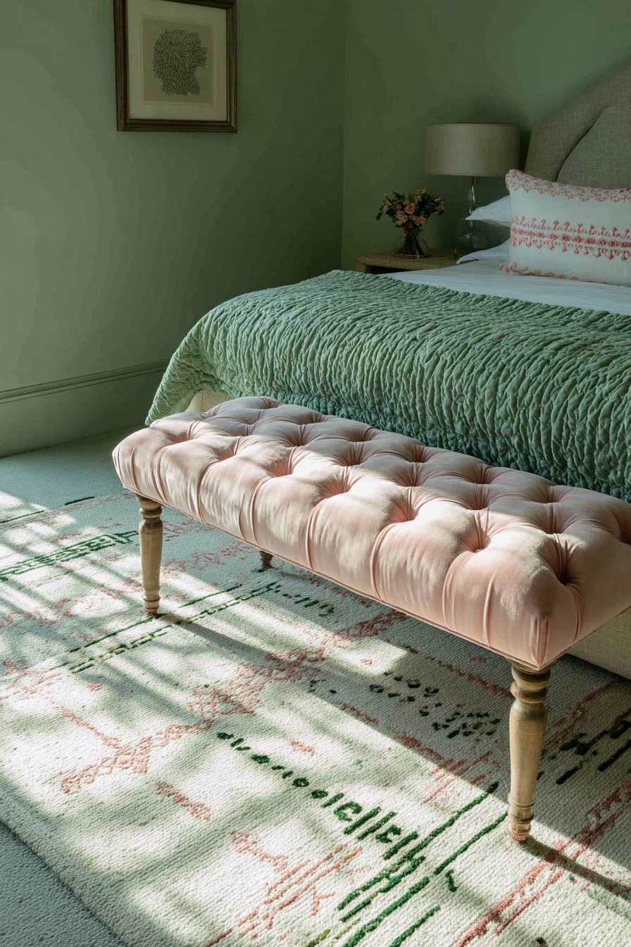
The quilted coverlet adds warmth both visually and physically. The stitching pattern creates surface interest and dimension. The pink embroidered border provides the perfect color bridge. This detail ties the separate furniture pieces together beautifully.
The bench serves multiple functions in this bedroom layout. It provides seating for putting on shoes. It offers a place to lay out tomorrow’s outfit. It adds a finishing touch to the bed arrangement.
Key Design Tips:
- Place benches at bed feet for both function and aesthetics
- Choose quilted bedding for texture and warmth
- Use embroidered borders to connect furniture colors
- Ground seating areas with geometric rugs in neutral bases
- Select wood tones that complement rather than match exactly
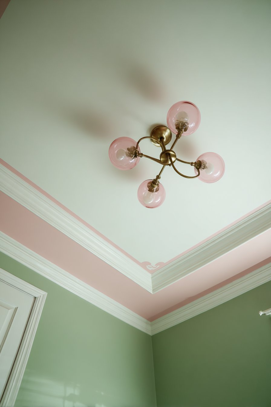
8. Blush Pink Ceiling with Sage Green Walls
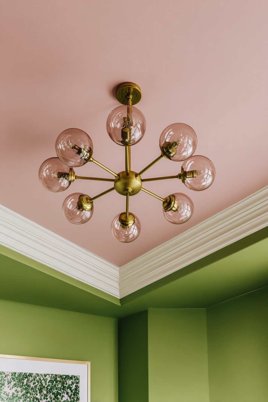
A soft blush pink painted ceiling creates unexpected drama overhead. White crown molding provides clean separation from sage green walls below. This reverse color application defies convention beautifully. The pink ceiling reflects warm light throughout the entire space.
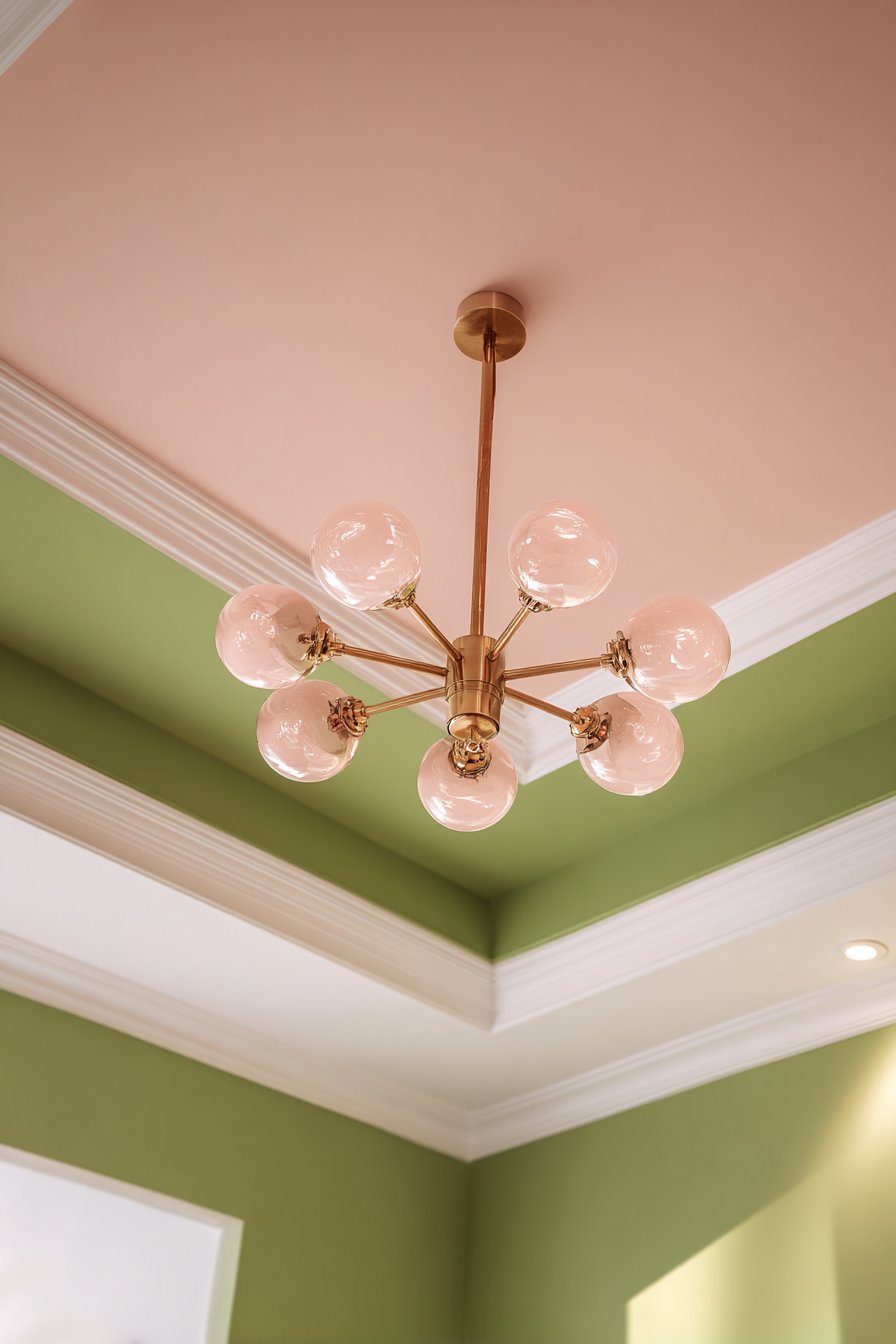
A modern chandelier with brass frame and pink-tinted glass globes hangs centrally. The fixture becomes both functional lighting and sculptural art. The pink glass reinforces the ceiling color while adding sparkle. The brass coordinates with other metallic accents throughout the room.
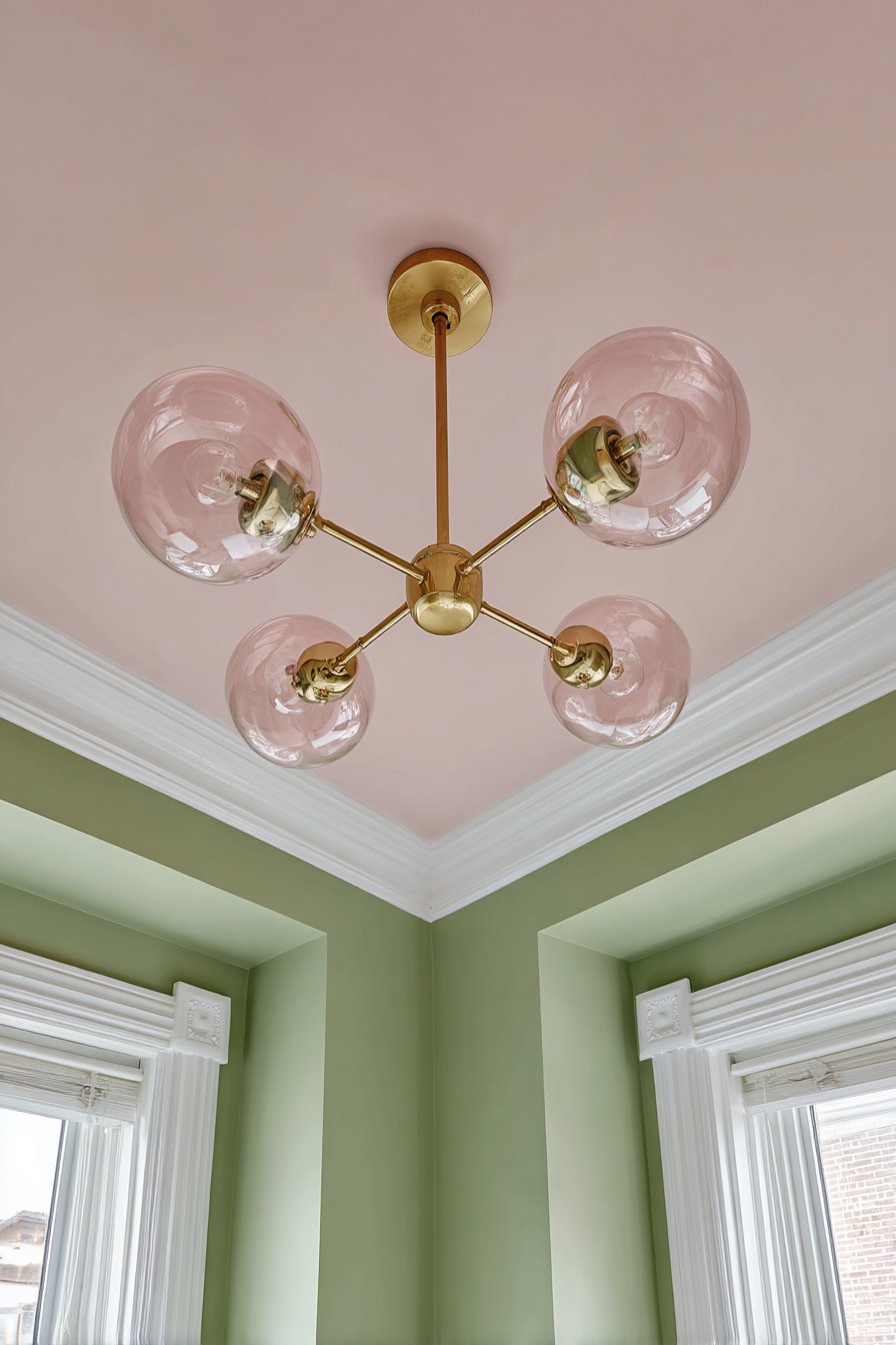
The psychological impact of the colored ceiling deserves recognition. The overhead warmth creates an intimate enveloping atmosphere. The space feels cozier without reducing the actual dimensions. The unexpected placement surprises and delights visitors.
The architectural details gain prominence through the contrasting colors. Crown molding stands out as white against both colors. The ceiling height appears more dramatic. The walls seem taller through the upward color transition.
Key Design Tips:
- Paint ceilings in accent colors for unexpected sophistication
- Use crown molding to create clean color separation
- Choose light fixtures with colored glass for cohesion
- Consider how ceiling colors reflect light downward
- Apply darker wall colors below lighter ceilings for balance
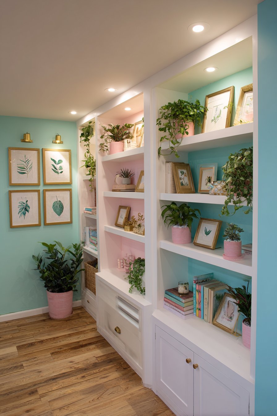
9. Built-In Shelving with Curated Display
White built-in shelving with adjustable shelves creates custom storage solutions. The curated display includes green hardcover books, pink ceramic planters with trailing pothos, and white picture frames with botanical prints. Decorative objects in brass add metallic sparkle throughout the arrangement.
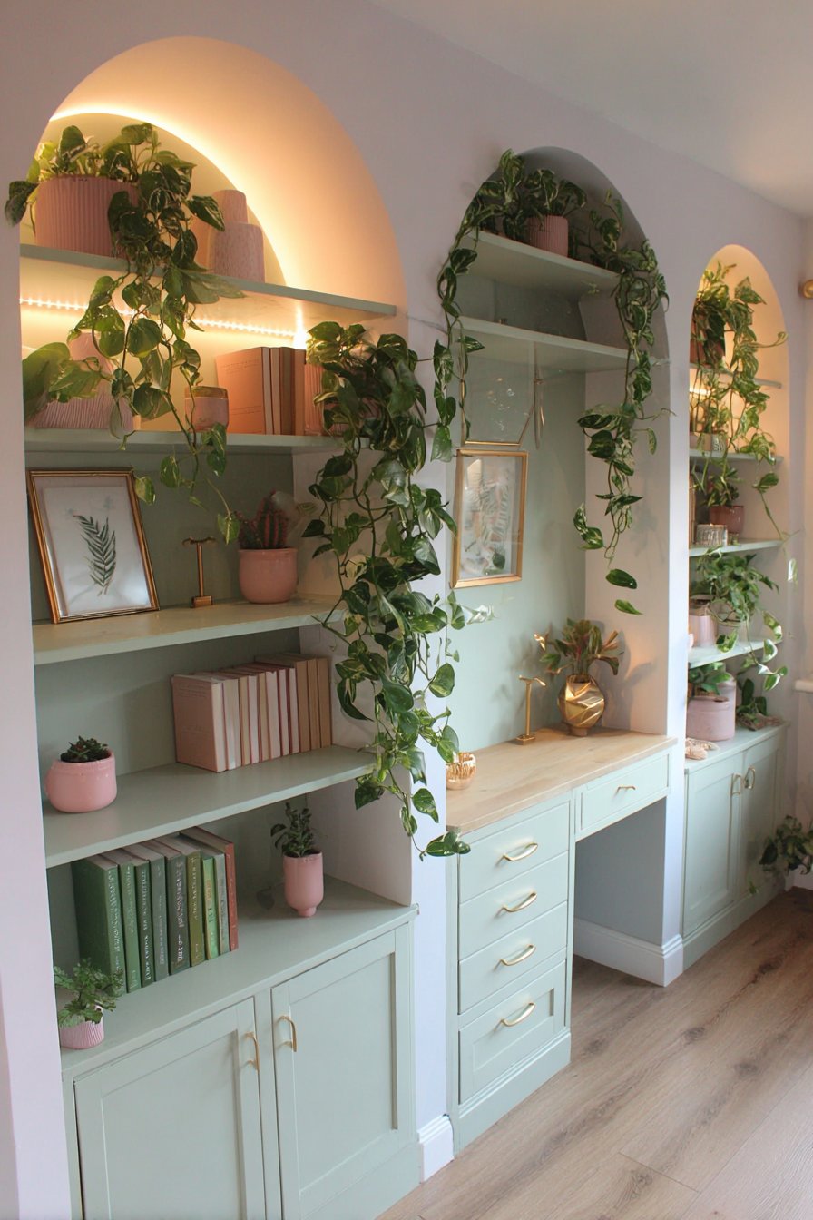
Integrated LED strip lighting provides gentle illumination for the displays. The even lighting showcases each item beautifully. The shelving unit flanks a small desk area painted in soft mint. Natural oak flooring grounds the entire space.
The styling of built-in shelving requires thoughtful curation. Color coordination prevents visual chaos. Varied heights create rhythm across the shelves. Empty space allows the eye to rest between grouped items.
The botanical theme continues through books, prints, and living plants. The repetition reinforces the design narrative. The green plants add life and freshness. The pink planters provide necessary color accents.
Key Design Tips:
- Install LED strip lighting in built-ins for professional display
- Arrange items in color-coordinated groups for cohesion
- Leave some shelf space empty to prevent overcrowding
- Mix books with decorative objects for varied texture
- Choose planters in accent colors to reinforce the palette
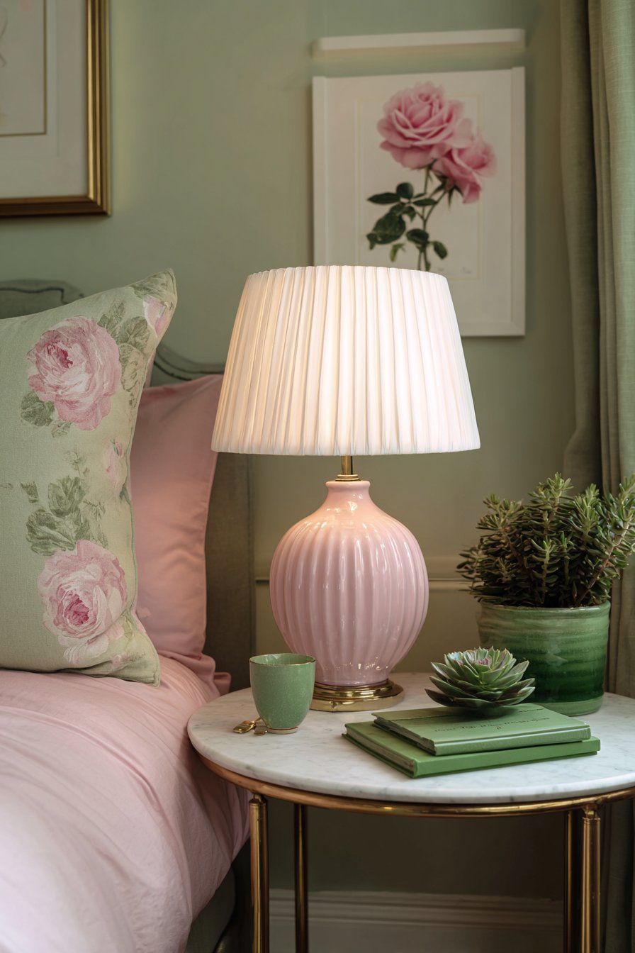
10. Nightstand Styling with Marble and Brass
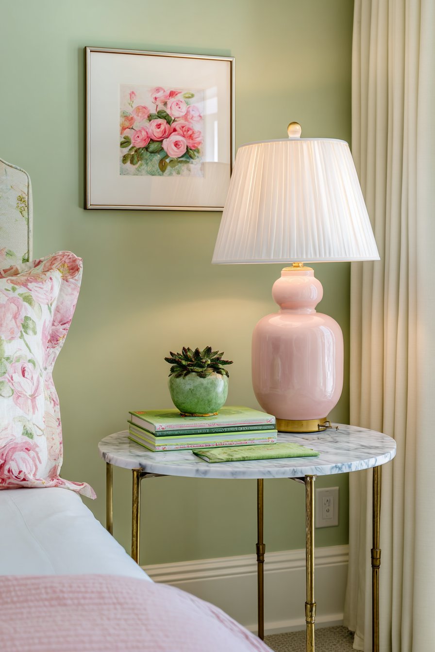
A round marble-topped bedside table with brass legs creates sophisticated simplicity. The pink marble introduces subtle color while maintaining elegance. A pink ceramic table lamp with white pleated shade provides necessary task lighting. A small succulent in green glazed pot adds living beauty.
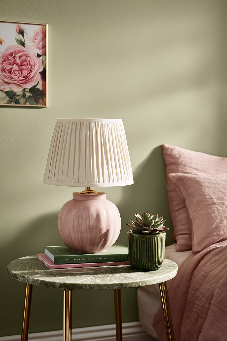
Behind the nightstand, soft sage green wall paint displays a single framed print of pink roses. The bed partially visible shows pink linen sheets continuing the color story. Natural side lighting creates warm ambiance throughout the vignette.
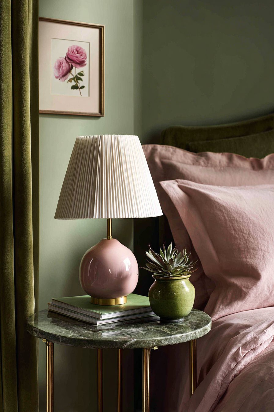
The stacked books feature green and pink spines that coordinate perfectly. This detail demonstrates attention to even the smallest elements. The varied book heights create visual interest. The horizontal stacking feels more relaxed than vertical arrangement.
The marble selection proves important to this design’s success. Pink marble adds color without boldness. The natural veining provides organic pattern. The polished surface reflects light adding dimension.
Key Design Tips:
- Choose nightstands with marble tops for luxury and durability
- Stack books horizontally for casual sophisticated styling
- Select lamp bases that match your primary accent color
- Add small plants to bedside tables for freshness
- Limit bedside items to essentials for clean styling
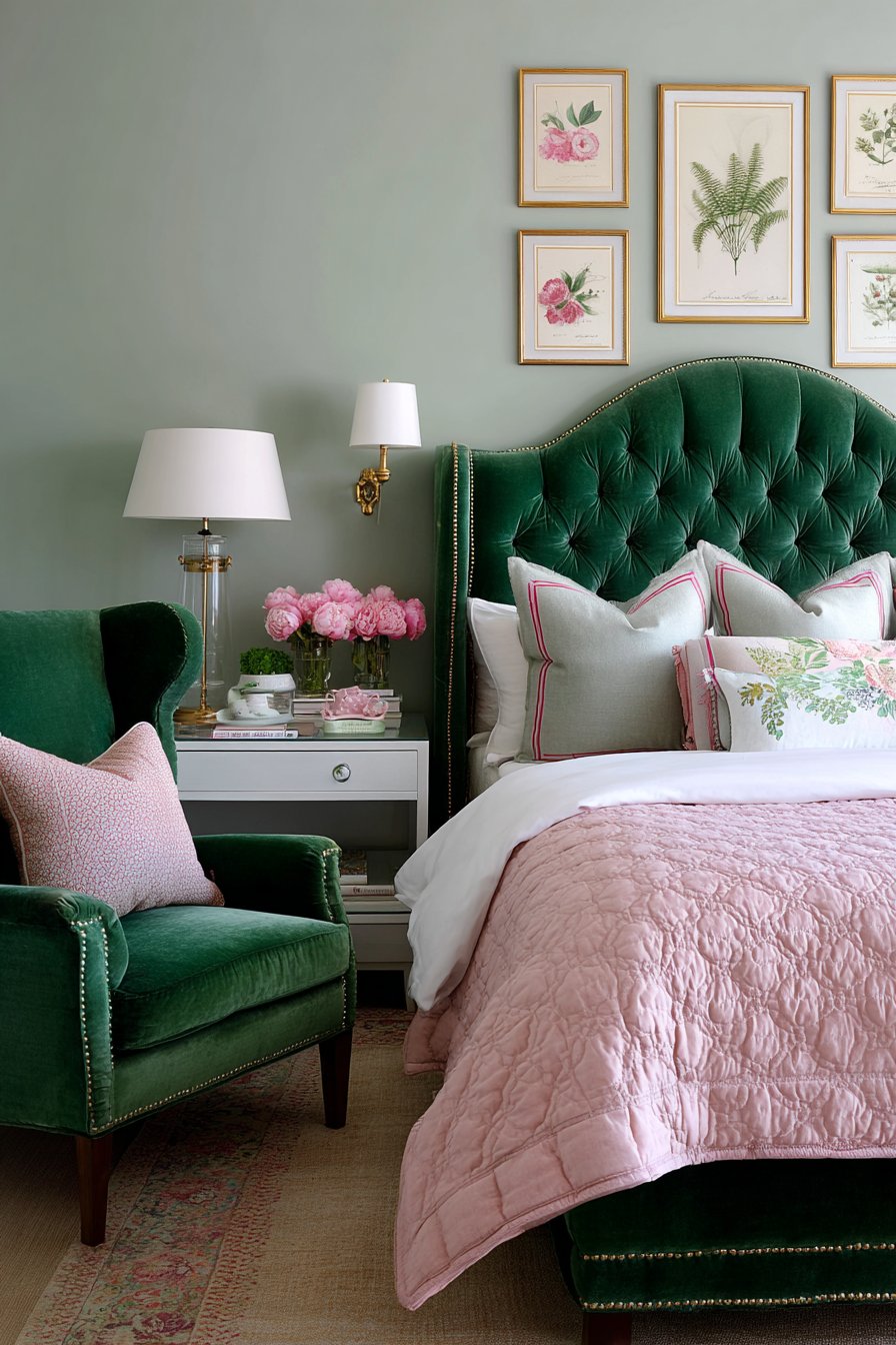
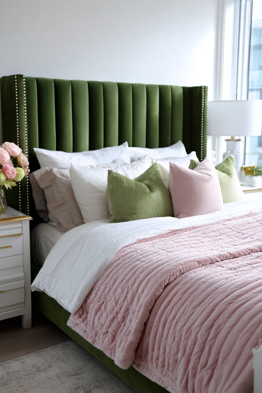
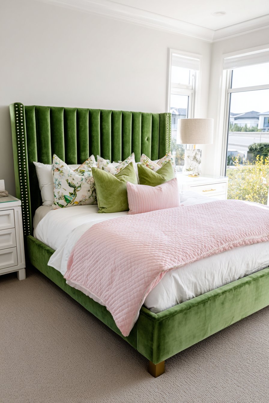
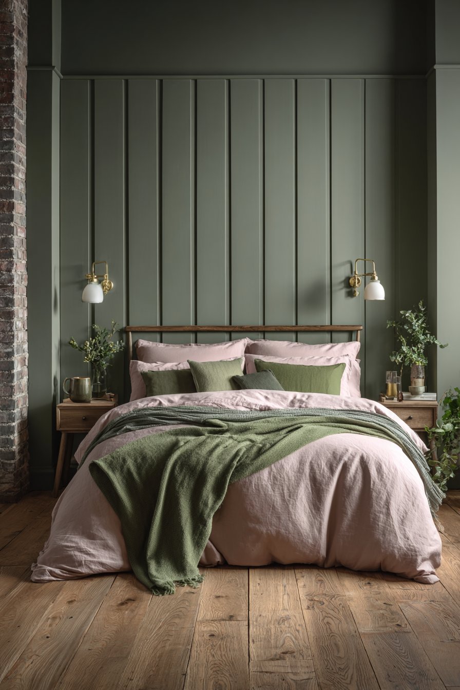
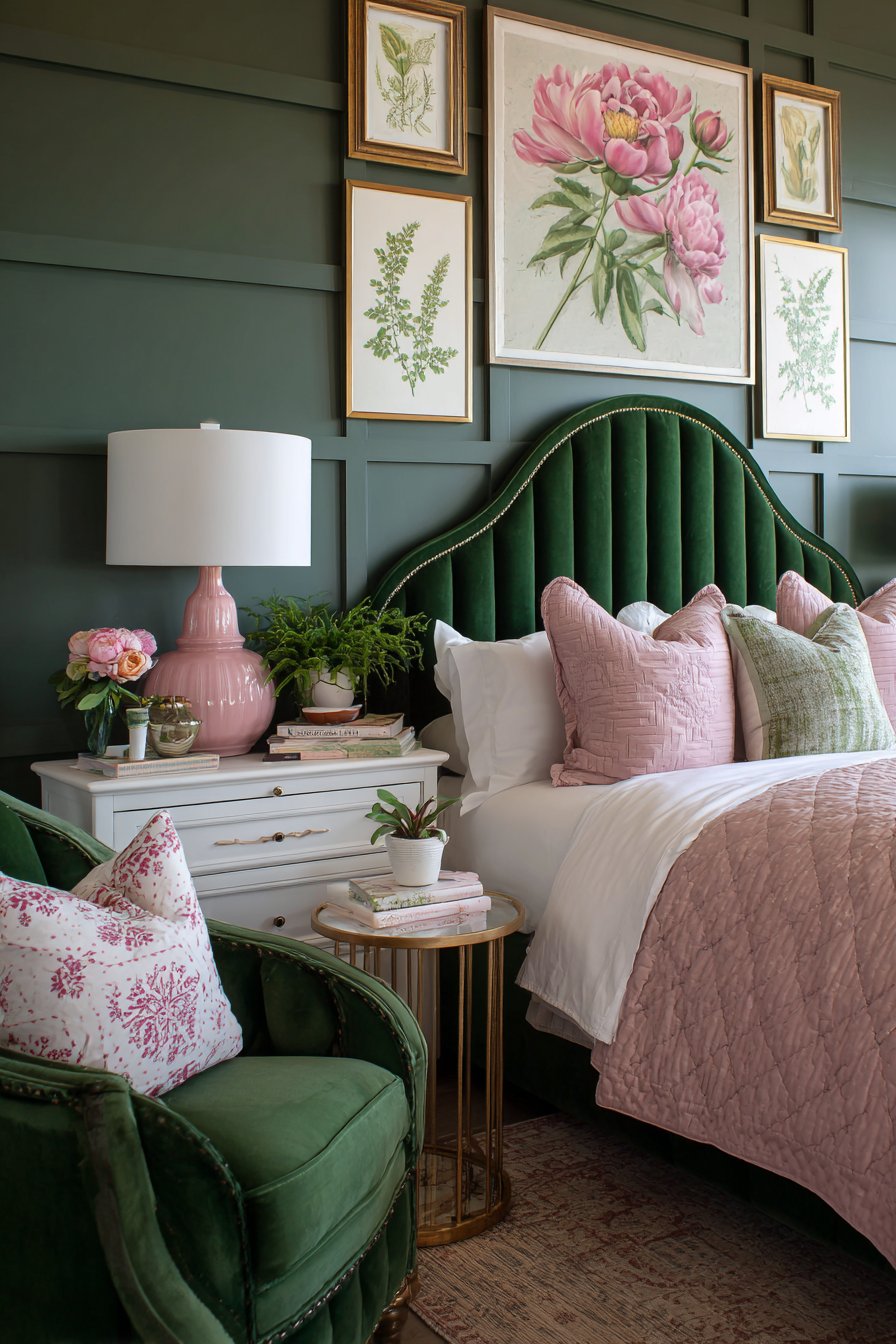
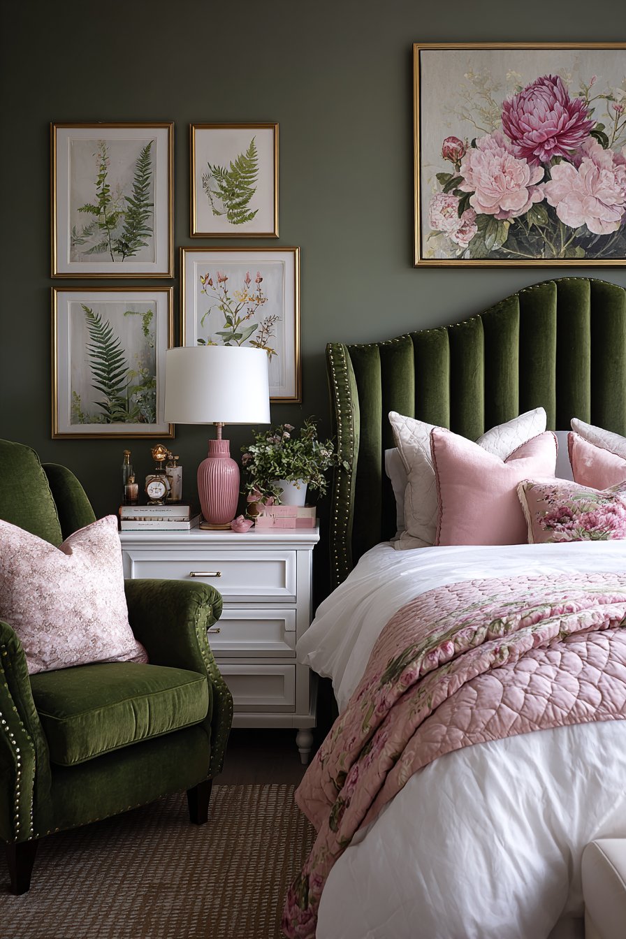
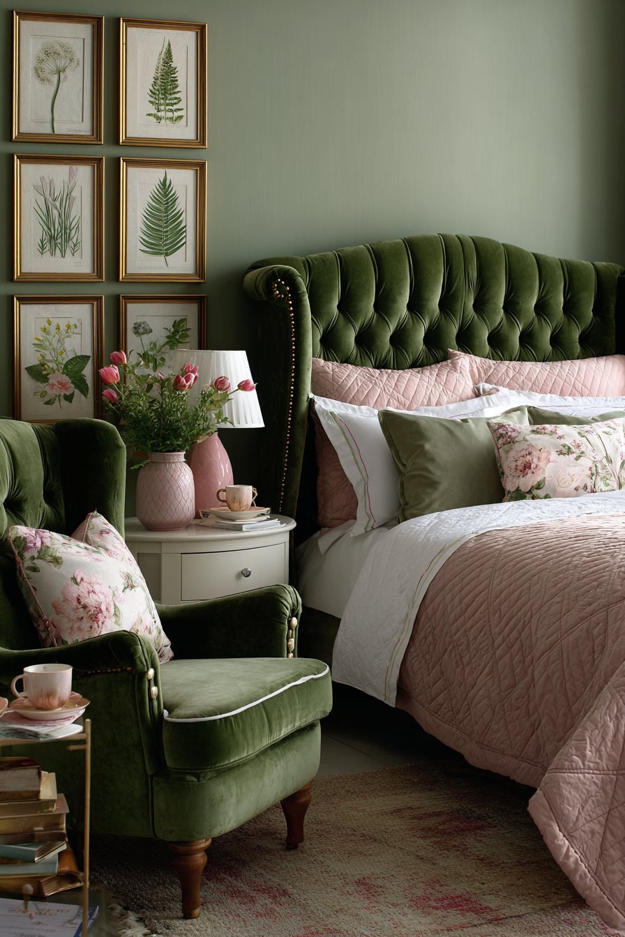
11. Channel Tufted Emerald Headboard Statement
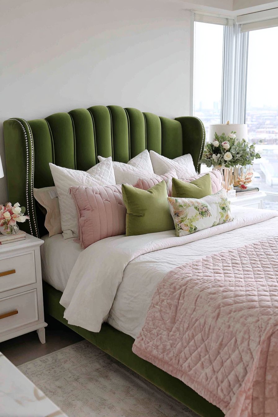
An emerald green velvet headboard with vertical channel tufting commands immediate attention. Brass nail head trim adds traditional detailing along the edges. The bed becomes the undeniable focal point. Layered bedding includes white linen base, blush pink quilted coverlet, and mixed pillows in various green and pink shades.
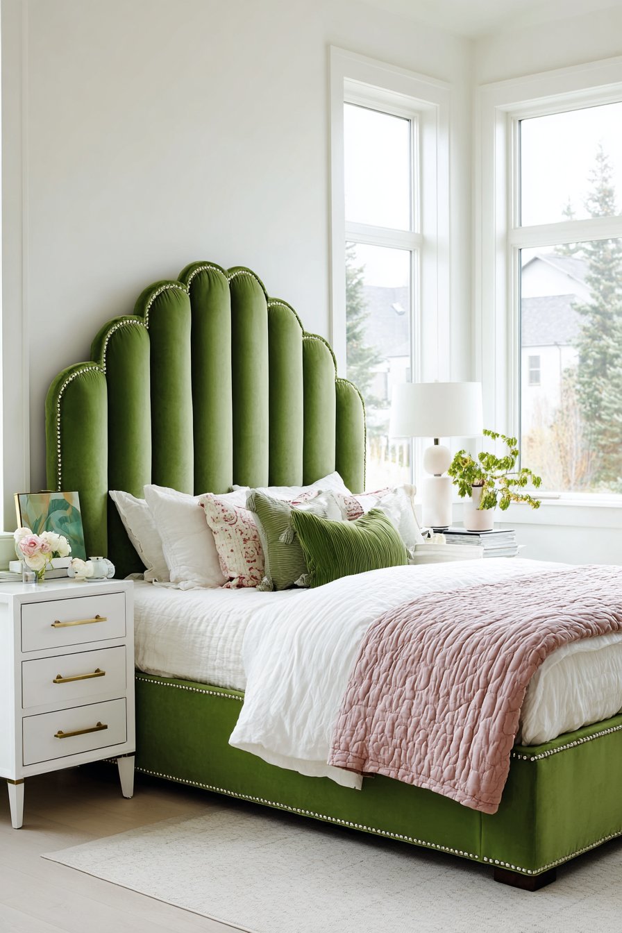
White nightstands with gold hardware flank the bed symmetrically. The matching pieces create balance and order. Soft white walls allow the bold headboard to dominate without competition. Natural window light highlights the luxurious velvet texture beautifully.
The pillow arrangement deserves special attention in this design. Varied shades from pale to saturated create depth. Different textures including velvet, linen, and cotton add dimension. The careful curation prevents the abundance from appearing cluttered.
The vertical tufting on the headboard elongates the wall visually. The channels create shadow lines that add architectural interest. The velvet catches light differently across the surface. These details make the headboard sculptural and dynamic.
Key Design Tips:
- Invest in statement headboards as room focal points
- Choose channel tufting over button tufting for modern appeal
- Layer bedding in complementary shades for richness
- Keep walls neutral when featuring bold upholstered furniture
- Add brass nail head trim for traditional refinement
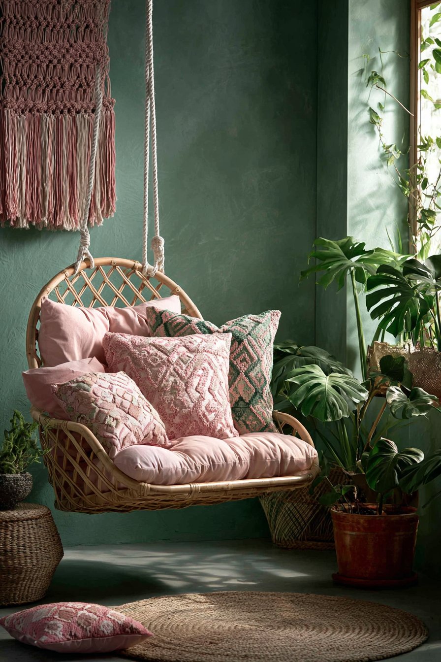
12. Bohemian Hanging Chair Corner
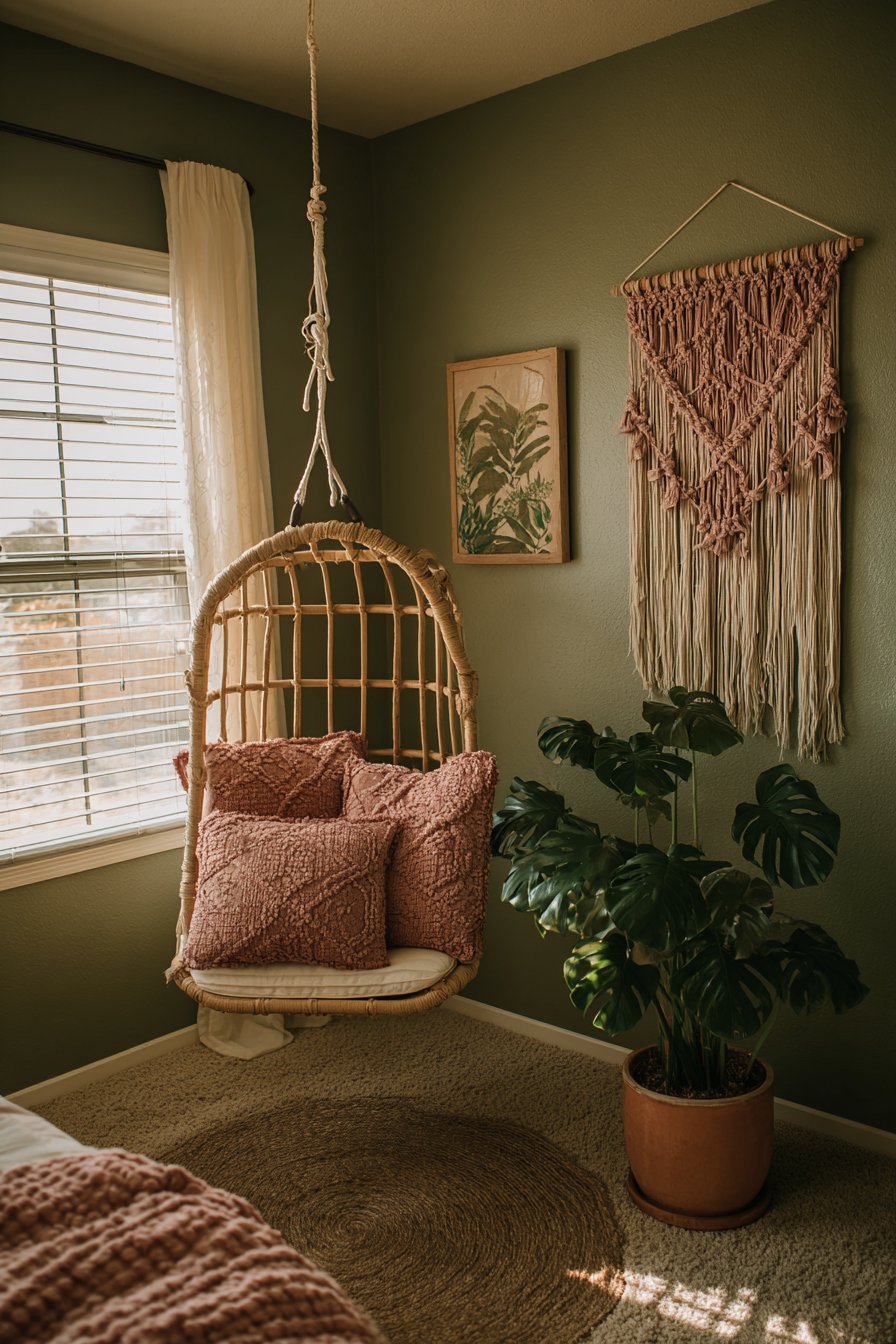
A hanging rattan chair suspended from the ceiling by white rope creates playful sophistication. Pink and green patterned cushions fill the seat invitingly. Beneath, a small round jute rug defines the cozy corner. The natural materials reinforce the bohemian aesthetic.
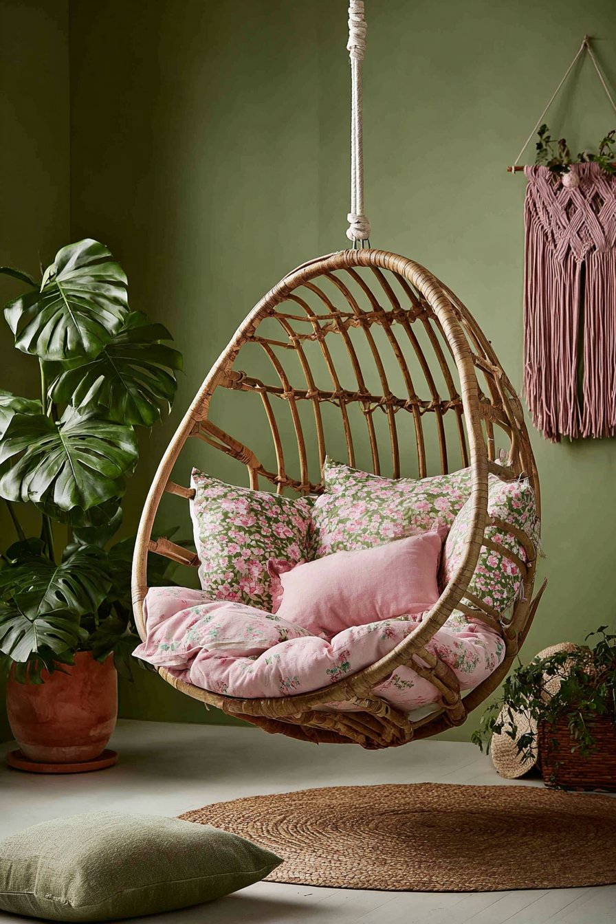
The adjacent wall painted in dusty sage displays macramé wall hanging with pink rope details. The handcrafted textile adds artisanal warmth. A floor plant in terracotta pot with green monstera leaves completes the vignette. Soft natural light creates a relaxed atmosphere perfect for reading or daydreaming.
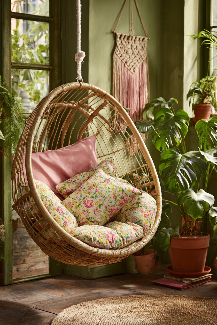
The textural variety in this corner creates rich sensory appeal. Rattan provides organic pattern and structure. Jute adds rustic grounding. Macramé introduces soft sculptural quality. Together they prevent the space from feeling flat or one-dimensional.
The suspended chair offers functionality beyond traditional seating. The gentle swaying motion provides relaxation. The elevated position feels special and separate. Children and adults alike find hanging chairs irresistible.
Key Design Tips:
- Install hanging chairs near windows for optimal natural light
- Layer multiple patterns in coordinating colors for bohemian style
- Use jute rugs to define and ground seating areas
- Add macramé wall hangings for handcrafted warmth
- Choose terracotta planters for authentic bohemian appeal
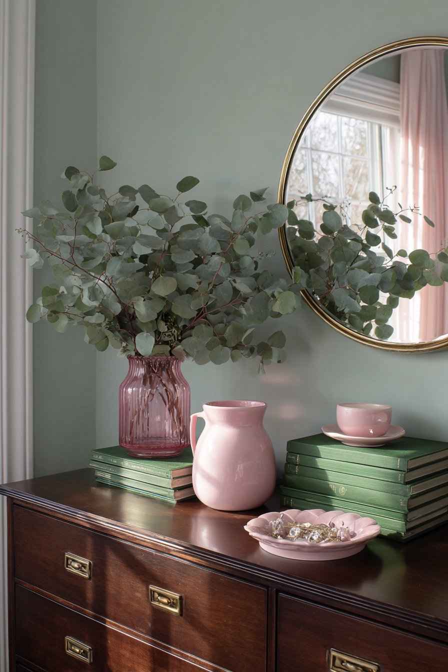
13. Mid-Century Dresser Display Composition
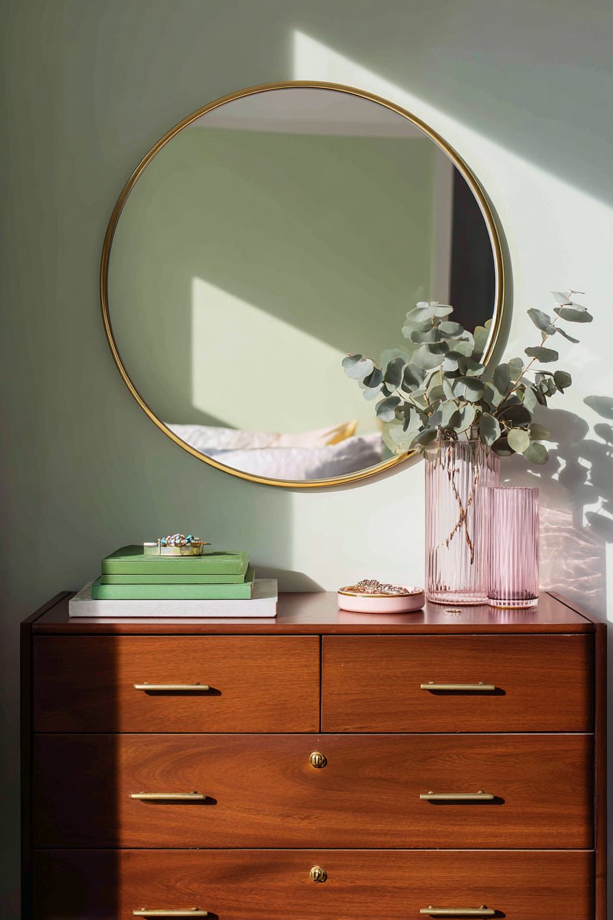
A mid-century modern dresser in walnut finish features brass drawer pulls. The warm wood tone adds natural richness. The dresser top display includes a large round mirror with thin gold frame. Two pink glass vases hold fresh eucalyptus branches bringing nature indoors.
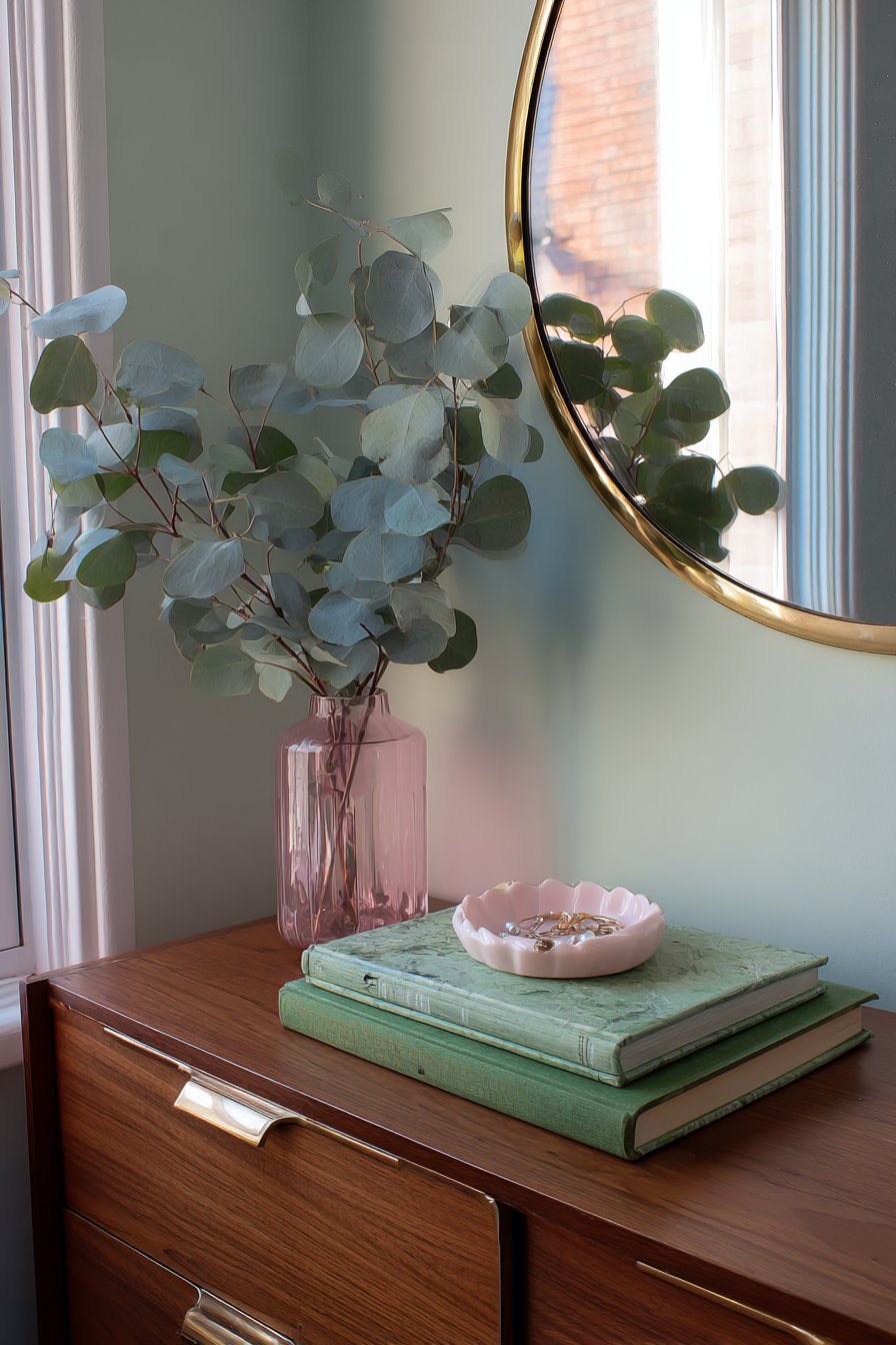
Green vintage books stack horizontally adding literary charm. A jewelry dish in blush ceramic provides functional beauty. The pale mint green wall behind creates a fresh backdrop. Natural morning light from an adjacent window highlights the curated styling perfectly.
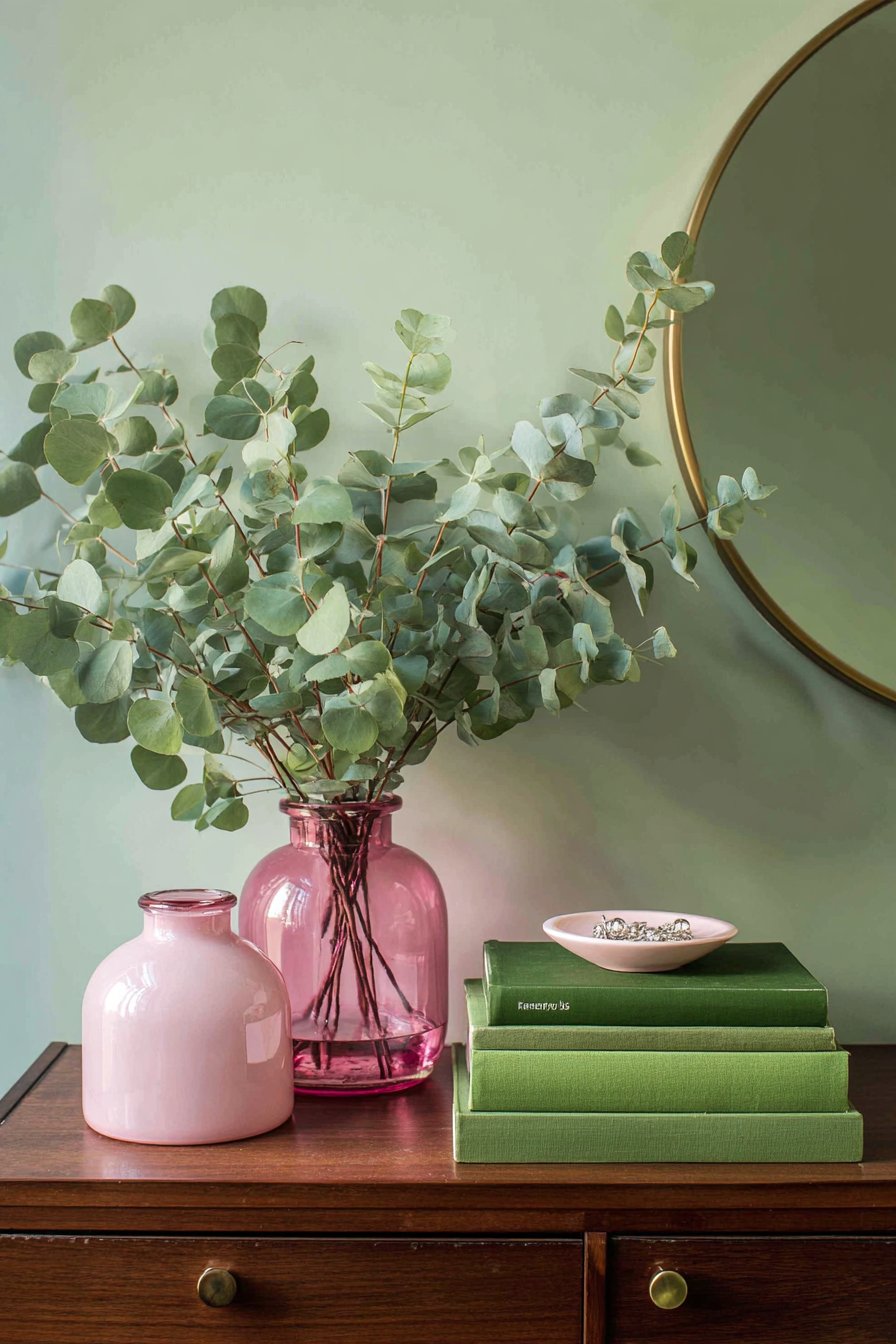
The balanced composition follows design principles carefully. The large mirror provides visual weight on one side. The grouped vases and books balance the other side. The jewelry dish centers the arrangement. This creates pleasing symmetry within an asymmetrical layout.
The material variety prevents the display from appearing boring. Glass provides transparency and reflection. Ceramic offers matte warmth. Metal adds shine and structure. Wood introduces organic grounding. Together they create sophisticated complexity.
Key Design Tips:
- Style dresser tops with grouped items rather than scattered pieces
- Choose mirrors with thin frames to maximize reflective surface
- Add fresh branches for height and natural movement
- Stack vintage books for intellectual and visual interest
- Balance large items with grouped smaller accessories
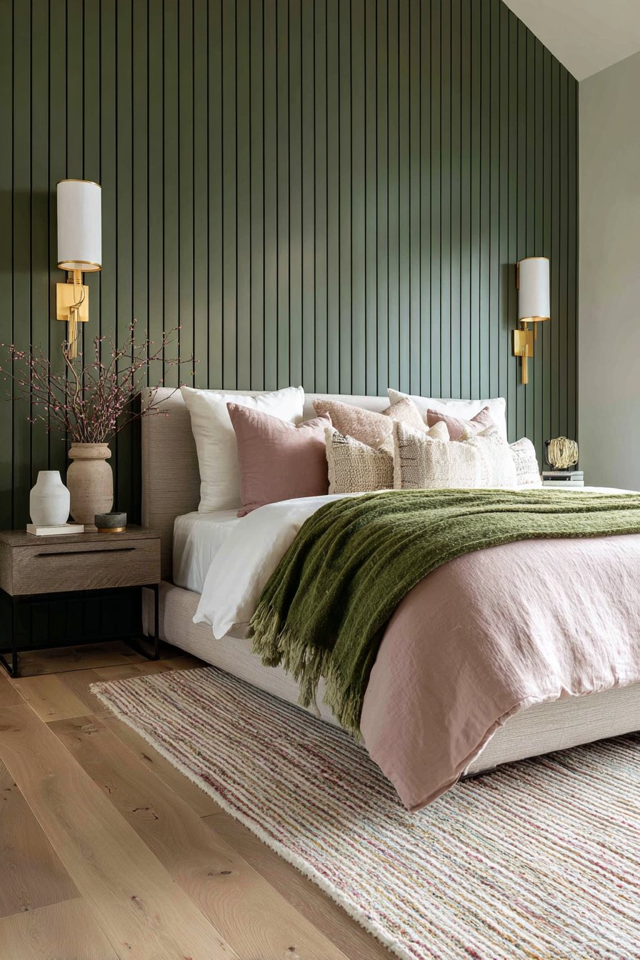
14. Graduated Green Wall Treatment
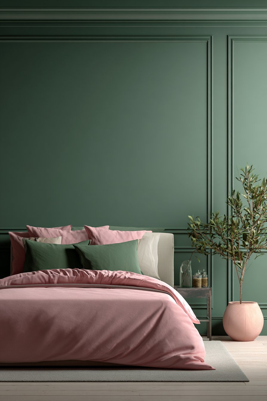
Three shades of green create a dramatic wall treatment with architectural precision. Dark forest green covers the lower third wainscoting. Medium sage fills the main wall area. Pale celadon appears on the upper section near the ceiling. White chair rail molding separates each section cleanly.
Against this graduated backdrop, a simple white bed displays predominantly pink bedding. Green accent pillows provide necessary color connection. The pink bedding pops brilliantly against the green wall treatment. The contrast creates visual excitement without chaos.
This graduated approach adds sophistication beyond single-color walls. The color transition draws the eye upward emphasizing ceiling height. The technique creates architectural interest in rooms lacking original details. The white molding prevents the colors from bleeding together.
The paint selection requires careful consideration for this effect. The shades must relate to each other harmoniously. Too much contrast creates jarring transitions. Too little contrast wastes the effort. Testing samples together before committing proves essential.
Key Design Tips:
- Use three related shades for graduated wall treatments
- Install chair rail molding to create clean color separation
- Paint lighter shades higher to emphasize ceiling height
- Keep bedding simple when walls provide visual interest
- Test paint samples together before making final selections
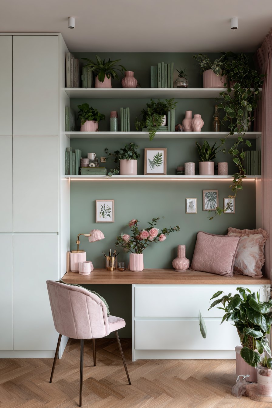
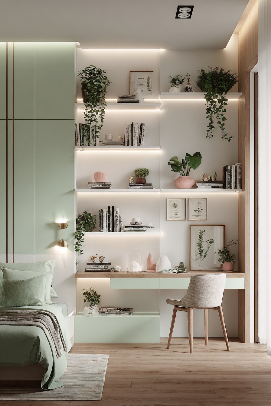
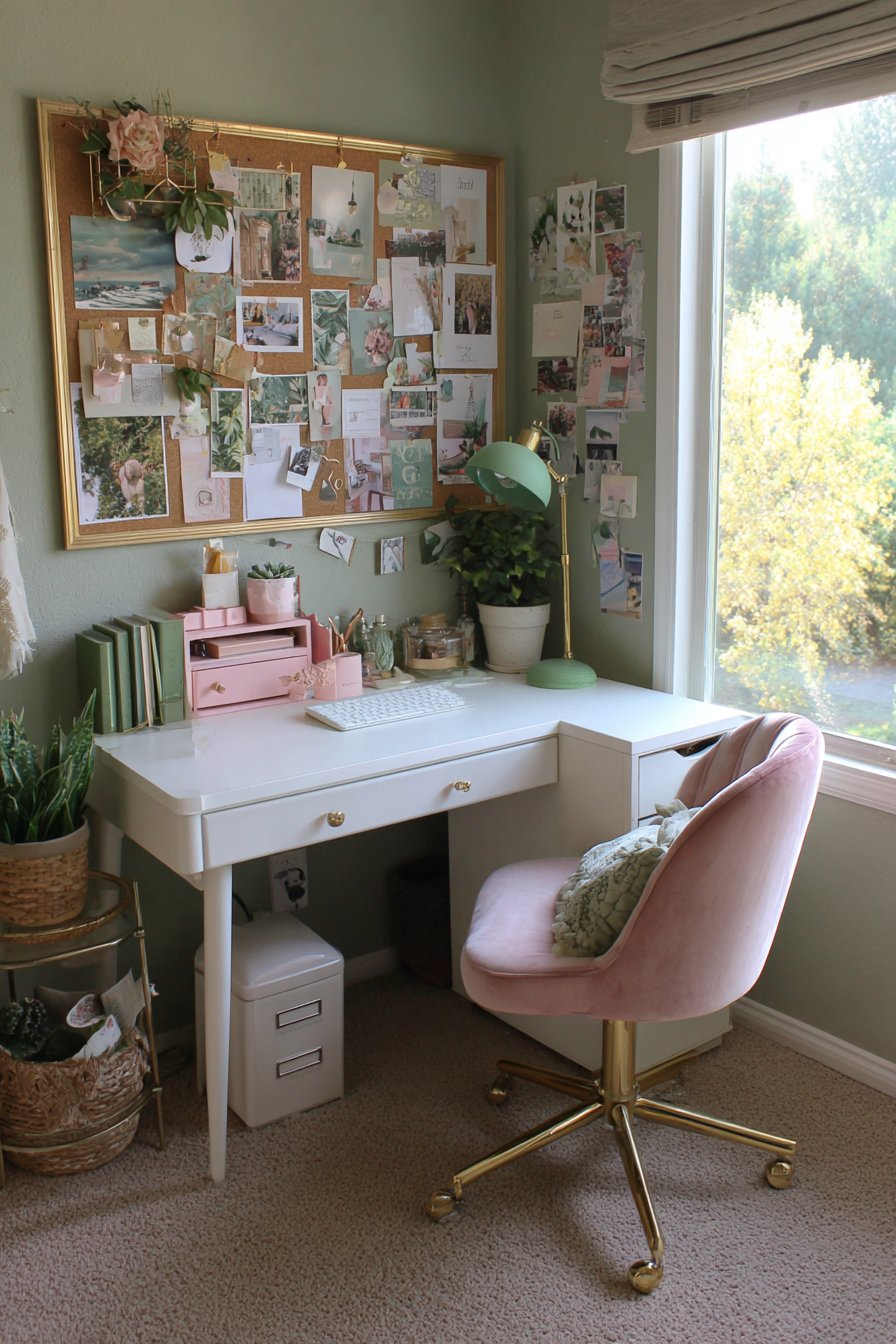
15. Feminine Home Office Nook
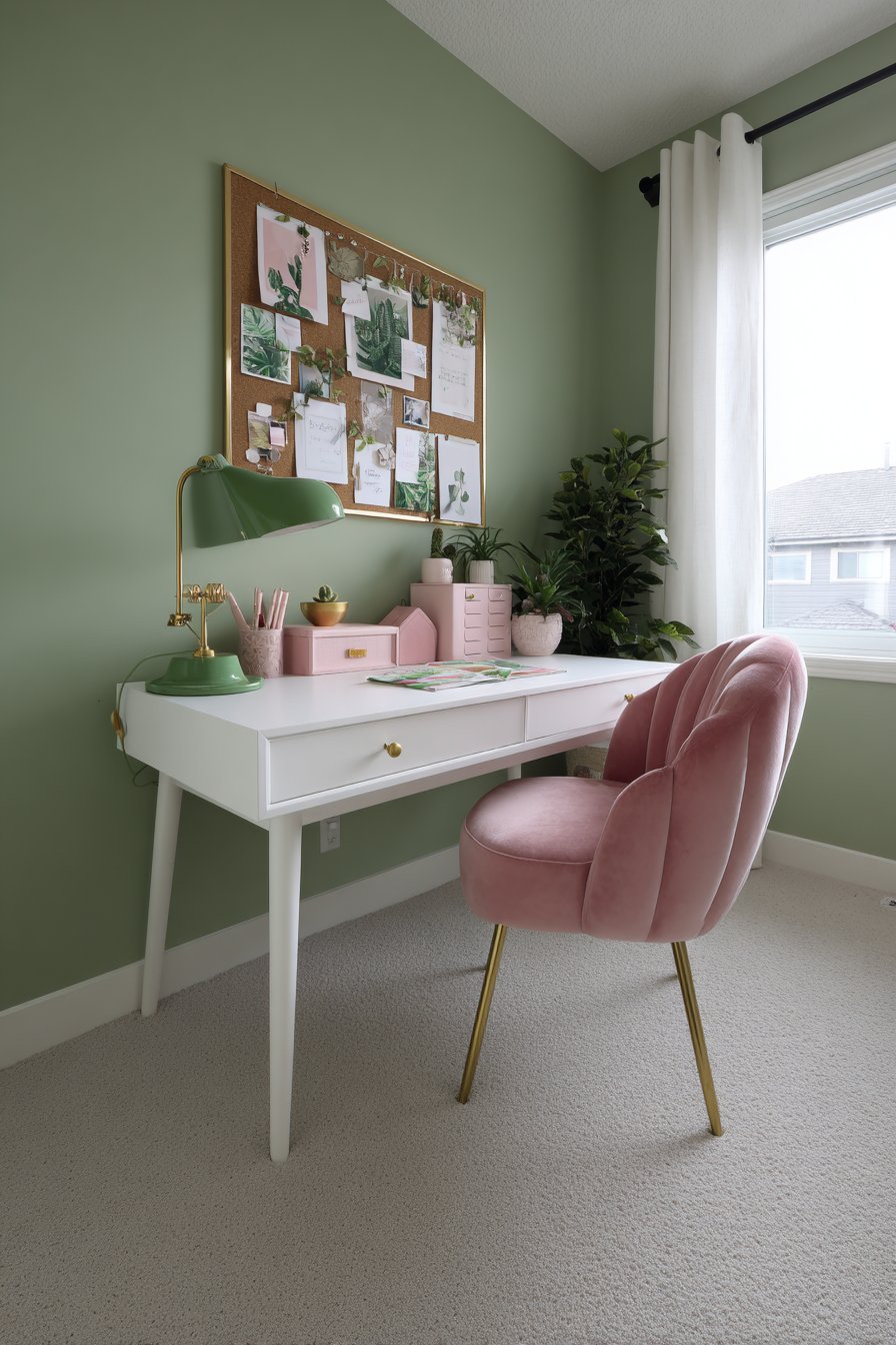
A white writing desk with tapered legs provides elegant workspace. A pink velvet task chair with gold base adds luxurious comfort. The desktop holds a green desk lamp with brass accents, pink file organizers, and small potted plants. The functional items maintain aesthetic appeal.
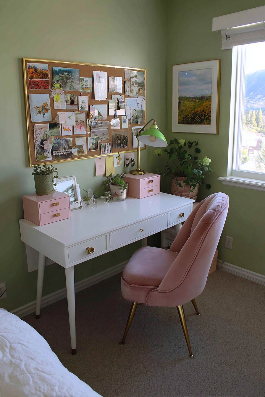
Above the desk, a cork board with gold frame displays inspiration images. The predominant green and pink tones coordinate with the room scheme. Soft sage wall paint provides a cohesive backdrop throughout. Natural light from a nearby window illuminates the workspace perfectly.
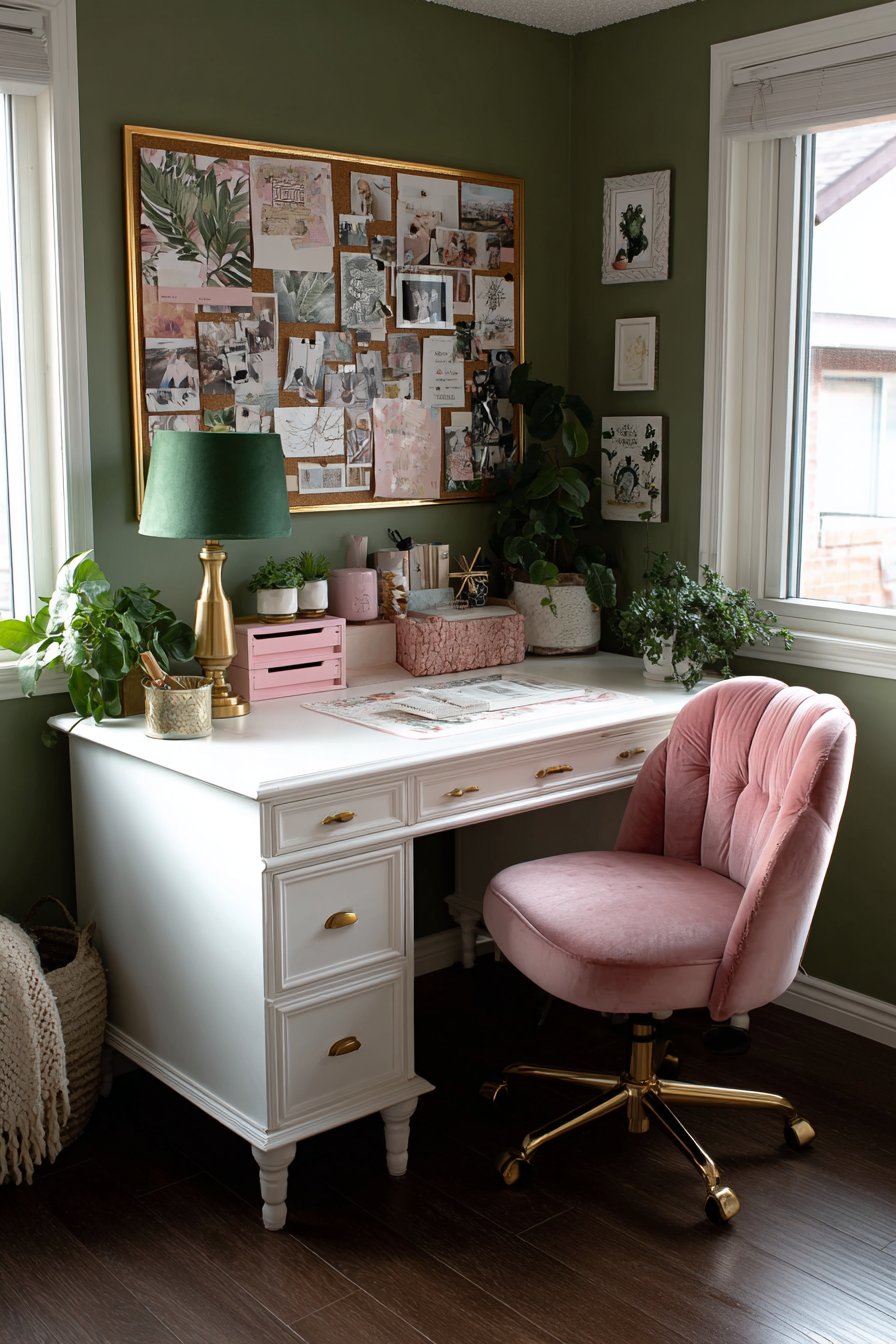
The velvet task chair elevates the typical office seating. The plush fabric makes work time more enjoyable. The gold base adds sophistication unexpected in desk chairs. The coordinated color maintains the room’s palette throughout the functional area.
The organized accessories keep the workspace functional and beautiful. File organizers prevent paper clutter. The desk lamp provides necessary task lighting. Small plants add life without consuming desk space. Everything serves both purpose and aesthetics.
Key Design Tips:
- Choose velvet desk chairs for luxury in home offices
- Install cork boards for flexible inspiration displays
- Keep desktop accessories coordinated with room colors
- Position desks near windows for natural task lighting
- Add small plants to workspaces for improved air quality
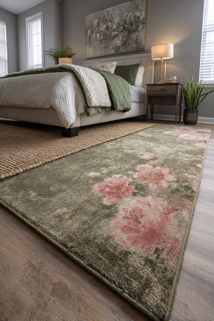
16. Layered Vintage Rug Arrangement
A large jute natural fiber rug serves as the foundation layer. A smaller vintage-inspired rug layers on top featuring faded pink florals on green background. The worn texture adds character and history. This layered approach creates depth and softness underfoot.
The rugs sit on light oak hardwood flooring beneath a white bed. Green and pink bedding continues the color coordination. The layering prevents the large jute from appearing too plain. The vintage rug adds pattern without overwhelming the space.
Layered rugs offer practical benefits beyond aesthetics. The combination provides extra cushioning. The vintage rug protects the larger base from direct foot traffic. Layers can be changed seasonally for different looks. The technique maximizes existing rug investments.
The faded quality of the vintage rug contributes important character. New rugs often appear too bright or harsh. Aged pieces blend more naturally with varied decor. The patina suggests collected rather than purchased styling.
Key Design Tips:
- Layer rugs for added depth and visual interest
- Use jute as base layers for natural texture
- Choose vintage rugs with faded patterns for character
- Ensure the top rug is significantly smaller than the base
- Consider rug layering for added floor cushioning
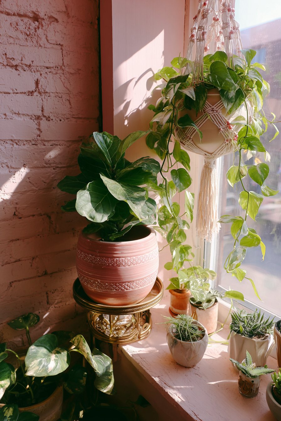
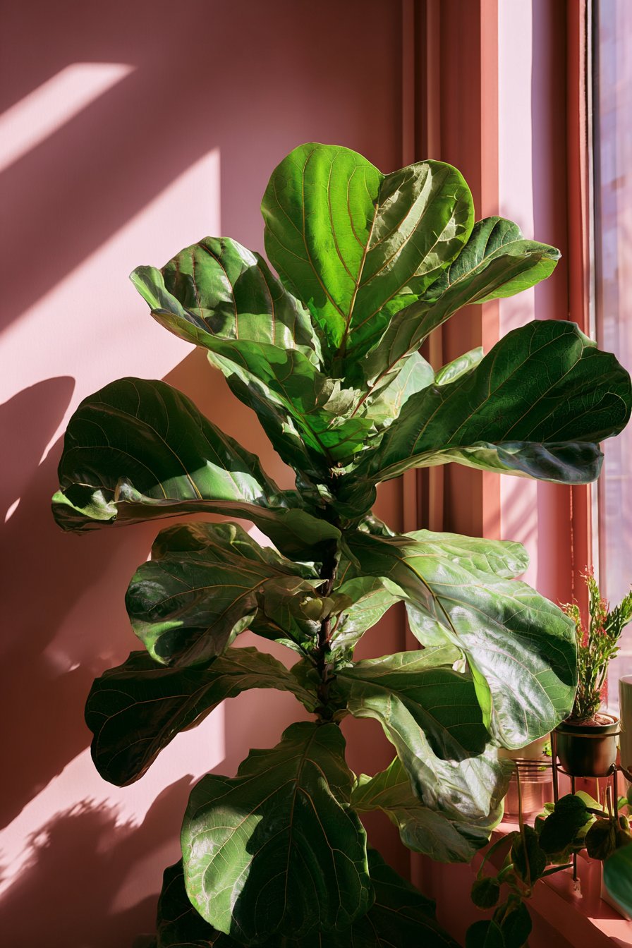
17. Botanical Corner with Living Greenery
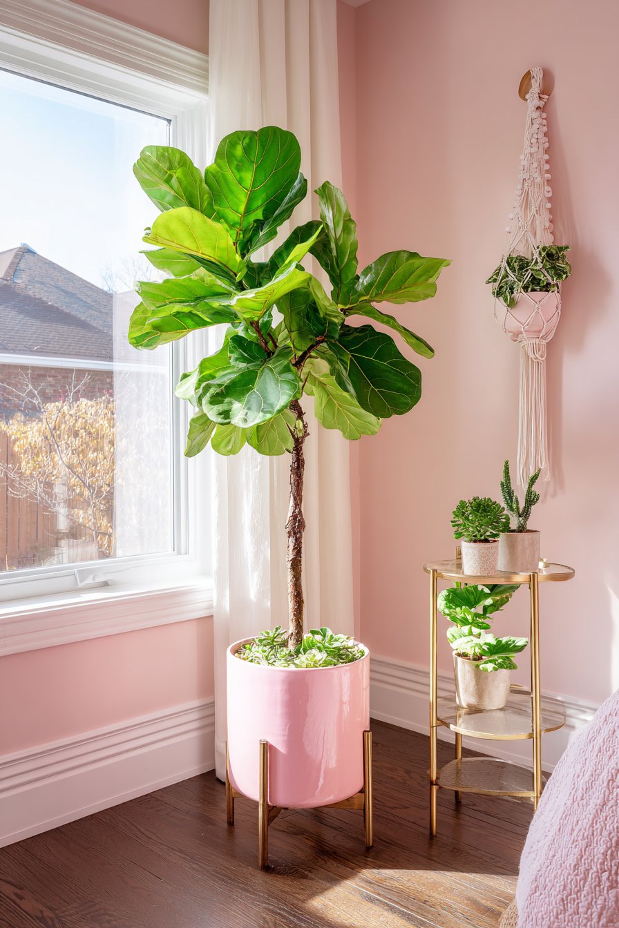
A tall fiddle leaf fig in pink ceramic planter anchors this plant corner. A hanging pothos in white macramé hanger with pink beaded details cascades from above. Small succulents sit on a three-tier brass plant stand. The abundant greenery creates living art within the bedroom.
The pale pink painted wall provides a soft backdrop that doesn’t compete. Natural window light from the side creates plant shadows and ensures healthy growth. The varied plant heights create visual rhythm. The different plant types add textural variety.
The pink ceramic planter introduces necessary color to the predominantly green display. The large scale matches the substantial fiddle leaf fig. The glazed finish adds shine and sophistication. The planter becomes decorative architecture itself.
The brass plant stand adds metallic warmth while maximizing vertical space. The tiered design displays multiple plants in a small footprint. The open structure doesn’t block light to lower plants. The gold tone coordinates with other metallic accents throughout the room.
Key Design Tips:
- Group plants in corners for impactful botanical displays
- Choose planters in accent colors to reinforce palette
- Vary plant heights for visual rhythm and interest
- Position plant corners near windows for optimal light
- Use tiered stands to maximize vertical growing space
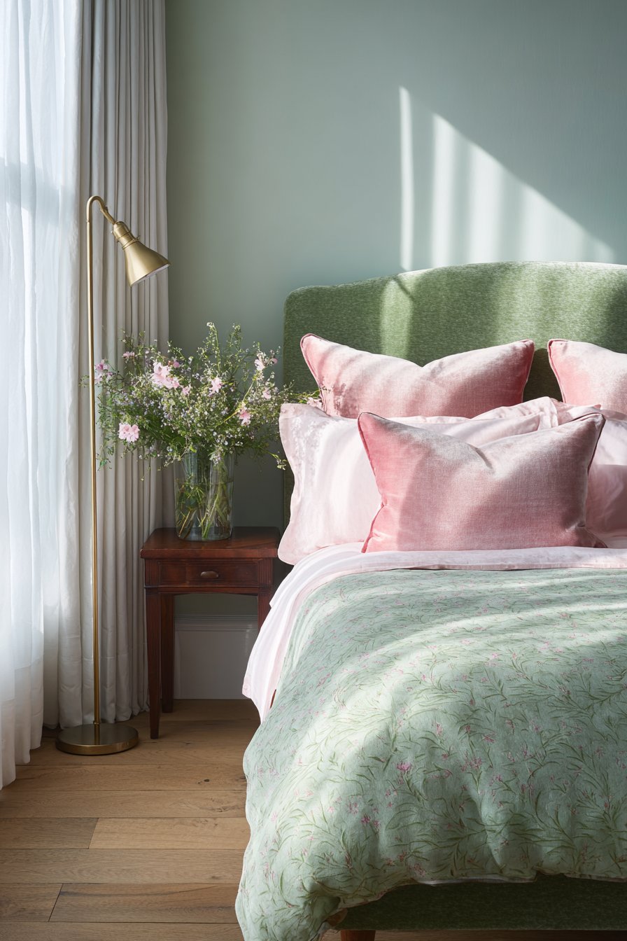
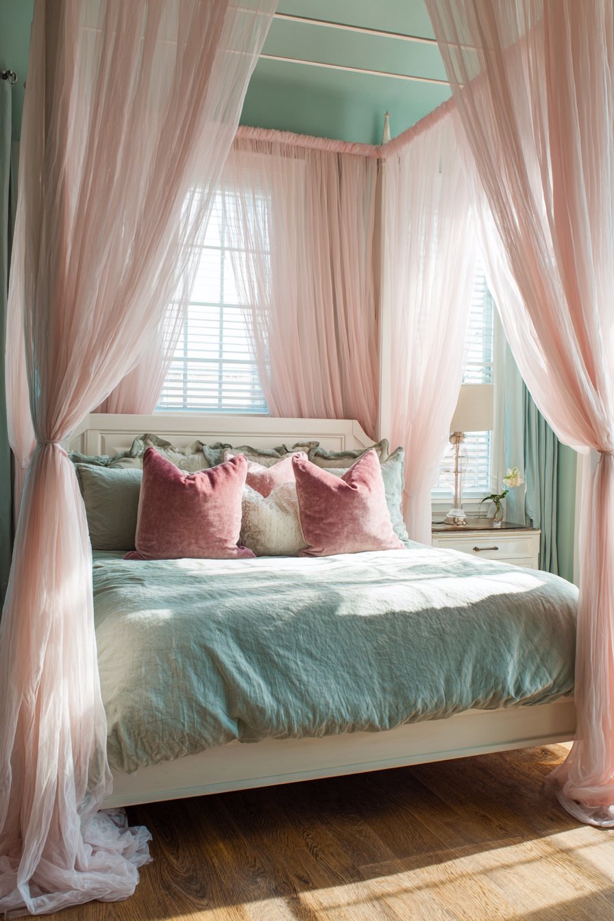
18. Romantic Four-Poster Canopy
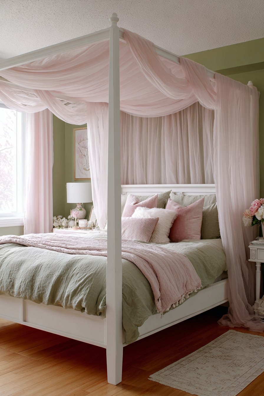
A white four-poster bed frame features simple clean lines. Sheer blush pink canopy fabric drapes from the posts creating romantic atmosphere. The fabric filters light beautifully creating a dreamy glow. Sage green linen duvet and pink velvet accent pillows coordinate perfectly.
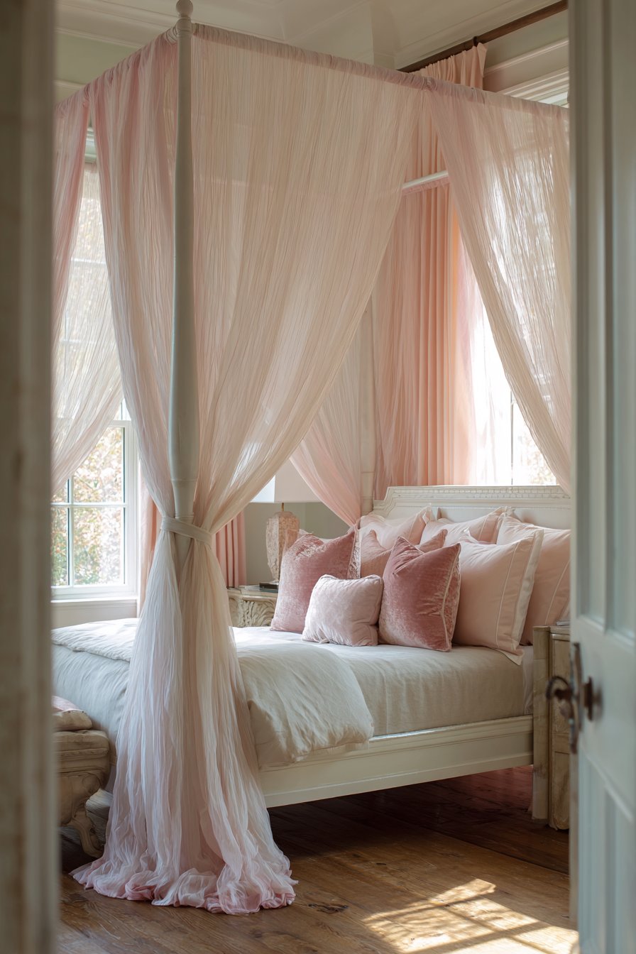
Very pale mint walls provide subtle color without overwhelming. Natural oak hardwood floors add warmth throughout the space. Soft diffused morning light filters through the canopy fabric. The ethereal quality feels feminine and peaceful.
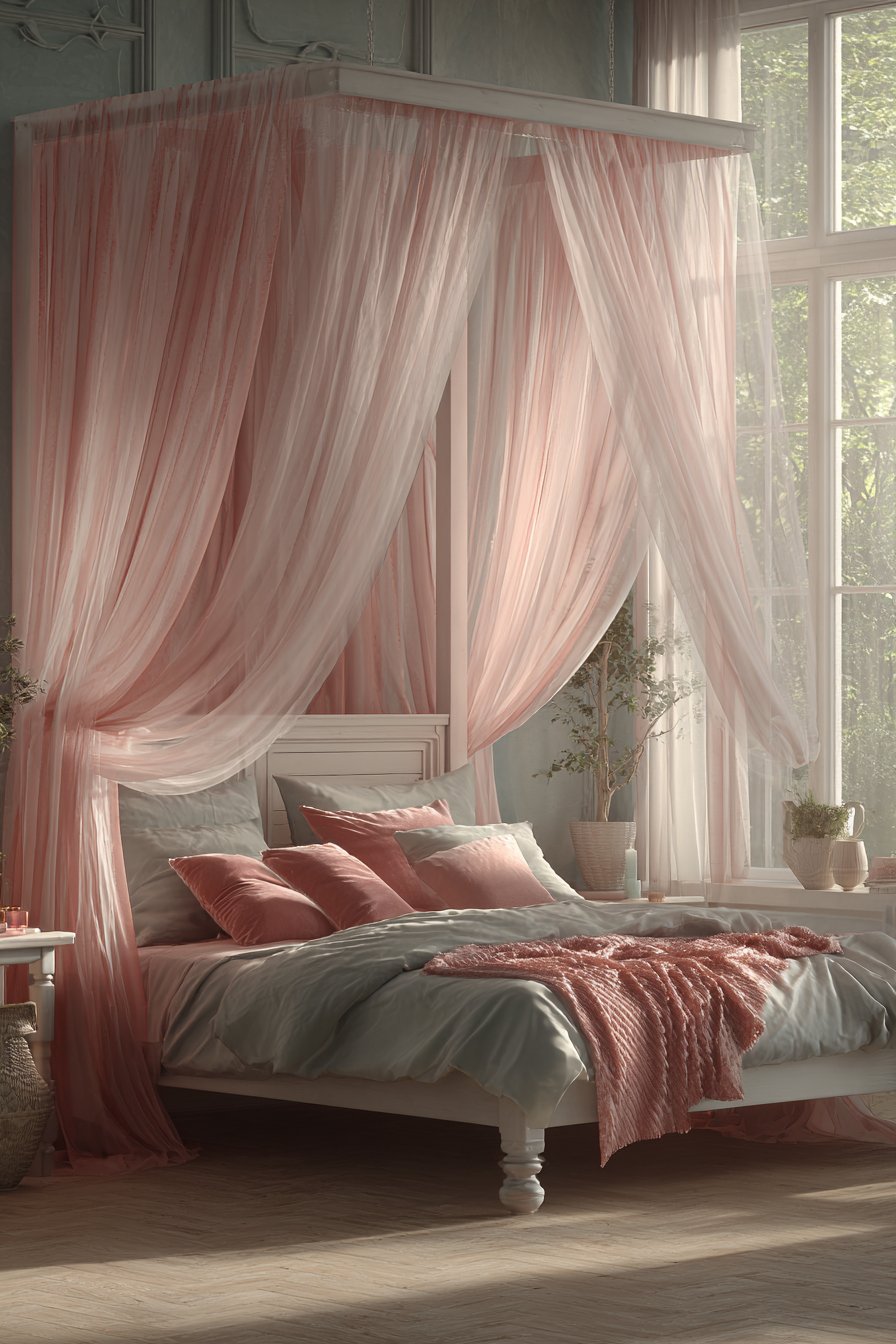
The canopy serves both decorative and functional purposes. The fabric adds softness and romance. The draping can close for added privacy and coziness. The filtered light creates gentle awakening. The structure defines the bed as a special sanctuary.
The simple bed frame allows the fabric to star. Ornate posts would compete with the draping. The white finish maintains airiness. The clean lines feel modern despite the traditional canopy concept.
Key Design Tips:
- Choose simple bed frames when adding canopy fabric
- Use sheer fabrics for canopies to maintain light flow
- Drape fabric loosely for romantic ethereal effect
- Keep walls very light when using canopy beds
- Select hardwood flooring to ground airy canopy designs
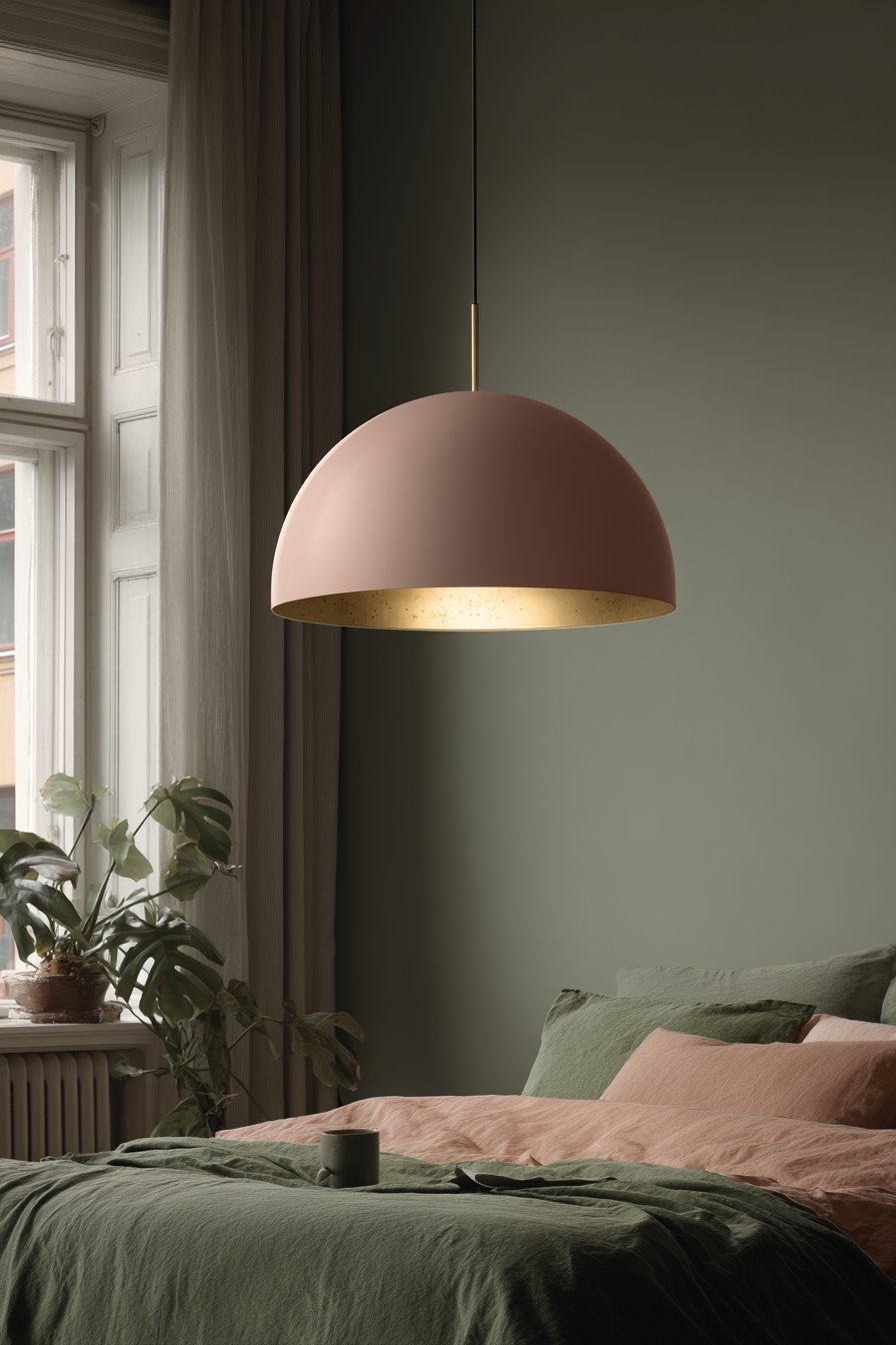
19. Statement Pink Pendant Lighting
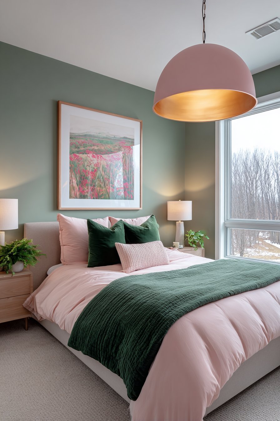
A statement pendant light features a large dome shade in soft pink metal. The brass interior reflects warm light when illuminated. The fixture hangs centrally above the bed becoming sculptural art. The bold lighting creates a focal point beyond typical overhead fixtures.
White ceiling and sage green walls provide clean backdrop. The bedding coordinates with pink sheets and green coverlet. The pendant design demonstrates how lighting becomes furniture. The soft pink metal adds color at an unexpected height.
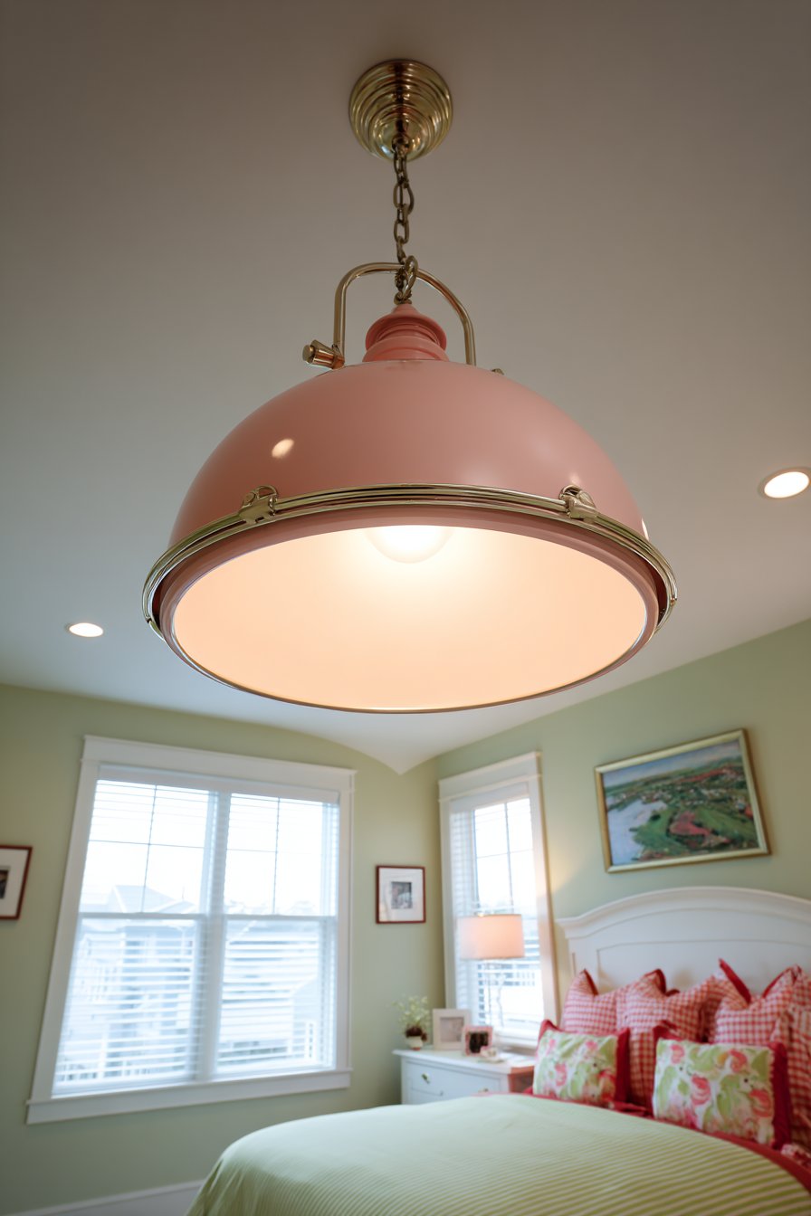
The dome shape directs light downward for functional illumination. The brass interior creates warm glow rather than harsh brightness. The size makes bold statement without overwhelming. The color coordinates without exactly matching other pink elements.
Pendant lighting above beds requires careful consideration. The fixture must hang high enough to avoid head bumps. The style should complement rather than compete with the headboard. The light level needs dimming capability for versatility.
Key Design Tips:
- Choose oversized pendants for dramatic lighting statements
- Select colored fixtures to reinforce room palette
- Install dimmers on bedroom pendant lights for versatility
- Hang pendants high enough to prevent head collisions
- Consider brass interiors for warm light reflection
20. Textured Wood Slat Accent Wall
Vertical wood slat paneling painted in forest green creates dimensional architecture. The slats cast beautiful shadows adding depth and movement. Brass wall sconces with white shades mount on the slatted surface. The combination of texture and metallic creates sophisticated interest.

The bed displays coordinating bedding in blush pink linen with green throw blanket. Natural oak flooring grounds the dramatic wall treatment. Side lighting emphasizes the shadow play between slats. The three-dimensional surface prevents the dark color from feeling heavy.
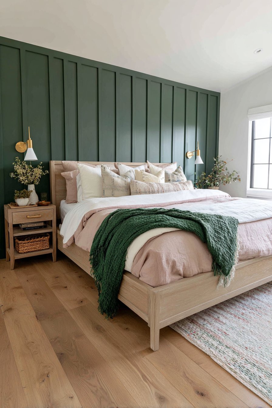
The wood slat application adds architectural character to plain walls. The vertical orientation emphasizes ceiling height. The painted finish maintains the texture while coordinating with the color scheme. The installation transforms standard drywall into featured architecture.
The sconce placement on textured walls requires careful planning. The mounting must attach to solid backing. The fixtures should highlight rather than hide the texture. The white shades provide light color contrast. The brass finish coordinates with other metallic accents.
Key Design Tips:
- Add wood slat paneling for instant architectural interest
- Paint slats in deep colors to emphasize shadow depth
- Mount sconces on accent walls for layered lighting
- Use side lighting to emphasize dimensional textures
- Ground dark accent walls with natural wood flooring
Why These Green and Pink Bedroom Designs Are the Best
These green and pink bedroom designs represent the finest approaches to creating balanced, sophisticated spaces. Each concept demonstrates expert understanding of color theory and interior design principles. The combination of green and pink offers unique advantages that other color schemes cannot replicate.
The psychological benefits of green and pink together create ideal bedroom environments. Green brings nature’s calming influence promoting relaxation and sleep quality. Pink adds warmth and nurturing comfort without overwhelming energy. Together they balance tranquility with gentle vitality.
The versatility of this color pairing accommodates diverse design styles seamlessly. Traditional spaces benefit from rich emerald and dusty rose combinations. Modern bedrooms shine with sage and blush minimalism. Bohemian aesthetics embrace forest green with coral pink accents. Each style finds expression within this adaptable palette.
Material selection opportunities expand with green and pink coordination. Velvet upholstery in either color adds luxury and texture. Linen bedding in coordinating shades provides casual elegance. Brass metallic accents bridge the warm and cool tones perfectly. Marble surfaces in pink introduce natural sophistication. These material combinations create rich sensory experiences.
The lighting possibilities enhance the green and pink combination beautifully. Natural daylight brings out the colors’ natural vibrancy. Warm artificial lighting creates cozy evening ambiance. The colors respond to lighting changes throughout the day maintaining interest. Pink ceiling paint reflects warm light downward. Green walls create refreshing backdrop in morning brightness.
Botanical themes integrate naturally with green and pink palettes. Living plants reinforce the green element with organic authenticity. Pink flowers introduce complementary color through nature’s design. Botanical prints and patterns connect the decorative choices to natural inspiration. This thematic consistency creates cohesive sophisticated design.
The gender-neutral potential of green and pink together breaks traditional expectations. Deeper forest greens with muted rose tones create mature sophisticated spaces. The palette moves beyond stereotypical associations when applied thoughtfully. Adults and children both respond positively to well-designed green and pink environments.
Spatial perception benefits from strategic green and pink application. Lighter shades expand small bedrooms visually. Darker accent walls create cozy intimate atmosphere in large rooms. The color distribution affects how spaces feel and function. Graduated wall treatments add architectural interest to plain rooms.
The investment value of green and pink design choices proves worthwhile. Quality furniture pieces in these colors remain stylish through trend cycles. The palette works with various accent colors allowing evolution. Bedding and accessories in coordinating shades offer affordable updates. The foundational color scheme supports long-term satisfaction.
Seasonal adaptability makes green and pink bedrooms practical year-round. Summer months feel fresh with emphasized greens and lighter pinks. Winter seasons gain warmth through deeper rose and forest tones. Textile changes allow seasonal expression without complete redesign. The color combination transitions naturally across temperature changes.
The emotional impact of green and pink bedrooms creates positive daily experiences. Waking in these colors starts days with gentle energy. Evening rest comes easier in the calming balanced atmosphere. The colors support both activity and relaxation. This functional versatility justifies the design investment.
These designs demonstrate how traditional color rules can evolve beautifully. Green and pink together challenge expected combinations successfully. The results prove that thoughtful design transcends conventional limitations. Each concept shows tested approaches that deliver beautiful livable results.
Conclusion
These twenty green and pink bedroom designs showcase the remarkable versatility of this color combination. From sage and blush softness to emerald and rose drama, the palette accommodates diverse preferences. The key takeaways include thoughtful material selection, strategic lighting placement, and balanced color distribution throughout the space.
Successful green and pink bedrooms begin with choosing your preferred shade intensities. Consider which green tones resonate with your personal style. Decide whether you want subtle or bold pink accents. Start with foundational pieces like bedding or paint colors. Add accessories gradually to build the complete look.
The investment in quality pieces pays dividends in lasting satisfaction. Choose substantial furniture in neutral tones that support color changes. Invest in excellent lighting that showcases your color choices beautifully. Select textiles that feel as good as they look. Your dream green and pink bedroom awaits through thoughtful planning and creative expression.